Hating on Papyrus font is like hating on Nickleback….
Continue reading “Deep Thoughts From Week Four”Tag: css
Typography This Week
Who knew there was so much to
Continue reading “Typography This Week”Good Boy Fetches My Files, and Occasionally Loses Them!
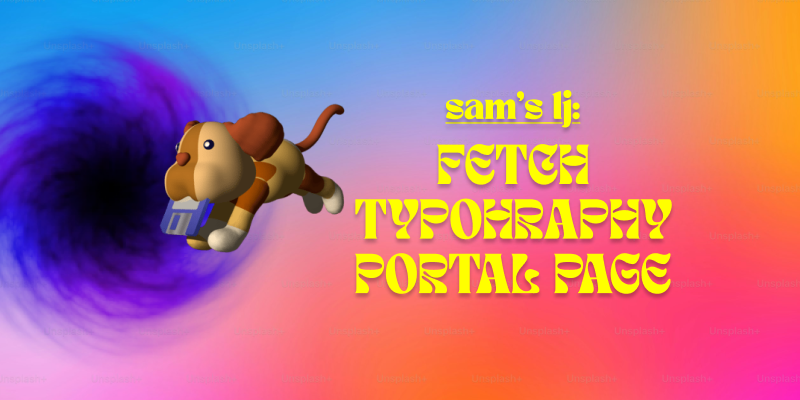
Lately, I’ve been getting more into web design, and honestly, it’s been a mix of excitement, frustration, and way too much time spent tweaking tiny details. Typography, FTP, and building my portal page have been my main focus, and each has come with its own set of surprises.
Typography has been one of my favorite parts. I always knew fonts mattered, but I never realized how much they shape the entire feel of a website. Picking the right font isn’t just about aesthetics—it’s about making sure people can actually read what you’re putting out there. I also got way too into typography games (yes, they exist, and yes, they’re weirdly addictive). Who knew I’d be out here kerning letters for fun? But honestly, playing those games helped me understand how small adjustments can make a design look polished or completely off.
On the more technical side, I’ve been using Fetch as my FTP client to upload my work. It’s pretty satisfying to drag and drop files and see my updates go live. At first, it felt a little intimidating—like, one wrong move and everything could disappear—but once I got the hang of it, it wasn’t bad at all. The key lesson? Keep files organized. Because trust me, trying to find the right version of a file in a mess of randomly named folders is not fun.
And then, there’s my portal page: Samet Kaya – Portal Page. It’s the hub for everything I’m working on, and designing it was a fun challenge. I wanted to make sure it was simple, clear, and easy to navigate—because if people have to think too hard about where to click, they probably won’t click at all. I focused on keeping the layout clean and making sure the important stuff was easy to find. So far, I’m happy with it, but let’s be real—I’ll probably keep tweaking it forever.
Web design has definitely been a learning experience, but I love how it’s a mix of creativity and problem-solving. One day I’m picking fonts, the next I’m troubleshooting an upload issue, and somehow, it all comes together. Now, onto the next challenge (or maybe just another round of typography games).
My Journey with HTML
My previous experience with HTML / CSS, and how I have been refreshing myself with the material!
Continue reading “My Journey with HTML”Back at it
These first two weeks have been what I would call a shock. Winter break did not feel like very long, but I still find myself with brain fog on week 2.
Continue reading “Back at it”Parallax and Bootstrap in CSS
Week 12 of this semester focused on utilizing CSS parallax and Bootstrap. Both are valuable features that enhance website aesthetics and streamline the design process. I’ve discovered that parallax is particularly effective for storytelling and product presentation, as it adds a visually appealing element to the website. However, it’s crucial to exercise moderation, as excessive use can lead to monotony and repetition.
Continue reading “Parallax and Bootstrap in CSS”Sass, Parallax & Bootstrap oh my!
There has been lots of opportunity to learn in the last couple weeks.
Continue reading “Sass, Parallax & Bootstrap oh my!”AAD86 – Weeks 11 & 12
Similarly to past weeks, Weeks 11 and 12 were fun but challenging in their own ways! Week 11 was our introduction to Sass alongside getting the solutions to the Sacramento Writer’s and Zen Music Festival pages. Week 12 was simple and straightforward, and focused on our introduction to Parallax and the beginnings of our final project.
Continue reading “AAD86 – Weeks 11 & 12”Lisa’s Learning Journal: Week 12
When does a tool become a gimmick? (And when does a gimmick become a headache…)
The last couple of weeks have flown by a bit faster than I expected. Last week, we got to play around with Sass, which I actually had some fun with. It reminded me of my time tackling object-oriented programming a few semesters ago. Sass came more naturally to me than I thought it would. That being said, I don’t know how often I will implement Sass in my own web coding career.
Continue reading “Lisa’s Learning Journal: Week 12”Something I learned
One of the things that I have really learned and that has helped me a lot is
Continue reading “Something I learned”AAD86 – Weeks 9 & 10
Per expectations, the content has definitely ramped up in difficulty. These past few weeks have definitely been challenging, but thankfully I’ve been able to enjoy the challenge rather than get overly frustrated over it.
Continue reading “AAD86 – Weeks 9 & 10”Lisa’s Learning Journal: Week 10
Ten weeks down, six more to go…
The last two weeks of web design have gone by smoothly. I’m enjoying the design challenges, even though they sometimes leave me with a headache. It’s fun to try and figure out how to do the CSS coding correctly. I feel more confident with my coding abilities than I did at the beginning of the semester even though I feel like I don’t know how to do much. Each step is another hurdle I am slowly tripping upon. However, I am happy with how I am progressing through the class.
Continue reading “Lisa’s Learning Journal: Week 10”Responsive Web Design & Media Query
What is a Media Query?
Media query is a CSS technique introduced in CSS3.
It uses the @media rule to include a block of CSS properties only if a certain condition is true.
Week 10=22 Weeks Until Degree Completion
Ok, sometimes I need to focus on the longterm goal to get the short term items done.
Continue reading “Week 10=22 Weeks Until Degree Completion”Lisa’s Learning Journal: Week 8
Is the Semester Halfway Over or Halfway Begun?
The past few weeks of AAD86 have been pretty smooth. It was fun to work through the stages of the midterm project, and I had a lot of fun finalizing my design. The first taste of responsive design was interesting. I think things are going to get a little more complicated moving forward with that. The introduction of indenting in CSS is a little scary since it seems like things can get really messy really fast.
Continue reading “Lisa’s Learning Journal: Week 8”AAD-0086 wk 5&6 – Float, Flex & Grid
With the concentration on the tools of spacial design, we worked with positioning, floats, flexbox and grids.
Continue reading “AAD-0086 wk 5&6 – Float, Flex & Grid”Lisa’s Learning Journal: Week 6
Let’s talk about Flex!
Oh boy. We finally made it to flexbox. For some reason, I never cared for the flexbox layout during AAD85. I thought, “Heck, I can do this whole HTML and CSS thing without it”. I don’t know why I hated flexbox so much. Though, it is most likely because learning flexbox involves change, and change is scary.
Continue reading “Lisa’s Learning Journal: Week 6”What I learned about CSS?
First month of the course has been so exciting and productive on this web development journey. Practicing more semantic HTML has been an eye-opener. Understanding the importance of structuring content in a meaningful way not only makes the code cleaner but also improves accessibility for all users. It’s incredible how a few well-placed tags can make such a big difference.
Continue reading “What I learned about CSS?”Lisa’s Learning Journal: Week 4
This is just the beginning.
I’m not sure why, but it’s wild to think that we are already creating functioning websites. I think back to AAD85 quite often and think about how long it took to understand HTML and CSS and what they do. By this time in that class, I believe we were still trying to recognize the differences between IDs and classes. It was definitely a struggle, but I think it’s almost funny now.
Continue reading “Lisa’s Learning Journal: Week 4”AAD-0086 wk4 – Learning Journal
This is a summary of our topics of concentration for weeks three and four in Intermediate Web Design.
Continue reading “AAD-0086 wk4 – Learning Journal”