This week, it occurred to me that I’m doing responsive design all wrong.
Continue reading “Things Are Getting Responsive”Tag: css
My Goals and What I Learned This Week
This week, I was really challenged by the Sacramento writer’s group and zen music festival challenges.
Continue reading “My Goals and What I Learned This Week”Two Weeks in Design: Learning by Doing

The past two weeks have been a deep dive into the world of web design. What started as simple class projects quickly turned into opportunities for real discovery. I did not just follow instructions. I started noticing how different choices in layout, structure, and tools can completely change how a website feels and functions.
Continue reading “Two Weeks in Design: Learning by Doing”Responsive Design + Midterm!
Hello Everyone!
This week we learned a ton about responsive design, worked with it hands on, and dove into its history. We also finished up our midterm! I’ll talk about how mine went.
Continue reading “Responsive Design + Midterm!”Adapting with CSS
It can be crazy to think about now, but computers used to be the only device we used to access the web. There was hardly a need to consider screen size when creating a website. Now we have smart fridges with internet access.
Continue reading “Adapting with CSS”Midterm, Midpoints, and Madness
Midterm: Sorted. Midpoint: Reached. Now, I need to figure out how to keep myself occupied for the next two weeks.
Continue reading “Midterm, Midpoints, and Madness”No expert here, but I have learned a few tricks.
Designing for the web can be …
Week 8: Midterm and Responsive Design
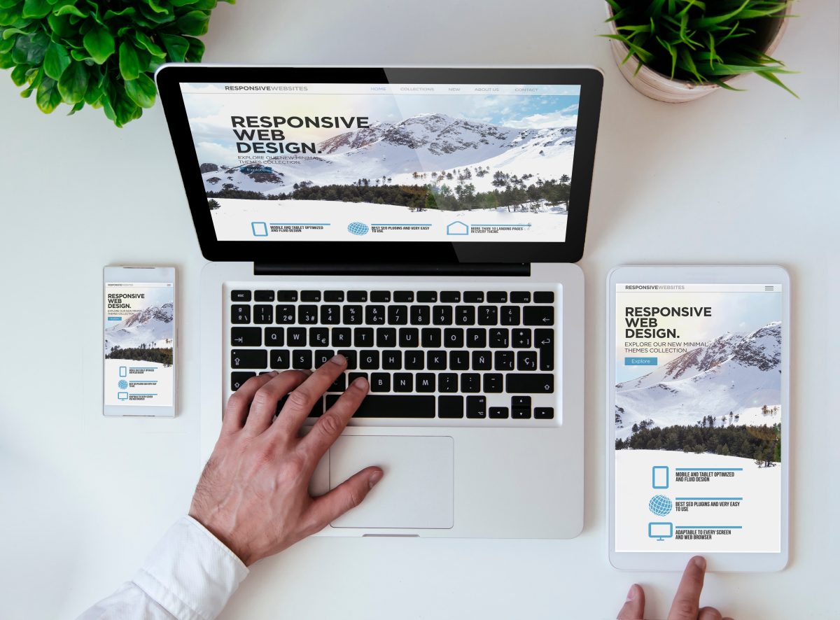
Now that we are halfway through the semester, I can see my CSS and HTML knowledge improving. All of the practices, notes, and challenges have helped me practice strategies and learn new techniques. When working on the Midterm Drafts and learning responsive design, I can see my growth from my previous class. To me learning responsive design for me was a major step towards making more professional sites.
Continue reading “Week 8: Midterm and Responsive Design”Fun with Flexbox
Working with Flexbox and grids this week has been challenging but fun. Both layout options hold a lot of potential for website layouts, giving designers more power when it comes to creating visually intriguing and well organized websites.
Continue reading “Fun with Flexbox”Flexbox Made Me Cry
Well…only a few tears.
Continue reading “Flexbox Made Me Cry”Learning Grids!
Hello Everyone!
This week we’ve dived further into web layout tools/techniques. Specifically, focusing on Grid, Positioning, and Flexbox! Here are some of my thoughts…
Continue reading “Learning Grids!”Flexbox Torture
You would think learning would be fun. But it turns out
Continue reading “Flexbox Torture”Week 5 & 6 Layout Techniques
These last two weeks have been a challenge! I had never even heard of grid, positioning, or floats, until this course. This is all very new and a bit overwhelming, but I am determined to understand it to the best of my abilities.
Continue reading “Week 5 & 6 Layout Techniques”Grid Garden Party
I played all 28 levels of the Grid Garden game and started our Grid Challenges assignment feeling pretty confident, only to get completely humbled!
Continue reading “Grid Garden Party”A Fortnight of Figma
This class is helping me put my impostor syndrome to bed. The past two weeks have been a productive and rewarding experience. Most notably, I’ve been getting back into making designs in Figma, and this time, I actually know what I’m doing.
Continue reading “A Fortnight of Figma”My Goals and What I’ve Learned This Week
This week, I feel as though my knowledge was definitely tested. I am grateful to have learned so much about flex box and grid, but it did not come without difficulties.
Continue reading “My Goals and What I’ve Learned This Week”I ❤️ Figma!
The past two weeks have been really productive and full of learning. I have improved my understanding of web layouts, CSS techniques, and design tools. Each week, I worked on different exercises and projects that helped me practice and apply what I learned in a meaningful way.
Week 5: Flexbox and CSS Layouts
In Week 5, we focused on Flexbox layouts and CSS positioning. I started with the Web Layout Overview & Review, which was a great refresher on structuring web pages. Then, I worked on the Flexbox Layout Challenges, which helped me practice arranging elements efficiently.
One of the most interesting tasks was the Convert Coffee Shop Website to Flexbox assignment. This activity helped me see how Flexbox is used in real-world layouts. I found it really useful because it made me think about how to structure a page in a more flexible and responsive way.
I also participated in the CSS Layout Discussion, where we talked about different layout strategies and how they apply to modern web design. It was helpful to hear different perspectives and learn from others’ experiences.
Week 6: CSS Grid and Midterm Preparation
In Week 6, we shifted our focus to CSS Grid, which is another powerful layout system. I worked on Gridspiration and the Introduction to CSS Grid & Grid Challenges. These activities helped me understand how Grid works differently from Flexbox and when to use each one.
One of the projects I really enjoyed was the Bakery Site Challenge. It required applying both Flexbox and Grid, and it made me think carefully about which layout system to use for different parts of the page. This challenge helped me feel more comfortable combining both techniques in my designs.
Midterm Project & Figma
A big part of this week was preparing for my midterm project. For my project, I decided to design a movie landing page. The assignment suggested using a new movie, but I chose my favorite movie, The Shawshank Redemption. I wanted to work on something I really enjoy, and I felt that this movie’s theme and visuals would make for an interesting design.
I used Figma to create the designs for my midterm project, and I am really happy about this. Figma is my favorite platform for web and interaction design. It allows me to organize my ideas visually, create clean wireframes, and design high-quality layouts. I feel confident using Figma because it has all the tools I need to experiment with different layouts and styles before writing any code. This step was really important because it helped me plan my project before starting the development process.
Reflections & Looking Ahead
These past two weeks have helped me build a stronger foundation in CSS layout techniques. I now feel more comfortable using both Flexbox and Grid, and I understand when to use each one. The hands-on exercises and projects were really helpful in making these concepts clearer.
Working on my midterm project in Figma was a great experience, and I am excited to move forward with the development phase. I plan to focus on making my movie landing page both visually appealing and functional.
Overall, I feel that I have learned a lot in these two weeks, and I am excited to continue improving my design and coding skills in the upcoming weeks.
From CR to CSS
Yesterday my flight from Costa Rica landed in Sacramento. Today, I’m back at the desk writing CSS with my brand new keyboard.
Continue reading “From CR to CSS”Why is it Ugly?
The good news: I remember how to code!
The bad news: Everything looks ugly…
Loving CSS!
Hello Everyone again! It has been refreshing getting back into coding and retouching on my typography knowledge! For this post, I will talk about how my learning progress has been from the past two weeks!
Continue reading “Loving CSS!”