The past two weeks have been incredibly informative. There was so much that I learned and I’m hoping it all the information absorbs into me.
Continue reading “Weeks 3 – 4: Diving Deeper into HTML & CSS”Tag: typography
Week 3-4
This week, I studied font handling and how to properly implement them in CSS. I learned how to establish a typographic hierarchy on a page using properties such as font-family, font-weight, font-size, and line-height. I also explored CSS selectors and how to use them effectively to target specific elements. I mastered basic tag, class, and ID selectors and learned to combine them to create complex styling structures. Additionally, I gained an understanding of pseudo-classes and pseudo-elements for managing interactivity (such as :hover) and styling specific elements. Applying these skills enables me to create layouts that are cleaner, more structured, and visually appealing.
Learning More About CSS and Typography
Over the past couple of weeks, I learned more about how CSS can change the look and feel of a webpage, especially through selectors and typography.
Continue reading “Learning More About CSS and Typography”Intricacies of Typography
I remember in my high school graphic design class, we watched a video praising Helvetica and slamming Comic Sans and Papyrus. At first I was a little hurt because I liked Comic Sans. I used to look through every font in Microsoft Word trying to find one that displayed letters (especially “a” and “t”) the way that I wrote them and Comic Sans was the only one. But the more I became aware of type, the more I understood. I do believe Comic Sans has its place, however just very specific places. Typography is very powerful, especially when used correctly, and I find it fascinating.
Read more: Intricacies of TypographyFrom serifs vs sans-serifs, to weight, to leading and kerning, typography has a lot more going on than most people realize. Type needs to look good, it has to fit the vibe of the content, and it needs to be legible. Combining multiple fonts in one space can be even more challenging, making sure they are different enough to warrant using both, while having enough similarities for them to look cohesive.
It is important to remember leading and kerning when using type. Many times, I think the font I am using is not going to work because it looks scrunched, but utilizing those adjustments can make a huge difference in legibility.
I also find it interesting how quickly technology went from having limited fonts to seemingly endless, even being able to adjust so many variable ourselves through Wakamai Fondue. Even how typefaces can be designed specifically for the web or print. And that it all started with the introduction of the printing press.
Aside from simply conveying blocks of text, I also find it fascinating that type can be used to create images as well. I watched Paula Scher’s video in one of my classes last semester and have been thinking about ever since. It is 40 minutes long but absolutely worth the watch.
I am a history nerd and remember learning about the printing press growing up, however there is so much more to it than I previously thought. I used History.com’s Printing Press article as a refresher/reference and thought I would share some of its history.
The oldest known printed book, The Diamond Sutra, that has been discovered was found in China from the Tang Dynasty (around 868 A.D). It was printed using hand carved wooden blocks. While this was effective for mass printing the same book, the letters could not be arranged; this is when the printing press came in. While many believe the printing press was invented by Johannes Gutenburg in 1440, the oldest known moveable type was created by Bi Sheng around 1041. His clay-based press was mentioned in a book, Dream Pool Essays, written by Shen Kuo in 1086.
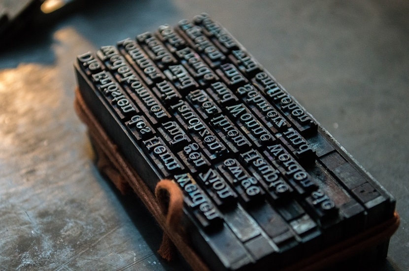
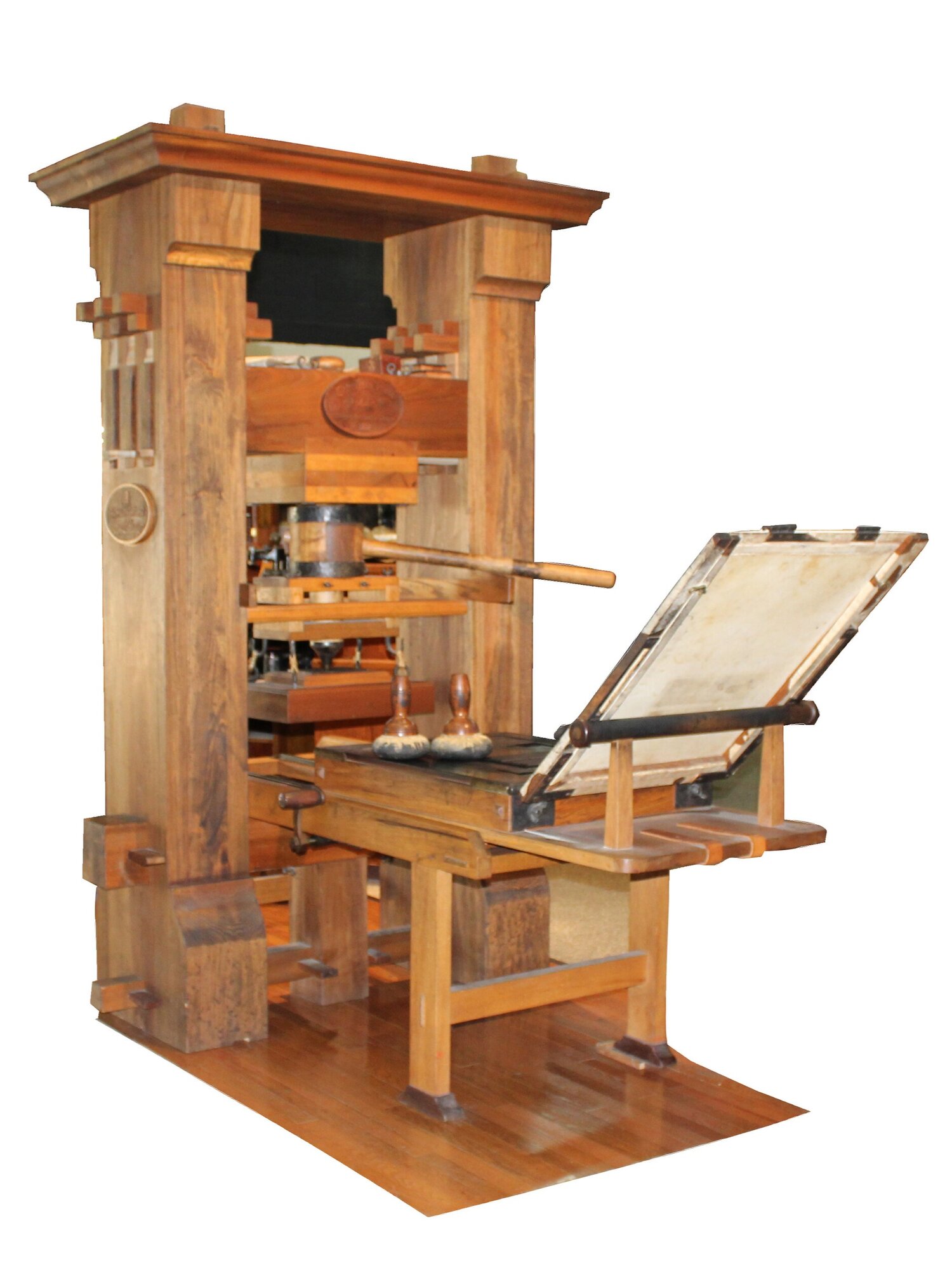
Gutenburg introduced metal-based letters, and introduced molds to mass produce more letter blocks. This made book printing, especially the Bible, take off in Europe during the Holy Roman Empire, eventually contributing to the split of the church. 21 copies of his Bible, in Gothic type, have survived to this day. While his original printing press and the design of it is lost, we do know what it had become by around 50 years later.
Why is it Ugly?
The good news: I remember how to code!
The bad news: Everything looks ugly…
Loving CSS!
Hello Everyone again! It has been refreshing getting back into coding and retouching on my typography knowledge! For this post, I will talk about how my learning progress has been from the past two weeks!
Continue reading “Loving CSS!”Typography is Great! But consider slower network speeds!
This week we went over how to properly incorporate fonts in our web pages. There’s a lot to typography and there’s even more to know when it’s used on the web!
Continue reading “Typography is Great! But consider slower network speeds!”95% of web design is typography?!? Oh no! 😱
Okay, okay, I confess. I don’t have strong feelings for or against any typefaces. Over a decade ago, when a classmate asked our professor to be excused from using Helvetica because she hated it, I felt puzzled. “How do you grow to hate a font? What did the font do to you?” I wondered.
Continue reading “95% of web design is typography?!? Oh no! 😱”Typography This Week
Who knew there was so much to
Continue reading “Typography This Week”Good Boy Fetches My Files, and Occasionally Loses Them!
Lately, I’ve been getting more into web design, and honestly, it’s been a mix of excitement, frustration, and way too much time spent tweaking tiny details. Typography, FTP, and building my portal page have been my main focus, and each has come with its own set of surprises.
Typography has been one of my favorite parts. I always knew fonts mattered, but I never realized how much they shape the entire feel of a website. Picking the right font isn’t just about aesthetics—it’s about making sure people can actually read what you’re putting out there. I also got way too into typography games (yes, they exist, and yes, they’re weirdly addictive). Who knew I’d be out here kerning letters for fun? But honestly, playing those games helped me understand how small adjustments can make a design look polished or completely off.
On the more technical side, I’ve been using Fetch as my FTP client to upload my work. It’s pretty satisfying to drag and drop files and see my updates go live. At first, it felt a little intimidating—like, one wrong move and everything could disappear—but once I got the hang of it, it wasn’t bad at all. The key lesson? Keep files organized. Because trust me, trying to find the right version of a file in a mess of randomly named folders is not fun.
And then, there’s my portal page: Samet Kaya – Portal Page. It’s the hub for everything I’m working on, and designing it was a fun challenge. I wanted to make sure it was simple, clear, and easy to navigate—because if people have to think too hard about where to click, they probably won’t click at all. I focused on keeping the layout clean and making sure the important stuff was easy to find. So far, I’m happy with it, but let’s be real—I’ll probably keep tweaking it forever.
Web design has definitely been a learning experience, but I love how it’s a mix of creativity and problem-solving. One day I’m picking fonts, the next I’m troubleshooting an upload issue, and somehow, it all comes together. Now, onto the next challenge (or maybe just another round of typography games).
AAD-0086 wk4 – Learning Journal
This is a summary of our topics of concentration for weeks three and four in Intermediate Web Design.
Continue reading “AAD-0086 wk4 – Learning Journal”Web Design AAD86 – Weeks 3 & 4
These last two weeks have been fun as we’ve started out re-introduction to CSS, which is what allows us to style and design our HTML pages.
Continue reading “Web Design AAD86 – Weeks 3 & 4”Templates for beginners
while in class were doing our final rough drafts of the website of our choosing to create about a certain topic, mine is a lawyer website and a tool that helped me use HTML and CSS to create my page and now a helpful tool for me to reference new code or refresh on the basics.
CSS Navigation Bar (w3schools.com)
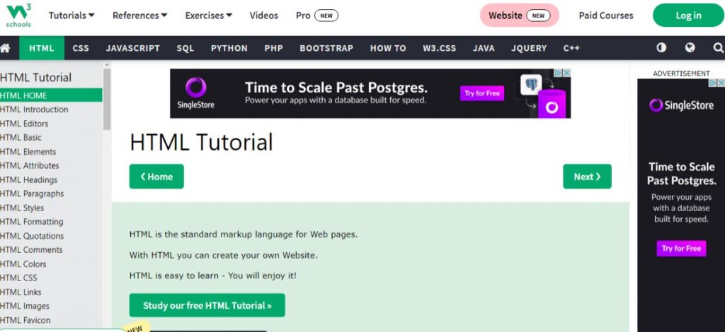
Here you can look up what you’re trying to create, and it will show you how it should look like in code and in another browser window to show a live code view of how it can look on a website screen.
New To Grid!
For this week’s reflecting on what we have been learning in class in HTML/ CSS Dreamweaver is how to make Grid’s in Dreamweaver. In doing that Grid is for two-dimensional layouts, meant to work with flex box, and when using flex box it uses heavily on “flex-wrap:wrap;” code onto Dreamweaver consider using grid instead wrap. Grid-gap helps you keep space between grid items. Grid-template-columns can take different units of measure.
Here is a video I found that’s been a reference now on understanding CSS grid and flex box in which I have been having trouble understanding.
update on HTML
In class we have been learning the basics of HTML and CSS of assembling it on Dreamweaver. The basic elements of creating the specific code we want as in <header> <p> <a href> <h1> <body> , etc to create and become familiar in the basics of setting up the code for a website. Also learning how to transfer files on an FTP I use FileZilla, to make our sites live has really been exciting. We are also setting up a portal page to link our projects for this semester.
Diving Into the Basics of CSS
It’s important to know how to change the basic rules of CSS using Dreamweaver, such as font, color, and spacing.
Continue reading “Diving Into the Basics of CSS”CSS Refresh and font-size.
These are two topic I have struggled with and one is resolved. I have the answer, Your Welcome. The other will probably be an ongoing learning battle.
Continue reading “CSS Refresh and font-size.”Typography: Here’s some things you need to know
Typography is such a critical element in all that we do… and yet, it’s such an overlooked thing in our day and age, when typography is being utilized more than ever. Here are some things you need to know to level up your typography skills and create better designs for the web.
Continue reading “Typography: Here’s some things you need to know”Typography Guidelines For Website Usability
Typography is the detail and the presentation of a story. It represents the voice of an atmosphere, or historical setting of some kind. It can do a lot of things. (Cyrus Highsmith)
Continue reading “Typography Guidelines For Website Usability”Typography and Week Four Summary, Mark-up, & Styling.
I thought I was over typography, we broke up years ago when I went chasing after a new love, as I call it, “The First One.” Never did font family inter-marriages, and bad kerning, or over-zealous drop caps, leave my inner aesthetic soul. It’s still inside, and I see cringe worthy examples, around, all the time.
Continue reading “Typography and Week Four Summary, Mark-up, & Styling.”