New Skills, Feedbacks and Exciting Opportunities

Over the past two weeks, I’ve been focusing on several key aspects of my web design projects and learning new techniques along the way. I completely revamped the design of my portal page. I worked on modernizing the overall layout and creating a more user-friendly design, making it cleaner and more intuitive. By using grid systems and flexible layouts, I ensured that the design is responsive across all devices. I also prioritized simplifying the navigation to focus on the most-used sections of the page.

I spent time enhancing my parallax effect as well. By having images and text move at different speeds, I was able to create a dynamic and engaging experience. I paid close attention to performance to ensure the parallax effect didn’t slow down the page. Additionally, I integrated Sass into my workflow to make my style sheets more efficient. By using variables, mixins, and nested structures, I was able to write more organized and maintainable CSS. This allowed me to avoid repetitive code and create a cleaner structure for the project.

The feedback I received helped me improve my design even further. I refined the color choices and typography on the portal page. I also noticed that the parallax effect wasn’t performing well on some mobile devices, so I optimized it for better performance. These types of feedback are crucial in helping me improve the design to be more polished and user-friendly.

As a result, the techniques I’ve learned over the past two weeks have made my projects more professional. The combination of parallax, Sass, and responsive design has made my designs more modern, dynamic, and user-friendly. I plan to continue improving and refining these skills in the coming weeks to finalize my projects.

PS: I’m beyond excited to be attending an industry event like Figma Config 2025 with a scholarship ticket. This is such an incredible opportunity for me, and I can’t wait to engage with some of the brightest minds in the design world. It’s going to be a truly eye-opening experience!
Two Weeks in Design: Learning by Doing

The past two weeks have been a deep dive into the world of web design. What started as simple class projects quickly turned into opportunities for real discovery. I did not just follow instructions. I started noticing how different choices in layout, structure, and tools can completely change how a website feels and functions.

Continue reading “Two Weeks in Design: Learning by Doing”

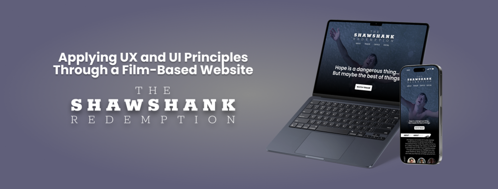
Applying UX and UI Principles Through a Film-Based Website: The Shawshank Redemption

This week, I worked on designing a fictional website for the movie The Shawshank Redemption using Figma. The goal of this project was to apply visual design principles while also thinking about user experience (UX) and navigation flow. I wanted the design to capture the emotional tone of the film, including its themes of hope, resilience, and friendship, while maintaining a clean, modern layout suitable for a movie-focused website. You can view my interactive prototype here: Figma Prototype

The structure of the website includes a landing page with a hero section, a short synopsis of the film, a cast section with actor images and names, and a simple navigation bar. I focused on maintaining visual hierarchy by using large headings, consistent spacing, and high-contrast colors to guide the user’s attention. The typography was chosen to reflect a sense of depth and seriousness, similar to the mood of the movie.

Figma was incredibly helpful throughout the process. I used frames and auto layout to keep spacing consistent across different sections, which made the design feel more organized and scalable. I also created components for elements like buttons and movie cards, which helped me make quick updates and keep everything consistent.

The prototyping tools in Figma allowed me to simulate the user’s experience on the site. I added interactions like hover effects and page transitions to test how users might move through the design. While testing, I noticed a few UX issues, such as unclear navigation and misaligned buttons. I revised these elements to improve usability and flow.

This project gave me the chance to apply both visual and interactive design skills. It also helped me become more confident in using Figma not just for static design work, but also for building working prototypes. I’m proud of the final result and excited to keep learning and designing more advanced user experiences in future projects.

P.S. If you’re into design and use Figma regularly (or want to start), don’t miss config 2025, Figma’s annual design conference. It will take place on May 6-8, 2025, both in-person in San Francisco and online for free.

It’s a great opportunity to learn from industry leaders, discover new features, and get inspired by real design stories from around the world. I highly recommend joining, even just attending online can spark so many new ideas!

I ❤️ Figma!

The past two weeks have been really productive and full of learning. I have improved my understanding of web layouts, CSS techniques, and design tools. Each week, I worked on different exercises and projects that helped me practice and apply what I learned in a meaningful way.

Week 5: Flexbox and CSS Layouts

In Week 5, we focused on Flexbox layouts and CSS positioning. I started with the Web Layout Overview & Review, which was a great refresher on structuring web pages. Then, I worked on the Flexbox Layout Challenges, which helped me practice arranging elements efficiently.

One of the most interesting tasks was the Convert Coffee Shop Website to Flexbox assignment. This activity helped me see how Flexbox is used in real-world layouts. I found it really useful because it made me think about how to structure a page in a more flexible and responsive way.

I also participated in the CSS Layout Discussion, where we talked about different layout strategies and how they apply to modern web design. It was helpful to hear different perspectives and learn from others’ experiences.

Week 6: CSS Grid and Midterm Preparation

In Week 6, we shifted our focus to CSS Grid, which is another powerful layout system. I worked on Gridspiration and the Introduction to CSS Grid & Grid Challenges. These activities helped me understand how Grid works differently from Flexbox and when to use each one.

One of the projects I really enjoyed was the Bakery Site Challenge. It required applying both Flexbox and Grid, and it made me think carefully about which layout system to use for different parts of the page. This challenge helped me feel more comfortable combining both techniques in my designs.

Midterm Project & Figma

A big part of this week was preparing for my midterm project. For my project, I decided to design a movie landing page. The assignment suggested using a new movie, but I chose my favorite movie, The Shawshank Redemption. I wanted to work on something I really enjoy, and I felt that this movie’s theme and visuals would make for an interesting design.

I used Figma to create the designs for my midterm project, and I am really happy about this. Figma is my favorite platform for web and interaction design. It allows me to organize my ideas visually, create clean wireframes, and design high-quality layouts. I feel confident using Figma because it has all the tools I need to experiment with different layouts and styles before writing any code. This step was really important because it helped me plan my project before starting the development process.

Reflections & Looking Ahead

These past two weeks have helped me build a stronger foundation in CSS layout techniques. I now feel more comfortable using both Flexbox and Grid, and I understand when to use each one. The hands-on exercises and projects were really helpful in making these concepts clearer.

Working on my midterm project in Figma was a great experience, and I am excited to move forward with the development phase. I plan to focus on making my movie landing page both visually appealing and functional.

Overall, I feel that I have learned a lot in these two weeks, and I am excited to continue improving my design and coding skills in the upcoming weeks.

Good Boy Fetches My Files, and Occasionally Loses Them!

Lately, I’ve been getting more into web design, and honestly, it’s been a mix of excitement, frustration, and way too much time spent tweaking tiny details. Typography, FTP, and building my portal page have been my main focus, and each has come with its own set of surprises.

Typography has been one of my favorite parts. I always knew fonts mattered, but I never realized how much they shape the entire feel of a website. Picking the right font isn’t just about aesthetics—it’s about making sure people can actually read what you’re putting out there. I also got way too into typography games (yes, they exist, and yes, they’re weirdly addictive). Who knew I’d be out here kerning letters for fun? But honestly, playing those games helped me understand how small adjustments can make a design look polished or completely off.

On the more technical side, I’ve been using Fetch as my FTP client to upload my work. It’s pretty satisfying to drag and drop files and see my updates go live. At first, it felt a little intimidating—like, one wrong move and everything could disappear—but once I got the hang of it, it wasn’t bad at all. The key lesson? Keep files organized. Because trust me, trying to find the right version of a file in a mess of randomly named folders is not fun.

And then, there’s my portal page: Samet Kaya – Portal Page. It’s the hub for everything I’m working on, and designing it was a fun challenge. I wanted to make sure it was simple, clear, and easy to navigate—because if people have to think too hard about where to click, they probably won’t click at all. I focused on keeping the layout clean and making sure the important stuff was easy to find. So far, I’m happy with it, but let’s be real—I’ll probably keep tweaking it forever.

Web design has definitely been a learning experience, but I love how it’s a mix of creativity and problem-solving. One day I’m picking fonts, the next I’m troubleshooting an upload issue, and somehow, it all comes together. Now, onto the next challenge (or maybe just another round of typography games).

HTML, errors, and and lessons…

The first two weeks of the semester have been a whirlwind of learning. From mastering HTML validation to understanding the importance of clean code, I’ve gained valuable insights into the world of web design. Here’s a look at what I’ve discovered so far.

In the first two weeks of the semester, I’ve already picked up a lot of valuable lessons. One of the most important things I’ve realized is how essential it is to pay attention to the smallest details in web design. Learning about HTML validation was a key takeaway for me. I discovered how important it is to ensure that your code is error-free. The HTML validator website has been a game-changer. It allows me to check my code for mistakes and make sure everything is structured properly before going live. This tool has helped me understand that even small coding errors can affect how a website functions, and using a validator ensures that my work meets the highest standards.

Another significant lesson has been understanding the different aspects of web design, from layout to content placement, and how each decision impacts the user experience. I’ve also started to see how critical it is to plan and organize everything from the start, as it makes the process much smoother in the long run. These first two weeks have been a great introduction, and I’m eager to continue learning and applying what I’ve learned as the semester goes on.