These past few weeks we dove head on into more complicated concepts, which had me scratching my head more than a few times but as we power on ahead I continue to feel more confident as a web designer.
Continue reading “Weeks 5 – 6: Experimenting with Flexbox and Grids”Tag: CSS Layout
Weeks 3 – 4: Diving Deeper into HTML & CSS
The past two weeks have been incredibly informative. There was so much that I learned and I’m hoping it all the information absorbs into me.
Continue reading “Weeks 3 – 4: Diving Deeper into HTML & CSS”Week 3-4
This week, I studied font handling and how to properly implement them in CSS. I learned how to establish a typographic hierarchy on a page using properties such as font-family, font-weight, font-size, and line-height. I also explored CSS selectors and how to use them effectively to target specific elements. I mastered basic tag, class, and ID selectors and learned to combine them to create complex styling structures. Additionally, I gained an understanding of pseudo-classes and pseudo-elements for managing interactivity (such as :hover) and styling specific elements. Applying these skills enables me to create layouts that are cleaner, more structured, and visually appealing.
Trusting the process with HTML
I’ve always been the type to want to know the ending before anything else; I’ve been that way for books, movies, shows—anything, really. It wasn’t until this last week that I realized I do the same thing with HTML.
Continue reading “Trusting the process with HTML”Revamping My Portal Page: Parallax, Big Kitties, and New CSS Tricks
“Meow”

This semester, I gave my portal page a much-needed upgrade. I have to say, it is been one of my favorite projects so far! I wanted the page to feel a little more alive and personal, so I brought in parallax scrolling effects, animated floating cats, and some playful, colorful backgrounds.
One of the biggest changes was adding a parallax background featuring a giant cat image that starts below the header and stretches down below my bio section. This added a really cool , making the page feel more dynamic without being overwhelming. I also used CSS animations to create floating kitties that drift across the screen, adding even more movement and personality.
Along with parallax, I used some modern CSS techniques like flexible layouts, colorful background shifts with keyframe animations, and subtle box shadows to give different sections some extra pop. Overall, this revamp made my portal page feel way more “me.” It’s fun, creative, and just the right amount of chaos thanks to all those giant kitties.
For centering, which works when?
Trying to center stuff horizontally shouldn’t be so confusing! I find myself cycling through all the possible CSS rules until I find one that works.
Continue reading “For centering, which works when?”Web design for all screen sizes

Just when you think you are finished with a website design….
Midterms, Midterms…and More Midterms
This week has been a doozy.
Continue reading “Midterms, Midterms…and More Midterms”No expert here, but I have learned a few tricks.
Designing for the web can be …
Flexbox Made Me Cry
Well…only a few tears.
Continue reading “Flexbox Made Me Cry”Learning Grids!
Hello Everyone!
This week we’ve dived further into web layout tools/techniques. Specifically, focusing on Grid, Positioning, and Flexbox! Here are some of my thoughts…
Continue reading “Learning Grids!”Flexbox Torture
You would think learning would be fun. But it turns out
Continue reading “Flexbox Torture”Week 5 & 6 Layout Techniques
These last two weeks have been a challenge! I had never even heard of grid, positioning, or floats, until this course. This is all very new and a bit overwhelming, but I am determined to understand it to the best of my abilities.
Continue reading “Week 5 & 6 Layout Techniques”I ❤️ Figma!
The past two weeks have been really productive and full of learning. I have improved my understanding of web layouts, CSS techniques, and design tools. Each week, I worked on different exercises and projects that helped me practice and apply what I learned in a meaningful way.
Week 5: Flexbox and CSS Layouts
In Week 5, we focused on Flexbox layouts and CSS positioning. I started with the Web Layout Overview & Review, which was a great refresher on structuring web pages. Then, I worked on the Flexbox Layout Challenges, which helped me practice arranging elements efficiently.
One of the most interesting tasks was the Convert Coffee Shop Website to Flexbox assignment. This activity helped me see how Flexbox is used in real-world layouts. I found it really useful because it made me think about how to structure a page in a more flexible and responsive way.
I also participated in the CSS Layout Discussion, where we talked about different layout strategies and how they apply to modern web design. It was helpful to hear different perspectives and learn from others’ experiences.
Week 6: CSS Grid and Midterm Preparation
In Week 6, we shifted our focus to CSS Grid, which is another powerful layout system. I worked on Gridspiration and the Introduction to CSS Grid & Grid Challenges. These activities helped me understand how Grid works differently from Flexbox and when to use each one.
One of the projects I really enjoyed was the Bakery Site Challenge. It required applying both Flexbox and Grid, and it made me think carefully about which layout system to use for different parts of the page. This challenge helped me feel more comfortable combining both techniques in my designs.
Midterm Project & Figma
A big part of this week was preparing for my midterm project. For my project, I decided to design a movie landing page. The assignment suggested using a new movie, but I chose my favorite movie, The Shawshank Redemption. I wanted to work on something I really enjoy, and I felt that this movie’s theme and visuals would make for an interesting design.
I used Figma to create the designs for my midterm project, and I am really happy about this. Figma is my favorite platform for web and interaction design. It allows me to organize my ideas visually, create clean wireframes, and design high-quality layouts. I feel confident using Figma because it has all the tools I need to experiment with different layouts and styles before writing any code. This step was really important because it helped me plan my project before starting the development process.
Reflections & Looking Ahead
These past two weeks have helped me build a stronger foundation in CSS layout techniques. I now feel more comfortable using both Flexbox and Grid, and I understand when to use each one. The hands-on exercises and projects were really helpful in making these concepts clearer.
Working on my midterm project in Figma was a great experience, and I am excited to move forward with the development phase. I plan to focus on making my movie landing page both visually appealing and functional.
Overall, I feel that I have learned a lot in these two weeks, and I am excited to continue improving my design and coding skills in the upcoming weeks.
Why is it Ugly?
The good news: I remember how to code!
The bad news: Everything looks ugly…
AAD86 – Weeks 9 & 10
Per expectations, the content has definitely ramped up in difficulty. These past few weeks have definitely been challenging, but thankfully I’ve been able to enjoy the challenge rather than get overly frustrated over it.
Continue reading “AAD86 – Weeks 9 & 10”Responsive Web Design and UX
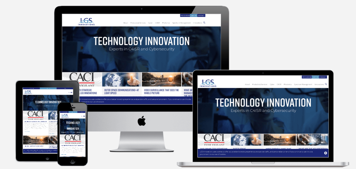
Responsive web design (RWD) refers to designing websites to adapt to a user’s device. The goal is for a website to retain its optimal usability and appearance regardless of the device it’s displayed on. Responsive web design responds to user needs by adapting to different screen sizes, orientations, layouts, and platforms. This is accomplished with the use of flexible grids and layouts, responsive images, and CSS media queries.
Continue reading “Responsive Web Design and UX”AAD-0086 wk4 – Learning Journal
This is a summary of our topics of concentration for weeks three and four in Intermediate Web Design.
Continue reading “AAD-0086 wk4 – Learning Journal”Final proposal
As the class is coming to an end the final project for the class, I’m working on right now were going to be developing our own website to a target audience and my audience will be anyone who is interest in the fantasy of the comic book world to see and understand some interesting and some non-interesting characters from the Marvel and DC universe’s. I’m excited to find and create the research for this project it’s something I’m interested in and also watched and read all the movies and comic books.
ADDING MEDIA QUERIES
This week were learning how to put our websites to fit into mobile devices, tablet, desktop, anything to show to it will look on the screen whether its straight, vertical, and horizontal.
This is the code in adding media queries for websites @media only screen and (min-width:700px){ } then input where it says “700px” and put the size of the website you want people to be viewing and add different styles for each viewing for if its a mobile devices, tablet, or a desktop.
CSS Media Queries for Beginners: Breakpoints, Max-Width, Min-Width, and More – YouTube I was referred to watch this video to get use to media queries and how to properly use them.