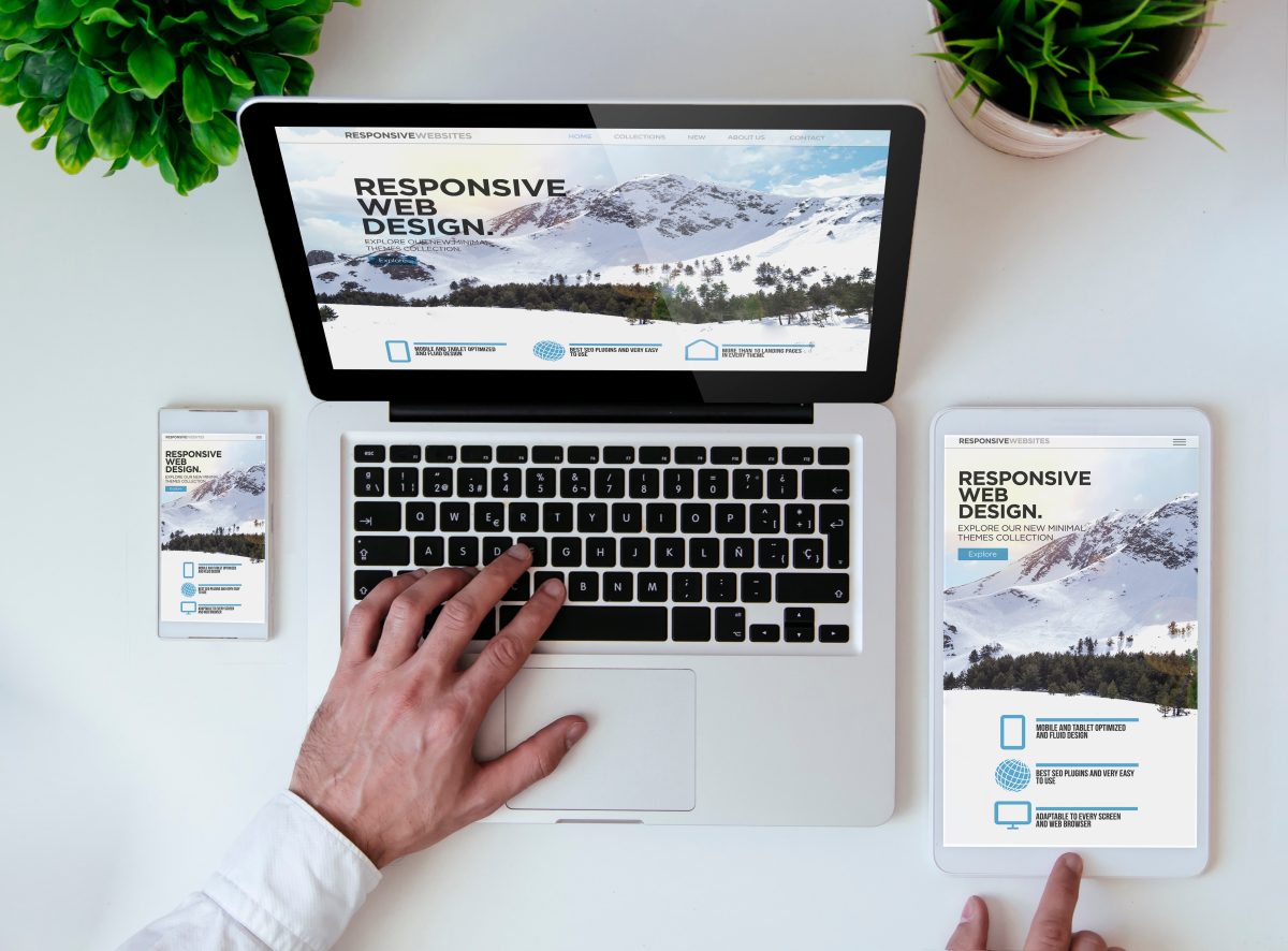
extremely challenging. But once you get the hang of Flexbox, Grids, and then add in some responsive design CSS things really start to fall into place.
CSS and media queries are key tools for making websites responsive. Media queries let us change how a website looks depending on the size of the screen. For example, we can adjust font sizes, layouts, or hide certain elements when viewed on a phone versus a desktop. This helps create a better experience for users, no matter what device they’re using. Instead of building separate websites for each screen size, we can use media queries in CSS to make one flexible design that works everywhere.