I’ve always been the type to want to know the ending before anything else; I’ve been that way for books, movies, shows—anything, really. It wasn’t until this last week that I realized I do the same thing with HTML.
Continue reading “Trusting the process with HTML”Tag: design
Applying UX and UI Principles Through a Film-Based Website: The Shawshank Redemption
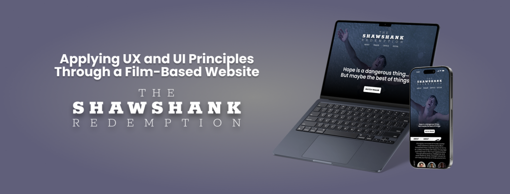
This week, I worked on designing a fictional website for the movie The Shawshank Redemption using Figma. The goal of this project was to apply visual design principles while also thinking about user experience (UX) and navigation flow. I wanted the design to capture the emotional tone of the film, including its themes of hope, resilience, and friendship, while maintaining a clean, modern layout suitable for a movie-focused website. You can view my interactive prototype here: Figma Prototype
The structure of the website includes a landing page with a hero section, a short synopsis of the film, a cast section with actor images and names, and a simple navigation bar. I focused on maintaining visual hierarchy by using large headings, consistent spacing, and high-contrast colors to guide the user’s attention. The typography was chosen to reflect a sense of depth and seriousness, similar to the mood of the movie.
Figma was incredibly helpful throughout the process. I used frames and auto layout to keep spacing consistent across different sections, which made the design feel more organized and scalable. I also created components for elements like buttons and movie cards, which helped me make quick updates and keep everything consistent.
The prototyping tools in Figma allowed me to simulate the user’s experience on the site. I added interactions like hover effects and page transitions to test how users might move through the design. While testing, I noticed a few UX issues, such as unclear navigation and misaligned buttons. I revised these elements to improve usability and flow.
This project gave me the chance to apply both visual and interactive design skills. It also helped me become more confident in using Figma not just for static design work, but also for building working prototypes. I’m proud of the final result and excited to keep learning and designing more advanced user experiences in future projects.
P.S. If you’re into design and use Figma regularly (or want to start), don’t miss config 2025, Figma’s annual design conference. It will take place on May 6-8, 2025, both in-person in San Francisco and online for free.
It’s a great opportunity to learn from industry leaders, discover new features, and get inspired by real design stories from around the world. I highly recommend joining, even just attending online can spark so many new ideas!
Week 8: Midterm and Responsive Design
Now that we are halfway through the semester, I can see my CSS and HTML knowledge improving. All of the practices, notes, and challenges have helped me practice strategies and learn new techniques. When working on the Midterm Drafts and learning responsive design, I can see my growth from my previous class. To me learning responsive design for me was a major step towards making more professional sites.
Continue reading “Week 8: Midterm and Responsive Design”A Fortnight of Figma
This class is helping me put my impostor syndrome to bed. The past two weeks have been a productive and rewarding experience. Most notably, I’ve been getting back into making designs in Figma, and this time, I actually know what I’m doing.
Continue reading “A Fortnight of Figma”A Quick Tour of Week 2
Week 2 of my AAD0086 class has been a nice warm-up of what’s to come. I appreciate the reintroduction to HTML through our future resume project, which was harder than I thought it would be given I’d just finished 0085 last semester. My first post is a reflection of what I’ve learned so far and what I’m looking forward to in this class.
Continue reading “A Quick Tour of Week 2”Parallax: What is it?
Parallax- an interesting name for an interesting design tool! Using parallax in your designs allow for an engaging and interactive experience for users, causing an illusion and offering some great creative design opportunities. Here’s a fun guide of resources to help you explore this world!
Continue reading “Parallax: What is it?”Creating Decorative Shapes with CSS
There are many ways to utilize CSS in your designs. From text treatments to colors and images, the possibilities are endless! However, you can also create simple graphics in your design with just CSS. Let’s take a look at how it’s done!
Continue reading “Creating Decorative Shapes with CSS”Responsa What? Understanding Responsive Design
Layouts can be tricky. It feels so nice to finally have a design that looks good and works well… until you take a look at it on a different device. What happened to your design?! How can you fix that? The answer…. Responsive Design! Let’s take a look at what it is and some of the basic things to know surrounding responsive design. Let’s go!
Continue reading “Responsa What? Understanding Responsive Design”CSS: All About Layout
There’s a lot of options when it comes to designing your layout in CSS. From flexbox properties to positioning, here’s all you need to know about CSS layout to get your designs to look awesome.
Continue reading “CSS: All About Layout”Weeks 11-13 Journal Entry
I love drop caps. They seem to add the “human” element to the written word; like “seeing” Dickens write it with a quill. Ah yes, CSS…
Continue reading “Weeks 11-13 Journal Entry”Going Mobile
This last week I couldn’t attend class due to family events and Thursday we had no class. However, there was still a lot of learning to be had within the course files. I think this week the work made me go through all the emotions – fun, annoyed, and relief!
Continue reading “Going Mobile”Flex Your Floats!
As a designer, I really like to think outside the box and do stuff that no one else is willing to try, or just haven’t yet. Usually, its just me being over zealous. Nevertheless, when it comes to using block elements and making a page that’s pretty and organized, utilizing floats and flexbox creates a panic-less me.
Continue reading “Flex Your Floats!”The Art of Typography
Combining fonts is really an unappreciated skill, unless you realize its not exactly the easiest design concepts to master.
Continue reading “The Art of Typography”