There are many ways to utilize CSS in your designs. From text treatments to colors and images, the possibilities are endless! However, you can also create simple graphics in your design with just CSS. Let’s take a look at how it’s done!
Hello! To start this mini lesson, let’s begin by taking a look at this example:

Can you identify what each element is? Take a moment to try and figure out what everything is…
Are you ready? Let’s take a look!
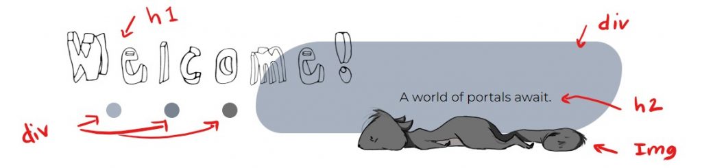
In this header, we can clearly see an h1, an h2, an img, and 4 div elements. The h1 and h2 serve as the text elements in the header with different styles applied to both and are using positioning to put them in their place. The image is optimized for the web and is positioned into its place as well.
But what about the graphic shapes? How do you make them and how do you style them? Let’s go through the step-by-step process of making and styling the CSS graphic shapes.
Diving into the HTML Code
<header>
    <h1 id="welcome">Welcome!</h1>
    <h2>A world of portals await.</h2>

    <div id="blue-blob"></div>

    <img src="images/tired-squirrel-small.png" alt="A drawing of a squirrel laying down" width="300" height="80">

    <div id="circle-row">
        <div id="circle-one"></div>

        <div id="circle-two"></div>

        <div id="circle-three"></div>
    </div>
</header>
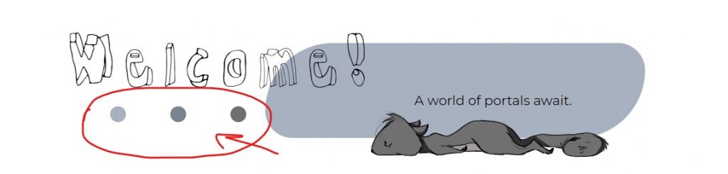
As you can see, we have a <header> element and inside it, we have multiple things happening. We have an h1, an h2, and then a div with an id=”blue-blob”. It is simply a div with nothing inside it… otherwise considered an empty box. As we continue through the code, notice the img is followed by another div with 3 divs placed inside of it. Each has its own id to make it easy to style them separately. By placing a div (box) around the 3 divs, this creates an opportunity for me to style them as a unit and do things like flexbox.
Now I have these divs and they do nothing! You can’t see them and they are simply boxes with nothing in them. What do I do with them? Well… now it’s time for the exciting part!
Styling with CSS
Blue-Blob Styles
#blue-blob {
   position: absolute;
   top: -50px;
   right: 25px;
   z-index: -1;
   width: 300px;
   height: 150px;
   background-color: #A7B1BF;
   border-radius: 200px 80px ;
}
Circle Styles
#circle-row {
    display: flex;
    position: absolute;
    top: 50px;
    left: 30px;
}
#circle-one {
    width: 20px;
    height: 20px;
    margin: 0px 20px;
    border-radius: 150px;
    background-color: #A7B1BF;
}

#circle-two {
    width: 20px;
    height: 20px;
    margin: 0px 20px;
    border-radius: 150px;
    background-color: #7A8390;
}

#circle-three {
    width: 20px;
    height: 20px;
    margin: 0px 20px;
    border-radius: 150px;
    background-color: #707070;
}
Here, you can see that I added styles to these divs using CSS. Here are the three basic things you need to get a div to show:
- Adding a width (width: ___px;)
- Adding a height (height: ___px;)
- Adding a background color (background-color: #______;)
Beyond that, it is all styling to give it the look you want. For this example, I added some rounded corners to create a circular shape rather than a square or rectangle.
- Adding a border-radius(border-radius: ___px;)
Finally, I added a margin on the sides of each circle so that when they sit side-by-side, there will be some space between each one.
Putting It All Into Place
Now it’s time to put everything in the right spot! You can do a variety of things to move them around, but here, I used flexbox and positioning to achieve this look.
If you look at the code, you will notice that I have a div with an id=”circle-row”. This div encompasses the 3 circle divs. Targeting the #circle-div, I want to add flex to this div to get the circles to sit side-by-side. I also added some positioning to get it to sit in the right spot on the page. This div is being positioned absolute to the header.
header {
   position: relative;
}

#circle-row {
    display: flex;
    position: absolute;
    top: 50px;
    left: 30px;
}
For the large “blue-blob”, I mainly used positioning to get it into the right spot. I also used z-index: -1 to move the div element behind everything else.
#blue-blob {
   position: absolute;
   top: -50px;
   right: 25px;
   z-index: -1;
   width: 300px;
   height: 150px;
   background-color: #A7B1BF;
   border-radius: 200px 80px ;
}
Wrapping It Up
And that’s about it! Now you have some graphic elements on your page completely created using HTML and CSS! It’s pretty cool to see what you can do with just some code. Be sure to take a look at it in action!