Layouts can be tricky. It feels so nice to finally have a design that looks good and works well… until you take a look at it on a different device. What happened to your design?! How can you fix that? The answer…. Responsive Design! Let’s take a look at what it is and some of the basic things to know surrounding responsive design. Let’s go!
What is responsive design?
Responsive design refers to adapting and changing the design of a page to adjust to various screen sizes and devices. In an age where there is more technology than ever from a variety of phones to laptops and computers, it is increasingly important to consider how your designs might show between different sized boundaries. Your design on a desktop might not work for mobile, and vice versa. Therefore, we have responsive web design where we take our designs and take into consideration where they might be seen and then work on our designs to become responsive to those needs.
Typically, basic web design revolves around fixed layouts where everything has its place and does not move, even if the size of the device is different, causing cropping of images, scrolling left-to-right, and more issues that might become undesirable, unprofessional, and less accessible. Responsive design allows elements to move and adjust to fit the boundaries of the device.
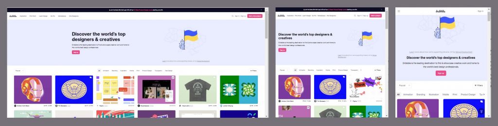
Take a look at responsive design in action! The three images below are the same site displayed at different sizes. Notice how they change to adapt to the size while keep a consistent design, layout, and overall look and feel. One of the main indicators of responsive design in this Dribble example is the layout of the rows and columns of content. It goes from 6 images across on a desktop to only 2 images across for a mobile version!
Dribble
Some more examples of websites that use responsive design…
And perhaps a poor example as well. Notice how Amazon does not change to adapt to smaller browsers and that you have to scroll left and right as well as up and down!
Poor example of Responsive Design: Amazon
Progressive Design vs Graceful Degradation
With responsive design, there are 2 main ways of approaching it. These are known as Progressive Enhancement and Graceful Degradation.
Progressive Enhancement refers to starting at the most basic crucial information a user would need to use the webpage and get a good experience out of it. They are not missing out on anything important. Typically, designs like this start out being designed in mobile first, where there is a limited amount of space to work with. This helps you identify the most important information and make sure that the user has the same experience as those on a larger device. With each larger device, the webpage is enhanced and more is added or built upon to add the the webpage. Perhaps there’s a different image or even more images across a row. Perhaps there is a different layout that suits a larger format. Progressive enhancement is about identifying the critical design work and utilizing larger designs to enhance or “plus” the design.
Graceful degradation on the other hand, refers to taking away elements as a webpage gets smaller. This can lead to mobile views getting different experiences and information as compared to desktop users. Desktop users have more space, so they get all the information. Mobile users are out of luck and get a smaller version of the webpage that may not have some of the content it might have if displayed on a larger device.
How does it work?
There are several things you can do to your webpage to make it responsive. Here are some basic things you can do to get started. These include using percentages, <picture> tags, media queries, and meta tags. Enjoy!
Using Percentages
If you have an image that should be responsive, you can use the <img> tag and style it in CSS with the following rule:
img {
max-width: 100%;
}
By defining a percentage for the width, we allow the image to be flexible. If we were to lock it to a pixel dimension (max-width: 500px), it would be a locked size and would therefore, not be responsive. By using a percentage instead, we say that we want the image to occupy a certain percentage of the space available and don’t impose restrictions on the actual pixel size.
You can utilize the percentage on other elements as well to make the webpage more flexible and truly responsive.
Using the <picture> tag
Yes, I know what you’re thinking. We already have an <img> tag that we can make to be responsive. Why should we use a <picture> tag too? Well, in responsive design, you can make an image scale to different sizes. However, if this is one image in the file, then you can have an incredibly large image file that doesn’t need to be there. What I mean is this: When you design for the desktop, you have an image that is say 1mb. Now, that same file can get scaled down to fit a smaller device but the file size remains the same. That can make loading time take longer and it’s simply something that you don’t need. It doesn’t have to be that way.
By using the picture tag, you can have multiple versions of the same image and you can tell the browser to pick the right sized image depending on the size of the device. Example:
<picture>
   <source media="(min-width: 1024px)" srcset="autumn-in-moscow-desktop.png">
   <source media="(min-width: 680px)" srcset="autumn-in-moscow-tablet.png">
   <source srcset="autumn-in-moscow-mobile.png">
   <img src="autumn-in-moscow.png" alt="Autumn in Moscow">
</picture>
This <picture> tag is saying that it has multiple images and will choose an image to display based on the min-width. This can be very helpful as it reduces file sizes and can help you develop better practices as a web designer.
Using Media Queries
@media (max-width: 799px) {
#page { width: 90%; }
}
Media queries are the key to making most responsive designs on the web. Here, you set the element widths as percentages rather than locked down pixel number widths, which allow for flexibility in grids. Instead of being a certain size, you tell the element that you want it to occupy a certain percentage of the space available.
You can also use media queries to override previous rules to adapt to larger or smaller sizes. Using the media query, you can tell a layout with two columns to shrink to column at a certain size. This overrides previous rules and allows for better customization for different sizes.
The Very Important Meta Viewport Tag
<meta name="viewport" content="width=device-width, initial-scale-scale=1">
This meta tag is a crucial element of getting responsive designs to work. Without it, mobile browsers automatically zoom out and show the page as a whole, defeating the hard work put into designing for mobile. However, by placing this tag in the head of your document, you can ensure that your responsive designs will work.
Well… Congratulations on reaching the end of this post! You’ve just completed a crash course in responsive web design and I hope you learned something new! Now go out there and start creating!