As the class is coming to an end the final project for the class, I’m working on right now were going to be developing our own website to a target audience and my audience will be anyone who is interest in the fantasy of the comic book world to see and understand some interesting and some non-interesting characters from the Marvel and DC universe’s. I’m excited to find and create the research for this project it’s something I’m interested in and also watched and read all the movies and comic books.
Author: aricher
ADDING MEDIA QUERIES
This week were learning how to put our websites to fit into mobile devices, tablet, desktop, anything to show to it will look on the screen whether its straight, vertical, and horizontal.
This is the code in adding media queries for websites @media only screen and (min-width:700px){ } then input where it says “700px” and put the size of the website you want people to be viewing and add different styles for each viewing for if its a mobile devices, tablet, or a desktop.
CSS Media Queries for Beginners: Breakpoints, Max-Width, Min-Width, and More – YouTube I was referred to watch this video to get use to media queries and how to properly use them.
Templates for beginners
while in class were doing our final rough drafts of the website of our choosing to create about a certain topic, mine is a lawyer website and a tool that helped me use HTML and CSS to create my page and now a helpful tool for me to reference new code or refresh on the basics.
CSS Navigation Bar (w3schools.com)
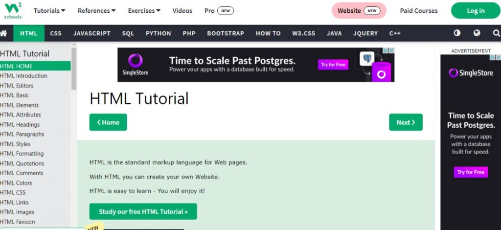
Here you can look up what you’re trying to create, and it will show you how it should look like in code and in another browser window to show a live code view of how it can look on a website screen.
New To Grid!
For this week’s reflecting on what we have been learning in class in HTML/ CSS Dreamweaver is how to make Grid’s in Dreamweaver. In doing that Grid is for two-dimensional layouts, meant to work with flex box, and when using flex box it uses heavily on “flex-wrap:wrap;” code onto Dreamweaver consider using grid instead wrap. Grid-gap helps you keep space between grid items. Grid-template-columns can take different units of measure.
Here is a video I found that’s been a reference now on understanding CSS grid and flex box in which I have been having trouble understanding.
update on HTML
In class we have been learning the basics of HTML and CSS of assembling it on Dreamweaver. The basic elements of creating the specific code we want as in <header> <p> <a href> <h1> <body> , etc to create and become familiar in the basics of setting up the code for a website. Also learning how to transfer files on an FTP I use FileZilla, to make our sites live has really been exciting. We are also setting up a portal page to link our projects for this semester.
What is the HTML head?
To learn about the HTML head, its purpose, the most important items it can contain, and what effect it can have on the HTML document.
The HTML head is the contents of the <head> element unlike the contents of the <body> element. Which are displayed on the page when loaded in a browser, the head’s content is not displayed on the page. Instead, the head’s job is to contain metadata about the document.
The <title> element is metadata that represents the title of the overall HTML document, not the document’s content. Metadata is data that describes data, and HTML has an “official way of adding metadata to a document the <meta> element. <meta charset=”utf-8”> This element specifies the document’s character encoding, the character set that the document is permitted to use. “utf=8”, is a universal character set that includes pretty much any character from any human language. This means that your web page will be able to handle displaying any language