
Responsive web design (RWD) refers to designing websites to adapt to a user’s device. The goal is for a website to retain its optimal usability and appearance regardless of the device it’s displayed on. Responsive web design responds to user needs by adapting to different screen sizes, orientations, layouts, and platforms. This is accomplished with the use of flexible grids and layouts, responsive images, and CSS media queries.
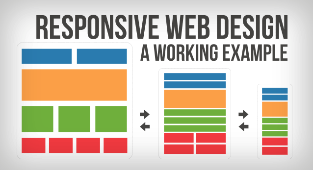
Because responsive design relies on shuffling elements around the page, design and development need to work closely together to ensure a usable experience across devices. Responsive design often turns into solving a puzzle — how to reorganize elements on larger pages to fit skinnier, longer pages or vice versa. However, ensuring that elements fit within a page is not enough. For a responsive design to be successful, the design must also be usable at all screen resolutions and sizes.
When elements move around the page, the user experience can be completely different from one view of the site to the next. It is important that design and development teams work together not to just determine how the content should be shuffled around, but to also see what the end result of that shift looks like and how it affects the user experience.
Focusing on Content
Content prioritization is one key aspect to doing responsive design well. Much more content is visible without scrolling on a large desktop monitor than on a small smartphone screen. If users don’t instantly see what they want on a desktop monitor, they can easily glance around the page to discover it. On a smartphone, users may have to scroll endlessly to discover the content of interest. Smart content prioritization helps users find what they need more efficiently.
Considering Performance
Performance can also be an issue with responsive design. RWD delivers the same code to all devices, regardless if the piece of code applies to that design or not. Changes to the design occur on the client-side, meaning each device — the phone, tablet or computer — receives the full code for all devices and takes what it needs.
A 4-inch smartphone receives the same code as a 24-inch desktop monitor. This can bog down performance on a smartphone, which may be relying on a slower, spottier data connection. (This is why some sites turn to adaptive design, where the server hosting the website detects the device that makes the request and delivers different batches of HTML code based on that device.)
Resource: NNGroup – Responsive Web Design (RWD) and User Experience