Typography is such a critical element in all that we do… and yet, it’s such an overlooked thing in our day and age, when typography is being utilized more than ever. Here are some things you need to know to level up your typography skills and create better designs for the web.
First things first. Why is typography so important and why do I need to care about it? Well, simply put… it’s one of the major ways you communicate through a visual language. Typography is the visual language of letters that form words and it can be found everywhere, from instruction labels, to directories, to posters, and anything else you can imagine that has words or other such visual symbols on it.
Making the right choices is incredibly important. For example, take a look at the following images. These images both have the same message, but the simple use of different fonts completely changed the meaning behind it.
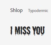

Take a look at this next example:
STOP! DON’T READ THE NEXT LINE!
… made ya look
So… what did you read first? Why? This is the power of typography and what it can do for your content. Now let’s take a look at some key things to remember when designing for the web.
Some Key Things to Remember
- Consider your line lengths.
Typically, you want to keep an eye on the length of your lines of text. A webpage with text stretching from one end it the other is not only hard to read, but is also hard to follow and doesn’t look as nice. Instead, consider keeping your line lengths to 40 -60 characters per line, or 12 -14 words per line. This will help make your lines easier to read and follow.
- Consider color blindness.
Some people are colorblind and it affects how functional your work can be. While it is impossible to truly design for everything an individual may need, you can start by being aware of your choices and how it may affect others. For example, red and green are common colors that become “invisible” to many people due to color blindness. Consider how necessary a colored font is and what you can do to make it better for everyone.
- Sometimes less fonts = better clarity and cohesion.
You don’t need a million fonts to have a good design! Typically, 1-2 fonts is a good place to start, with one font as your “main” font, and the second as an “accent.” Simplicity means clarity and clarity means functionality. Consider how your fonts work together and whether it does what you want it to do.
- Make use of headlines and indents!
Make use of simple design tools to help the typographic elements of your design. Headlines are great ways to give quick information and detail important sections of a webpage while indenting can break up a line of text to visually separate information.
- Use whitespace.
Make sure to include areas of rest in your designs. Packing information together creates distractions and makes it harder on the eyes. For clarity and better design, utilize whitespace to help make your elements pop.
- Black text is always easier to read than white!
Black text is preferred over white text… even if you have sufficient contrast. When you read, your eyes look for recognizable shapes and patterns, which are easier to see with black on white, rather than white on black. Using white text for large blocks of text can strain the eyes and make it much harder to read.
Conclusion
Overall, typography is a very important tool that we all should become familiar with. Hopefully these tips will serve you well as you go on to design your own content and develop better typographic choices for the web and beyond. For further study, check out some of the links below.
Enjoy!
Resources:
The Beginner’s Guide to Typography in Web Design
Designing for Readability – A Guide to Web Typography
10 Tips On Typography in Web Design
INTRO TO TYPOGRAPHY: Free Web Design Course 2020 | Episode 4
9 Website Typography Mistakes To Avoid