What is a Media Query?
Media query is a CSS technique introduced in CSS3.
It uses the @media rule to include a block of CSS properties only if a certain condition is true.
Always Design for Mobile First
Mobile First means designing for mobile before designing for desktop or any other device (This will make the page display faster on smaller devices).
This means that we must make some changes in our CSS.
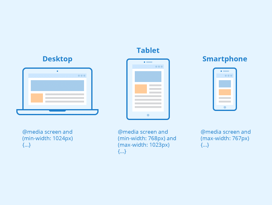
Adding Break Points
We can add a breakpoint where certain parts of the design will behave differently on each side of the breakpoint.
Example:
@media only screen and (max-width: 600px) {
body {
background-color: lightblue;
}
}