Lisa’s Learning Journal: Week 6

Let’s talk about Flex!

Oh boy. We finally made it to flexbox. For some reason, I never cared for the flexbox layout during AAD85. I thought, “Heck, I can do this whole HTML and CSS thing without it”. I don’t know why I hated flexbox so much. Though, it is most likely because learning flexbox involves change, and change is scary.

Continue reading “Lisa’s Learning Journal: Week 6”


What I learned about CSS?

First month of the course has been so exciting and productive on this web development journey. Practicing more semantic HTML has been an eye-opener. Understanding the importance of structuring content in a meaningful way not only makes the code cleaner but also improves accessibility for all users. It’s incredible how a few well-placed tags can make such a big difference.

Continue reading “What I learned about CSS?”

Lisa’s Learning Journal: Week 4

This is just the beginning.

I’m not sure why, but it’s wild to think that we are already creating functioning websites. I think back to AAD85 quite often and think about how long it took to understand HTML and CSS and what they do. By this time in that class, I believe we were still trying to recognize the differences between IDs and classes. It was definitely a struggle, but I think it’s almost funny now.

Continue reading “Lisa’s Learning Journal: Week 4”

Reminders and Review – AAD86 Progress 1

After a few months of not doing anything related to a new topic you learned, it can be pretty easy to forget bits and pieces of what you were taught. Especially since it’s a new topic, you may not have had the time previously to commit every little detail to your brain.

Continue reading “Reminders and Review – AAD86 Progress 1”

From Learning to Experimentation

abstract art

I can best describe coding as a love/hate relationship for me. I love the details. I hate the details. I resist it because I become laser focused and I can’t step away. But I get to say that it’s such a great feeling to be in this class this semester.

Continue reading “From Learning to Experimentation”

Lisa’s Learning Journal: Week 2

How does HTML work again??

It’s been a while since I last worked with HTML, so I feel a little rusty. I took AAD85 with Natalie Rishe, and I’m so thankful she made us document everything we did in her class. I am able to refer back to a simpler time when I remember what the heck is going on.

Continue reading “Lisa’s Learning Journal: Week 2”

Deeper Understanding of HTML

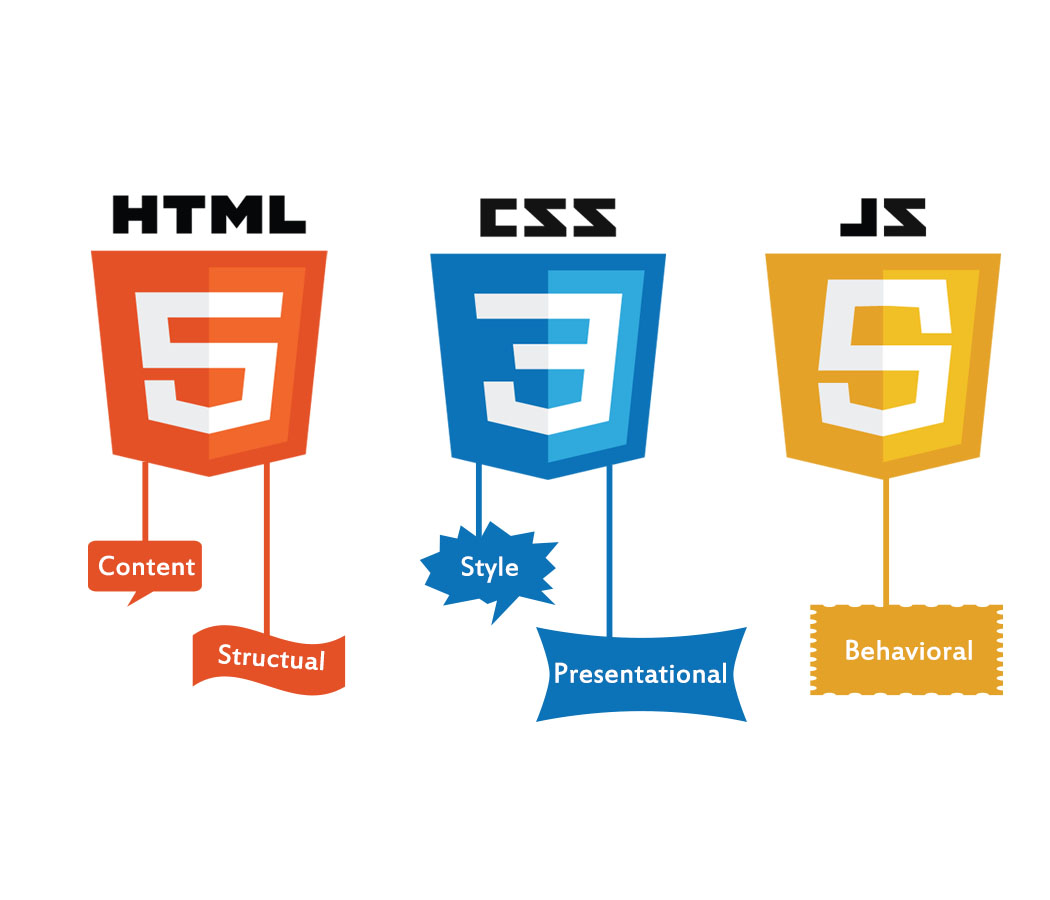
The HyperText Markup Language or HTML is the standard markup language for documents designed to be displayed in a web browser. It defines the meaning and structure of web content. It is often assisted by technologies such as Cascading Style Sheets (CSS) and scripting languages such as JavaScript.

Continue reading “Deeper Understanding of HTML”

What I learned In Week 12 AAD 0062

This week I learned about Parallax. I felt the application and how its applied was really cool. When I was in my introduction class I really wanted to know how to styles backgrounds and overlay text to some degree. So this project while being challenging was extremely fun for me.

Continue reading “What I learned In Week 12 AAD 0062”

Final proposal

As the class is coming to an end the final project for the class, I’m working on right now were going to be developing our own website to a target audience and my audience will be anyone who is interest in the fantasy of the comic book world to see and understand some interesting and some non-interesting characters from the Marvel and DC universe’s. I’m excited to find and create the research for this project it’s something I’m interested in and also watched and read all the movies and comic books.

Creating Decorative Shapes with CSS

There are many ways to utilize CSS in your designs. From text treatments to colors and images, the possibilities are endless! However, you can also create simple graphics in your design with just CSS. Let’s take a look at how it’s done!

Continue reading “Creating Decorative Shapes with CSS”

ADDING MEDIA QUERIES

This week were learning how to put our websites to fit into mobile devices, tablet, desktop, anything to show to it will look on the screen whether its straight, vertical, and horizontal.

This is the code in adding media queries for websites @media only screen and (min-width:700px){ } then input where it says “700px” and put the size of the website you want people to be viewing and add different styles for each viewing for if its a mobile devices, tablet, or a desktop.

CSS Media Queries for Beginners: Breakpoints, Max-Width, Min-Width, and More – YouTube I was referred to watch this video to get use to media queries and how to properly use them.

Templates for beginners

while in class were doing our final rough drafts of the website of our choosing to create about a certain topic, mine is a lawyer website and a tool that helped me use HTML and CSS to create my page and now a helpful tool for me to reference new code or refresh on the basics.

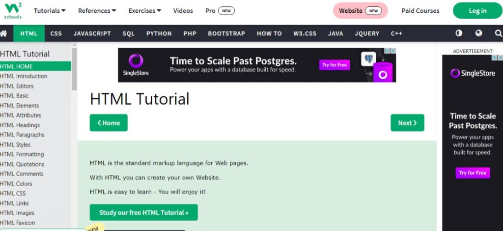
CSS Navigation Bar (w3schools.com)

Here you can look up what you’re trying to create, and it will show you how it should look like in code and in another browser window to show a live code view of how it can look on a website screen.

What I Learned In Week Four

Hello Everyone I know its been a while since you have seen my last post I was having trouble with my log in for word press. For week four it was a lot of review for me, refreshing my memory on code styling. For instance I feel the week made me realizes how I can utilize styling directly on the html page rather then always separating. It’s also the week that showed me other apps to use besides File Zilla when it comes to putting my sites up live for the class.

This week also made realize how much I still have to learn in some area with making sure my links to sites work properly with the my main

Continue reading “What I Learned In Week Four”

New To Grid!

For this week’s reflecting on what we have been learning in class in HTML/ CSS Dreamweaver is how to make Grid’s in Dreamweaver. In doing that Grid is for two-dimensional layouts, meant to work with flex box, and when using flex box it uses heavily on “flex-wrap:wrap;” code onto Dreamweaver consider using grid instead wrap. Grid-gap helps you keep space between grid items. Grid-template-columns can take different units of measure.

Here is a video I found that’s been a reference now on understanding CSS grid and flex box in which I have been having trouble understanding.

CSS Grid Layout Crash Course – YouTube