Revisiting the fundamentals of HTML semantics has been rewarding! I now feel confident in my ability to create and style websites. I’m particularly excited to dive deeper into CSS and explore FlexBox. Uploading files to the server has been exciting. It motivates me to get my domain so that I can start a blog and showcase my projects.
Continue reading “Taking Back Web Design”Category: AAD 086 SP25
Intricacies of Typography
I remember in my high school graphic design class, we watched a video praising Helvetica and slamming Comic Sans and Papyrus. At first I was a little hurt because I liked Comic Sans. I used to look through every font in Microsoft Word trying to find one that displayed letters (especially “a” and “t”) the way that I wrote them and Comic Sans was the only one. But the more I became aware of type, the more I understood. I do believe Comic Sans has its place, however just very specific places. Typography is very powerful, especially when used correctly, and I find it fascinating.
Read more: Intricacies of TypographyFrom serifs vs sans-serifs, to weight, to leading and kerning, typography has a lot more going on than most people realize. Type needs to look good, it has to fit the vibe of the content, and it needs to be legible. Combining multiple fonts in one space can be even more challenging, making sure they are different enough to warrant using both, while having enough similarities for them to look cohesive.
It is important to remember leading and kerning when using type. Many times, I think the font I am using is not going to work because it looks scrunched, but utilizing those adjustments can make a huge difference in legibility.
I also find it interesting how quickly technology went from having limited fonts to seemingly endless, even being able to adjust so many variable ourselves through Wakamai Fondue. Even how typefaces can be designed specifically for the web or print. And that it all started with the introduction of the printing press.
Aside from simply conveying blocks of text, I also find it fascinating that type can be used to create images as well. I watched Paula Scher’s video in one of my classes last semester and have been thinking about ever since. It is 40 minutes long but absolutely worth the watch.
I am a history nerd and remember learning about the printing press growing up, however there is so much more to it than I previously thought. I used History.com’s Printing Press article as a refresher/reference and thought I would share some of its history.
The oldest known printed book, The Diamond Sutra, that has been discovered was found in China from the Tang Dynasty (around 868 A.D). It was printed using hand carved wooden blocks. While this was effective for mass printing the same book, the letters could not be arranged; this is when the printing press came in. While many believe the printing press was invented by Johannes Gutenburg in 1440, the oldest known moveable type was created by Bi Sheng around 1041. His clay-based press was mentioned in a book, Dream Pool Essays, written by Shen Kuo in 1086.
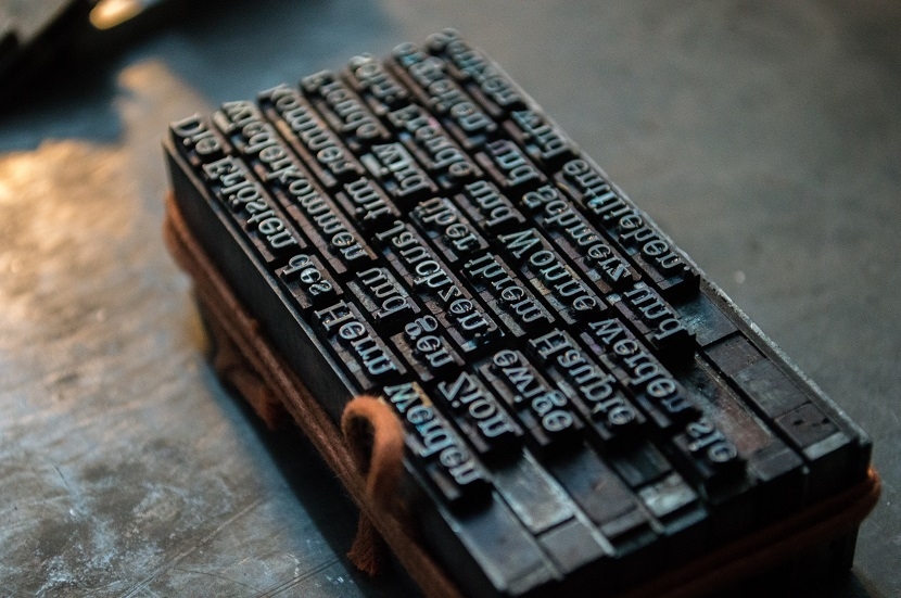
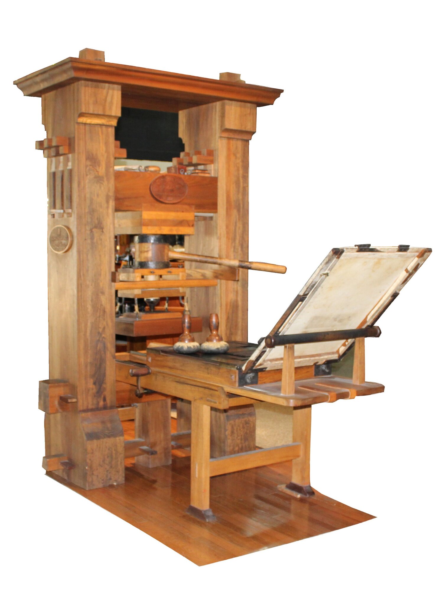
Gutenburg introduced metal-based letters, and introduced molds to mass produce more letter blocks. This made book printing, especially the Bible, take off in Europe during the Holy Roman Empire, eventually contributing to the split of the church. 21 copies of his Bible, in Gothic type, have survived to this day. While his original printing press and the design of it is lost, we do know what it had become by around 50 years later.
Why is it Ugly?
The good news: I remember how to code!
The bad news: Everything looks ugly…
Loving CSS!
Hello Everyone again! It has been refreshing getting back into coding and retouching on my typography knowledge! For this post, I will talk about how my learning progress has been from the past two weeks!
Continue reading “Loving CSS!”Typography is Great! But consider slower network speeds!
This week we went over how to properly incorporate fonts in our web pages. There’s a lot to typography and there’s even more to know when it’s used on the web!
Continue reading “Typography is Great! But consider slower network speeds!”Week Four!
We are officially a quarter of the way through the semester, and I’ve already learned so much while reviewing and practicing plenty of older concepts. The past few weeks were more hands-on and deeper in terms of learning experience, so here’s a recap of what that looked like for me.
Continue reading “Week Four!”Deep Thoughts From Week Four
Hating on Papyrus font is like hating on Nickleback….
Continue reading “Deep Thoughts From Week Four”Week 4 Recap
I loved learning more about type this week, however it had me asking a lot of questions. Is type really that important? How much is too much with type? Is simple better when it comes to type?
Continue reading “Week 4 Recap”95% of web design is typography?!? Oh no! 😱
Okay, okay, I confess. I don’t have strong feelings for or against any typefaces. Over a decade ago, when a classmate asked our professor to be excused from using Helvetica because she hated it, I felt puzzled. “How do you grow to hate a font? What did the font do to you?” I wondered.
Continue reading “95% of web design is typography?!? Oh no! 😱”Week 4 was a doozy
This week we learned more about uploading files to the server, styling our html files with css, and downloading and converting typography from the web into our html files. I had the most issues with uploading files to the server because I don’t fully understand the process. However, it’s one of the main topics I want to learn because it’s vital to the web design process so I’ve been spending a lot of time researching it this week.
What I did learn from uploading my files to the server was just how important it is to name and organize your files. I made the mistake of copying my files and putting them into a server folder, because there wasn’t really much instruction on that bit, and ended up deleting files that I thought I didn’t need. I deleted files because the server folder system confused me and so I decided to go back to my original filing system, deleted the copied files, but then it completely messed up all of my files for some reason and I spent hours trying to get my files back. I still don’t fully understand how having a server folder is different than just having a root and source folder within the files you are uploading, but I am working on understanding that.
The typography module was also really confusing because when something didn’t work the way it was intended, I would scour the web trying to troubleshoot why it may not be working. The font-squirrel video showed different information than the transfonter files I downloaded. The files looked different and I wasn’t sure if I was doing something wrong or if it was my computer or what.
Just feeling a bit lost and in the woods this week for class.
Highlights of the Past Two Weeks
My favorite things these past few weeks were working on the portal page and my own content!
Continue reading “Highlights of the Past Two Weeks”My Highlights from the past two weeks
I really liked creating our portal page.
Continue reading “My Highlights from the past two weeks”Typography This Week
Who knew there was so much to
Continue reading “Typography This Week”Good Boy Fetches My Files, and Occasionally Loses Them!
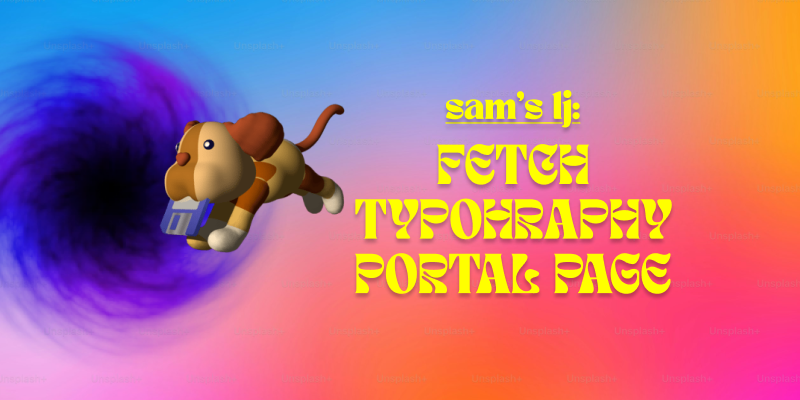
Lately, I’ve been getting more into web design, and honestly, it’s been a mix of excitement, frustration, and way too much time spent tweaking tiny details. Typography, FTP, and building my portal page have been my main focus, and each has come with its own set of surprises.
Typography has been one of my favorite parts. I always knew fonts mattered, but I never realized how much they shape the entire feel of a website. Picking the right font isn’t just about aesthetics—it’s about making sure people can actually read what you’re putting out there. I also got way too into typography games (yes, they exist, and yes, they’re weirdly addictive). Who knew I’d be out here kerning letters for fun? But honestly, playing those games helped me understand how small adjustments can make a design look polished or completely off.
On the more technical side, I’ve been using Fetch as my FTP client to upload my work. It’s pretty satisfying to drag and drop files and see my updates go live. At first, it felt a little intimidating—like, one wrong move and everything could disappear—but once I got the hang of it, it wasn’t bad at all. The key lesson? Keep files organized. Because trust me, trying to find the right version of a file in a mess of randomly named folders is not fun.
And then, there’s my portal page: Samet Kaya – Portal Page. It’s the hub for everything I’m working on, and designing it was a fun challenge. I wanted to make sure it was simple, clear, and easy to navigate—because if people have to think too hard about where to click, they probably won’t click at all. I focused on keeping the layout clean and making sure the important stuff was easy to find. So far, I’m happy with it, but let’s be real—I’ll probably keep tweaking it forever.
Web design has definitely been a learning experience, but I love how it’s a mix of creativity and problem-solving. One day I’m picking fonts, the next I’m troubleshooting an upload issue, and somehow, it all comes together. Now, onto the next challenge (or maybe just another round of typography games).
Diving into CSS Week 3
This week we started getting into the weeds with CSS. We learned about inheritance, the cascade, and specificity, CSS reset vs. Normalize reset, and started styling our own html documents with CSS.
I learned that inheritance is when child elements take on styling that their parents passed down to them, just like how genes are passed on from parent to child. The Cascade is the mechanism that relates to how CSS rules that are in conflict with each other are sorted out by the browsers. And specificity is the process by which the browser determines which rule to apply to an element to solve conflicts. These concepts determine how your browser solves conflicts when you create new CSS rules that override the browser’s CSS. Hierarchy and specificity of your elements is ultimately how an element ends up being styled.
CSS reset is a stylesheet that removes all of the default styling from a page and normalize reset only minimizes the differences with the browser’s styling. Either work, but it depends on how much work you want to put into styling your document. The advantages of CSS reset is that it really forces you to really style everything rather than accept the default, can more purposely make decisions as to how to design site, and is easier to follow design standards. The downside is you have to style everything. Normalize has it’s pros in that it saves time for styling, especially for newbies. The disadvantage is that you are constantly fighting the browser’s styling and end up needing to create separate rules for overriding the browser’styling, and you may miss something.
The takeaway this week was that HTML and CSS are the bedrock of all website design, and to gloss over them is missing the very basics of website design. We need these programming languages in order to create websites, so I’m excited to be starting from scratch because I feel like I’m learning the fundamentals the old fashioned way, and as the saying goes “if it ain’t broke, don’t fix it”. I feel empowered to keep going!
Starting Strong with Semantics
During our first two weeks into this class, I already have a better understanding of HTML and how strong it is.
First Two Weeks In Web Design
The first two weeks have been a breeze, with plenty of fun and enjoyment in new material. The HTML discoveries made in our resumes and the deep dives into the world of elements have been valuable learning experiences.
Continue reading “First Two Weeks In Web Design”Two Weeks In
What I have learned in the last two weeks of this class.
Continue reading “Two Weeks In”My Journey with HTML
My previous experience with HTML / CSS, and how I have been refreshing myself with the material!
Continue reading “My Journey with HTML”Semantic HTML, Interesting elements, My first post
What I have learned so far in the first two weeks of class, is how to write HTML semantically!
Continue reading “Semantic HTML, Interesting elements, My first post”