I am learning so much and having so much fun seeing things come together. So much that it is a beautiful day out and I have spent the whole afternoon working on code and I don’t even care. I will get outside tomorrow I promised myself. I found some great tutorials on grid….
Continue reading “I love this class”Responsive Design
This week has been an eye opener! It never occurred to me how many different ways are out there to achieve the same layout on a page, and it has been really interesting learning about all of them.
Continue reading “Responsive Design”My Goals and What I Learned This Week
This week, I was really challenged by the Sacramento writer’s group and zen music festival challenges.
Continue reading “My Goals and What I Learned This Week”Web design for all screen sizes

Just when you think you are finished with a website design….
Two Weeks in Design: Learning by Doing
The past two weeks have been a deep dive into the world of web design. What started as simple class projects quickly turned into opportunities for real discovery. I did not just follow instructions. I started noticing how different choices in layout, structure, and tools can completely change how a website feels and functions.
Continue reading “Two Weeks in Design: Learning by Doing”The Responsive Website Journey Pt.1
This week was a real doozy for me. It’s hard to stay focused with everything else going on in my personal life, but I really am trying my best.
Continue reading “The Responsive Website Journey Pt.1”Responsive Design + Midterm!
Hello Everyone!
This week we learned a ton about responsive design, worked with it hands on, and dove into its history. We also finished up our midterm! I’ll talk about how mine went.
Continue reading “Responsive Design + Midterm!”Adapting with CSS
It can be crazy to think about now, but computers used to be the only device we used to access the web. There was hardly a need to consider screen size when creating a website. Now we have smart fridges with internet access.
Continue reading “Adapting with CSS”Responsive design and mid term project!
I was very excited for the mid term project since it’s always a great chance to get out some creativity!
Midterms, Midterms…and More Midterms
This week has been a doozy.
Continue reading “Midterms, Midterms…and More Midterms”Responsive Design
This week was a huge eye-opener! We had a great video and article to read on the history of responsive design, and learned many new things about how to use responsive design in our websites.
Continue reading “Responsive Design”The past couple of weeks…here are some updates!
Over the past 2 weeks, our class has taken on more creative pursuits. This has been especially rewarding, with my favorite so far being working with Figma.
Continue reading “The past couple of weeks…here are some updates!”Applying UX and UI Principles Through a Film-Based Website: The Shawshank Redemption
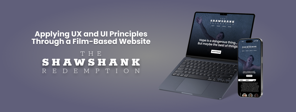
This week, I worked on designing a fictional website for the movie The Shawshank Redemption using Figma. The goal of this project was to apply visual design principles while also thinking about user experience (UX) and navigation flow. I wanted the design to capture the emotional tone of the film, including its themes of hope, resilience, and friendship, while maintaining a clean, modern layout suitable for a movie-focused website. You can view my interactive prototype here: Figma Prototype
The structure of the website includes a landing page with a hero section, a short synopsis of the film, a cast section with actor images and names, and a simple navigation bar. I focused on maintaining visual hierarchy by using large headings, consistent spacing, and high-contrast colors to guide the user’s attention. The typography was chosen to reflect a sense of depth and seriousness, similar to the mood of the movie.
Figma was incredibly helpful throughout the process. I used frames and auto layout to keep spacing consistent across different sections, which made the design feel more organized and scalable. I also created components for elements like buttons and movie cards, which helped me make quick updates and keep everything consistent.
The prototyping tools in Figma allowed me to simulate the user’s experience on the site. I added interactions like hover effects and page transitions to test how users might move through the design. While testing, I noticed a few UX issues, such as unclear navigation and misaligned buttons. I revised these elements to improve usability and flow.
This project gave me the chance to apply both visual and interactive design skills. It also helped me become more confident in using Figma not just for static design work, but also for building working prototypes. I’m proud of the final result and excited to keep learning and designing more advanced user experiences in future projects.
P.S. If you’re into design and use Figma regularly (or want to start), don’t miss config 2025, Figma’s annual design conference. It will take place on May 6-8, 2025, both in-person in San Francisco and online for free.
It’s a great opportunity to learn from industry leaders, discover new features, and get inspired by real design stories from around the world. I highly recommend joining, even just attending online can spark so many new ideas!
My Goals and What I Learned This Week
This week, I had the opportunity to learn about responsive web design and continue to better my midterm design.
Continue reading “My Goals and What I Learned This Week”Figuring out Figma & Ditto Clipboard
Using Figma to design my microsite has gone very smoothly, if you ignore my mess of layers and the random slivers of empty space that like to appear and disappear along the edges of my project.
Continue reading “Figuring out Figma & Ditto Clipboard”Midterm, Midpoints, and Madness
Midterm: Sorted. Midpoint: Reached. Now, I need to figure out how to keep myself occupied for the next two weeks.
Continue reading “Midterm, Midpoints, and Madness”Week 8 Finalizing the Midterm Project
Over the last few weeks, we’ve been working on our Midterm project, which is a design project using software like Figma. I chose to do Figma because I want to become more comfortable with the program, and there are more tutorials available on the web for this software than others. I also figured that having Figma experience + projects will look good on my resume for future work. I’d like to do more work in Figma and really get a handle on the animations so that I can create moving prototypes.
I can’t express enough how much I liked working on this project. I just love working with design software and have so much fun learning new ones. I’ve only worked with Figma once, and it was just while watching a tutorial last semester so I didn’t do very much with it. Being able to get into the grit of the design is partly why I enjoy working with design software. I love tweaking the minute details of a design and getting the alignment just right, choosing the perfect font type and colors to give the right vibe, and adding shadows and borders on an image only to delete it because it’s not quite right. I love that process, and it’s something I really enjoy doing.
I am a tad bit concerned for the final project, however. I know that we can use this design for our final or come up with something entirely new. But, after putting in so much time into these designs, I don’t see why I’d choose to do something else—except that I may be making the coding of this site a bigger challenge than I’m ready for. I can see 100 different places where Flexbox and Grid could be used, and I would bet $100 that we have to create our final project using Flexbox or Grid, and maybe Float if we only use it once. I’m still feeling a little shaky about Flexbox and Grid and the final will really be the ultimate test, especially give how long my site project is. I may need to cut some of the site out and shorten it, so I don’t run out of time creating it. I’m looking forward to the challenge!
Lastly, we have been working on responsive design. Given that I’ve only seen it in the lectures and done the assignments along with the tutorial, I feel like I understand it fairly well. It seems easy enough, anyway. Placing the code that you want changed inside of the media query makes sense. And having limits on how small or large the browser can be seems sensible. I can’t see any issues learning about it so far, and I’m hoping this is one of those things that just clicked with me 🙂 We’ll find out!
No expert here, but I have learned a few tricks.
Designing for the web can be …
Halfway There
I really like like flexbox, it sometimes feels like a game or a riddle.
Continue reading “Halfway There”Week 8: Midterm and Responsive Design
Now that we are halfway through the semester, I can see my CSS and HTML knowledge improving. All of the practices, notes, and challenges have helped me practice strategies and learn new techniques. When working on the Midterm Drafts and learning responsive design, I can see my growth from my previous class. To me learning responsive design for me was a major step towards making more professional sites.
Continue reading “Week 8: Midterm and Responsive Design”