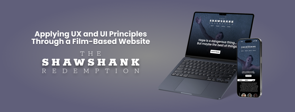
This week, I worked on designing a fictional website for the movie The Shawshank Redemption using Figma. The goal of this project was to apply visual design principles while also thinking about user experience (UX) and navigation flow. I wanted the design to capture the emotional tone of the film, including its themes of hope, resilience, and friendship, while maintaining a clean, modern layout suitable for a movie-focused website. You can view my interactive prototype here: Figma Prototype
The structure of the website includes a landing page with a hero section, a short synopsis of the film, a cast section with actor images and names, and a simple navigation bar. I focused on maintaining visual hierarchy by using large headings, consistent spacing, and high-contrast colors to guide the user’s attention. The typography was chosen to reflect a sense of depth and seriousness, similar to the mood of the movie.
Figma was incredibly helpful throughout the process. I used frames and auto layout to keep spacing consistent across different sections, which made the design feel more organized and scalable. I also created components for elements like buttons and movie cards, which helped me make quick updates and keep everything consistent.
The prototyping tools in Figma allowed me to simulate the user’s experience on the site. I added interactions like hover effects and page transitions to test how users might move through the design. While testing, I noticed a few UX issues, such as unclear navigation and misaligned buttons. I revised these elements to improve usability and flow.
This project gave me the chance to apply both visual and interactive design skills. It also helped me become more confident in using Figma not just for static design work, but also for building working prototypes. I’m proud of the final result and excited to keep learning and designing more advanced user experiences in future projects.
P.S. If you’re into design and use Figma regularly (or want to start), don’t miss config 2025, Figma’s annual design conference. It will take place on May 6-8, 2025, both in-person in San Francisco and online for free.
It’s a great opportunity to learn from industry leaders, discover new features, and get inspired by real design stories from around the world. I highly recommend joining, even just attending online can spark so many new ideas!