Introducing my first Learning Journal entry! So far in this class I’ve reviewed HTML tags and basic code structure for HTML pages. Luckily, while not practicing much over the summer and having taken AAD 85 three years ago, I still feel a familiarity with HTML and Visual Studio thanks to the Interaction Design class I took last semester.
Continue reading “Hello World”What I Learned Weeks 1,2 AAD 86
The first two weeks were busy. First, I met my new classmates. I learned how to better organize my life and to do everything without stress.
Continue reading “What I Learned Weeks 1,2 AAD 86”First Two Weeks
Over the first two weeks of Fall semester, I practiced some basic HTML by working on the future resume project, set goals for myself, and did some review of HTML tags.
Continue reading “First Two Weeks”Deeper Understanding of HTML
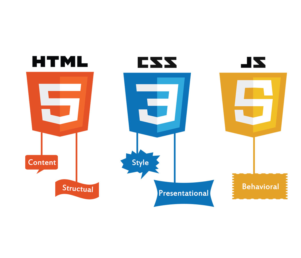
The HyperText Markup Language or HTML is the standard markup language for documents designed to be displayed in a web browser. It defines the meaning and structure of web content. It is often assisted by technologies such as Cascading Style Sheets (CSS) and scripting languages such as JavaScript.
Continue reading “Deeper Understanding of HTML”My HTML has cobwebs
I took AAD 85 in the Spring of 2023. I also was working at a company where I had to use HTML/CSS on the daily. After the Spring, and after getting laid off, I haven’t looked at a line of code since. And it shows.
Continue reading “My HTML has cobwebs”What I learned In Week 12 AAD 0062

This week I learned about Parallax. I felt the application and how its applied was really cool. When I was in my introduction class I really wanted to know how to styles backgrounds and overlay text to some degree. So this project while being challenging was extremely fun for me.
Continue reading “What I learned In Week 12 AAD 0062”What I learned about in Week 10
Week 10 was really good , It felt like a review week and helped me get more confident with styling in general. I was able to be more specific with the styles I applied to my sites and portal page. Also helped understand code higher arks.
Continue reading “What I learned about in Week 10”What I learned Week 8 AAD86

Week 8 was pretty challenging to put it simply. I was having some trouble with the concentric challenge at first it took me way longer then expected to understand how it works. The final mid term draft was fun though it at least showed me that I had to think about how much text I put for a mobile page and design layout really play a role in presentation.
Continue reading “What I learned Week 8 AAD86”Parallax
Learning Parallax was fun! It makes me feel like an actual designer. Its cool that something like this doesn’t need JavaScript.
The link I shared above is an excellent example of parallax scrolling. The design feels so interactive!
The link bellow also has some parallax but something extra is going on at the end, when you move the mouse so do the fruit and veggies.
And this last one is INSANE! There is a lot going on but smoothly.
Sass and Parallax
Over the past couple of weeks, we touched on a completely new approach to styling our websites.
Continue reading “Sass and Parallax”Terminology is Everything.
We have done so much writing and research that not having the right word can make or break what you are trying to say or look for or code. Having a name or word for something is power. Once you have the word you can learn how to use it and bend it to your will.
Continue reading “Terminology is Everything.”Impressions on Parallax
This week was quite interesting since we went more in-depth with a technique that I’ve been wanting to learn about.
Continue reading “Impressions on Parallax”2022 Web Design Trends
Web Styling
Web styling and designing are always audience specific. It is just like the old proverb, “It is not what you say but how you say it.” Here are some articles to think about trends for 2022.
https://www.theedigital.com/blog/web-design-trends.
https://webflow.com/blog/web-design-trends-2022
The examples that initially popped out to me that I liked were the use of large texts and pictures for a landing page to create an experience that creates a world that an audience can relate to, a beckoning of sorts for the viewers to relate to view in close at the web site.
However, the most critical trend is that of mobility and the design feature that I like the most for that was the scroll effect on mobile. In one article the mobility is even addressed for users who are left or right handed.
In my years of academia I mostly focused on creative arts and to be considerate of the audience was next to none, I had little in mind. My intention were set my own trends and not rely on any others. So this is an interesting experience for me to consider for web-design and the creation of content that is made primarily for the viewer. The creation of a world for the viewer to funnel in the call to action. To see what other designers are coming up with to take it a step further for the audience.
Parallax – fashionable web design?
I’ve often felt like Goldilocks when interacting with websites that utilize parallax. Too many parallax effects in a site can be extremely overwhelming. Too little can seem underwhelming for the excitement of the effect. But when it’s done just right, it can be incredible.
Continue reading “Parallax – fashionable web design?”Fasten Your Bootstraps!
What is bootstrap? To put it simply, bootstrap is a CSS framework that allows designers to develop responsive, mobile-first websites. There are times when using bootstrap is ideal, and other times when it is now. To learn more, keep reading!
Continue reading “Fasten Your Bootstraps!”An Intro to Sass
Growing up I was always told I had sass, but that’s not what we’re talking about here! Sass in relation to coding has nothing to do with attitude, but everything to do with looks (of your website).
Continue reading “An Intro to Sass”Final proposal
As the class is coming to an end the final project for the class, I’m working on right now were going to be developing our own website to a target audience and my audience will be anyone who is interest in the fantasy of the comic book world to see and understand some interesting and some non-interesting characters from the Marvel and DC universe’s. I’m excited to find and create the research for this project it’s something I’m interested in and also watched and read all the movies and comic books.
Parallax Universe
For this journal entry, I will share a resource found on Github for a simple parallax scrolling effect nearly identical to the examples shown in this week’s lecture. The difference here is that it uses Javascript and jQuery.
Continue reading “Parallax Universe”Parallax: What is it?
Parallax- an interesting name for an interesting design tool! Using parallax in your designs allow for an engaging and interactive experience for users, causing an illusion and offering some great creative design opportunities. Here’s a fun guide of resources to help you explore this world!
Continue reading “Parallax: What is it?”Parallax
When 2 or more layers are moving at different speeds in the same or opposite direction it creates a sort of gliding effect. This effect is known as parallax. There are many ways we can achieve the parallax effect using CSS.