The past two weeks have definitely been on the more challenging side it feels like as we delve deeper into responsive design and how to incorporate it into our own sites.
Continue reading “Responsive Design”Category: AAD 086 SP22
Creating Decorative Shapes with CSS
There are many ways to utilize CSS in your designs. From text treatments to colors and images, the possibilities are endless! However, you can also create simple graphics in your design with just CSS. Let’s take a look at how it’s done!
Continue reading “Creating Decorative Shapes with CSS”What’s A Media Query?
Understanding this key part of responsive web design is essential before learning how to use them in your CSS code.
Continue reading “What’s A Media Query?”Deeper Dive Into Responsive Design
The last few weeks have had us take a closer look into Responsive Web Design and how to code for it. I have learned a lot and feel a lot more confident with my knowledge on the process now.
Continue reading “Deeper Dive Into Responsive Design”Example of responsive design
I was trying to figure out what to post about this week when I came across a great example of responsive web design via Abduzeedo. This project comes from Thought & Found, an agency based in Australia, and the website is for KGM: an electrical contractor.
Continue reading “Example of responsive design”1 + 1 = 3 or Ask-A Friend
Some how, some way synergy became the grandfather of bad business words. Is it because it has been so overused at meetings and by project managers that us worker bees feel beaten to death by it? Today it seems like it is just raw filler because management needs a word to push us around with.
Continue reading “1 + 1 = 3 or Ask-A Friend”ADDING MEDIA QUERIES
This week were learning how to put our websites to fit into mobile devices, tablet, desktop, anything to show to it will look on the screen whether its straight, vertical, and horizontal.
This is the code in adding media queries for websites @media only screen and (min-width:700px){ } then input where it says “700px” and put the size of the website you want people to be viewing and add different styles for each viewing for if its a mobile devices, tablet, or a desktop.
CSS Media Queries for Beginners: Breakpoints, Max-Width, Min-Width, and More – YouTube I was referred to watch this video to get use to media queries and how to properly use them.
Responsive Design
What are your thoughts on responsive design? Do you find it useful or maybe you never thought that you are using it in everyday life?
Continue reading “Responsive Design”Why you should make Mobile-Fist A Priority?
Mobile-first design is a web development strategy that considers the mobile user’s needs first. It creates a better experience for these users by starting the design process from small screens instead of the other way around. So instead of creating a desktop website and then forcing it to fit into a mobile phone, you start with a small screen. Also, let me assure you, it’s much easier to scale up to big sizes than scale down from big design elements to small ones ensuring that your user’s experience is seamless across devices.
Absolute Figma Basics
I tried learning Figma in a couple hours I thought I was doing well until I needed to add another section. Most of the tutorials I found were based on a multiple page website or just one page with one section so after a few hours I figured out how to design the website in figma file. So here is some absolute basic starting things to know:
Continue reading “Absolute Figma Basics”figma or adobe xd…
which do you prefer? Figma or Adobe XD?
I learned to love using Figma to do my design. At first I found it hard and as I keep using it it became easy and so much fun for me. The tools are very few and quick. Really you won’t find any unnecessary tools.
Sharing and exporting your work is also an easy task on Figma. Seriously this design and prototype app is just fun to use.
I have also tried the Adobe XD and to be honest I got frustrated exploring the app. It was difficult (for me) to start and what to do next. I don’t know if it was really just a little bit more complex to use than figma or maybe I just was not interested to learn it because I already have my heart set on using the other app I am comfortable using.
Inspirations and Ambitions with CSS
While peer reviewing other student’s websites I’ve gained some new ideas and aspirations for what I want my Finals to look like. I figured I’d share some of these concepts in the minor chance that it might also inspire others.
Continue reading “Inspirations and Ambitions with CSS”Prototype Drudgery
There are some things to prepare in advance to make building a complex prototype feel less like drudgery and more like design. I have to consciously remind myself before I start to stop and prepare.
Continue reading “Prototype Drudgery”If you haven’t already–give Figma a try!
What is Figma? Figma is an online graphic editor and prototyping tool that can truly do it all.
Continue reading “If you haven’t already–give Figma a try!”Creating a Website Draft Using Adobe XD
A website draft can be a great way to get your layout down before beginning to code.
Continue reading “Creating a Website Draft Using Adobe XD”Responsive Design
Responsive design felt like a scary thing when I first thought about how you would code it, but it turns out to be much simpler than I thought.
Continue reading “Responsive Design”Shoddy first drafts
For anyone looking to improve their writing, I recommend picking up a copy of “Bird by Bird.” Anne Lamott gives some of the most helpful advice for writers and students of life I have ever read.
Continue reading “Shoddy first drafts”Templates for beginners
while in class were doing our final rough drafts of the website of our choosing to create about a certain topic, mine is a lawyer website and a tool that helped me use HTML and CSS to create my page and now a helpful tool for me to reference new code or refresh on the basics.
CSS Navigation Bar (w3schools.com)
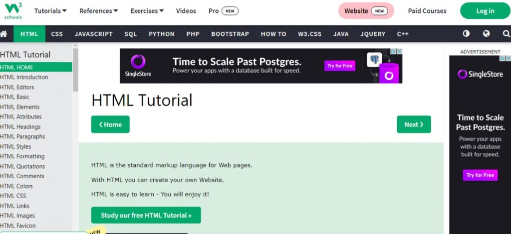
Here you can look up what you’re trying to create, and it will show you how it should look like in code and in another browser window to show a live code view of how it can look on a website screen.
What is Responsive Design?
Responsive design is a graphic user interface (GUI) design approach used to create content that adjusts smoothly to various screen sizes. Designers size elements in relative units (%) and apply media queries, so their designs can automatically adapt to the browser space to ensure content consistency across devices.
Continue reading “What is Responsive Design?”Phone Internet
What is responsive design for you? Have you ever wondered when did it start and how it was in the begging? I always thought that the internet was out for a long time, but was it?
Continue reading “Phone Internet”