Wk 14 – What I’ve Learned

I like the fact that we were given a second round to accustom ourselves to using git and GitHub to save our progress on our work. It’s a really simple but genius idea on how to backtrack if someone makes a mistake down the line. I’ve learned that saving to GitHub basically consists of 4 commands:

  • git status
  • git add .
  • git commit -m “comment”
  • git push

And that’s basically it! One giant fancy “save” to your Git repository on GitHub.

Then, on Thursday, we looked over and studied “Parallax” and true Parallax. Basically, Parallax means objects closer to you feel they are moving faster than objects in the back while you are moving. It’s similar to looking at buildings in a cityscape drift by as you are viewing out the passenger-side window of a moving car.

There is a sort of false “Parallax” which consists of setting an image as a background to a div and allowing it to scroll. This can make for a very interesting and eye-catching effect, but it should be used purposefully, as it can distract away from the main content of the page.

Weeks 11-13, What I’ve Learned

I really appreciated the break we had during week 12, it was a nice pause from the rigor of academia. During Week 11, I worked with the class to build the Sacramento Writer’s Group website. It was a good practice to reinforce what I have learned about media queries.

During Spring Break, I studied Java, as it has been something on my to-do list for quite some time. For my learning material, I used Sams Teach Yourself Java in 24 Hours (ISBN 0672337940 ). I wish I could have learned it in 24 hrs, but realistically, I got to maybe chapter 15 (aka ‘hour 15’) of chapter 24. But I do feel I learned a lot, especially with my overall understanding of programming in general. I feel it will help me with my web-related work or design, and if it doesn’t, it was a nice way to satisfy my need for a challenge.

During Week 13, we finally (finally!☺) got around to learning how to use Git and GitHub. I think it’s amazing that GitHub will save your work in case you make a mistake, so that you are able to go back to it, and restore lost work.

Wk 10b – More Responsive Design

This week we looked at attempting to build the site for the Sacramento Writer’s Group. It was a bit like ‘leaving the nest,’ as beforehand we generally were guided with instructions and copy-paste snippets. It was a good challenge to really try it out ourselves.

When we came back on Thursday, we followed along to learn the ‘right’ way to do it. My attempt differed somewhat in that I used section tags instead of article tags to divide content on the lower half of the page. We also extended material learned last week. After attempting to build the site from the ground up, we were tasked with then adding media queries to make it responsive for mobile, and responsive to other screen sizes.

Wk 8 – Color Theory & CSS Grid

This week we learned a bit about color theory and Coolors.co, a very neat site used to create color palettes. This was especially helpful when deciding on a color scheme for my midterm microsite.

Coolors.co

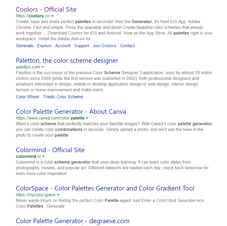
Additionally, anyone who searches ‘palette generator’ will find a myriad of tools at their disposal:

On Thursday we looked at the Grid layout. The Grid layout is used to format content on both a 2D horizontal and vertical axis. The great thing about the grid layout is it can be used in conjunction with the flexbox layout. I personally am enjoying the increased flexibility with CSS 3.

Lastly, my microsite has made some progress. I continued with styling the in-page navigation links and added my first slideshow gallery, which was exciting. Just a few more tweaks and the site should be good to go!

Wk 7 – Midterm & Audio Space

This week we learned . . .

This week we were introduced to our midterm project and prompted to create a proposal for what type of site it would be for. I chose to make a ‘microsite’ for a faux catering company that serves “meat & potato” style food and alcohol. The site’s demo would be those aged 21+.

Additionally this Thursday we practiced in-class building a site using Grid layout. Grid layout is useful and better for building content with two or more rows/columns. Flexbox is ideally used and designed for content in only one row/column. The site included a CSS animation that flipped a card-image over when the mouse cursor hovered over it. This was cool, seeing how it needed no JS, but ran into problems on mobile. This was because a mouse hover is not the same a finger tap on a phone. To fix this, JS could be used.