Responsive Design
This week, I learned that responsive design is about creating websites that work well on different devices and screen sizes, such as computers, tablets, and phones. A website should not only look good but also be easy to use and understand. The content and layout should adjust to the user’s screen instead of forcing everyone to see the same design.
I also learned that the role of web designers has changed over time. In the past, designers focused more on how a webpage looked, but today, they need to think about the user’s experience and what people want to accomplish on a website. AI is also changing web design because it can help designers with ideas and technical tasks, but human creativity and decision-making are still important.
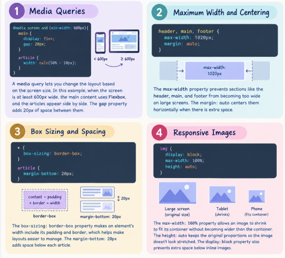
CSS Notes for Responsive Design
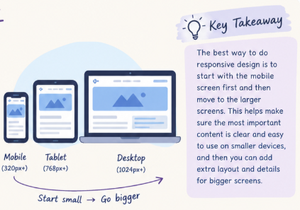
Overall, I learned that responsive design is not just about changing the size of a webpage. It is about making websites flexible, accessible, and useful for everyone. I also understand that CSS properties such as media queries, Flexbox, maximum width, and responsive images help create layouts that work on different screens. As I continue learning web design, I want to practice using these techniques so I can create websites that look good and provide a better experience for users.