I can’t believe it’s that easy. I thought designing responsive websites for mobile screens would be very difficult.
I hope I haven’t spoken too soon. If so, next week I’ll probably post the title “Wow Responsive Design, Slow Down…”
I learned that the process for designing a responsive website for a mobile screen is like designing for a computer screen but in reverse. For the computer screen, you would write the code to change the layout as the window shrinks to fit the content properly (max-width). For the mobile screen, you write the code to change the layout as the window grows (min-width). This can be seen, for example, when a mobile phone goes from portrait to landscape orientation.

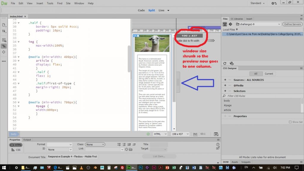
Also, I learned by accident that shrinking the window on the live view in Dreamweaver activates the responsive design function of live view. Check out the following picture.