This week, I learned more about using Flexbox and Grid to create layouts with CSS. At first, there were many different properties to remember, and some of them were confusing. After practicing them in different layouts, I started to understand how they work together and how each property can change the position and spacing of elements.
With Flexbox, I learned how to use display: flex, flex-wrap, flex-direction, justify-content, align-items, and gap. I also practiced properties such as flex: 1, flex-grow, and margin: auto. These properties helped me understand how to arrange items in rows and columns, make items share available space, and control the spacing between different elements. I especially liked being able to change the direction and alignment of the items and immediately see the difference on the page.
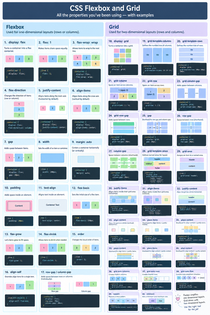
I also learned about CSS Grid. Grid was helpful for creating layouts with both rows and columns. I practiced display: grid, grid-template-columns, grid-template-rows, grid-column, grid-row, gap, grid-template-areas, grid-area, repeat(), and 1fr. Using grid-template-areas helped me understand how I can plan a page layout by giving different sections names and placing them where I want them. The repeat() function also made it easier to create multiple columns without writing the same code many times.
One thing I noticed is that Flexbox feels more natural when I need to arrange items in one direction, such as a navigation menu or a row of cards. Grid is useful when I need more control over both rows and columns, especially for larger page layouts. I am starting to understand that Flexbox and Grid are not really competing with each other. They can be used together depending on what I am trying to create.
I also noticed that small changes in the CSS can make a big difference in the layout. For example, changing justify-content or align-items can quickly move elements to different positions. With Grid, changing the number of columns or using different grid-column and grid-row values can completely change the structure of the page. Seeing these changes directly in the browser has been very helpful for me.
I still need more practice remembering all the properties and knowing which one to use without looking at my notes. Sometimes I understand what I want the layout to look like, but I am not sure which CSS property will create that result. However, I feel more comfortable with Flexbox and Grid than I did before. I think practicing by changing the CSS, experimenting with different values, and immediately seeing the result is helping me learn the most. I also think that with more practice, I will be able to choose between Flexbox and Grid more easily when creating my own web pages.