Illustration and Design Portfolio
Browse Galleries
Digital Design
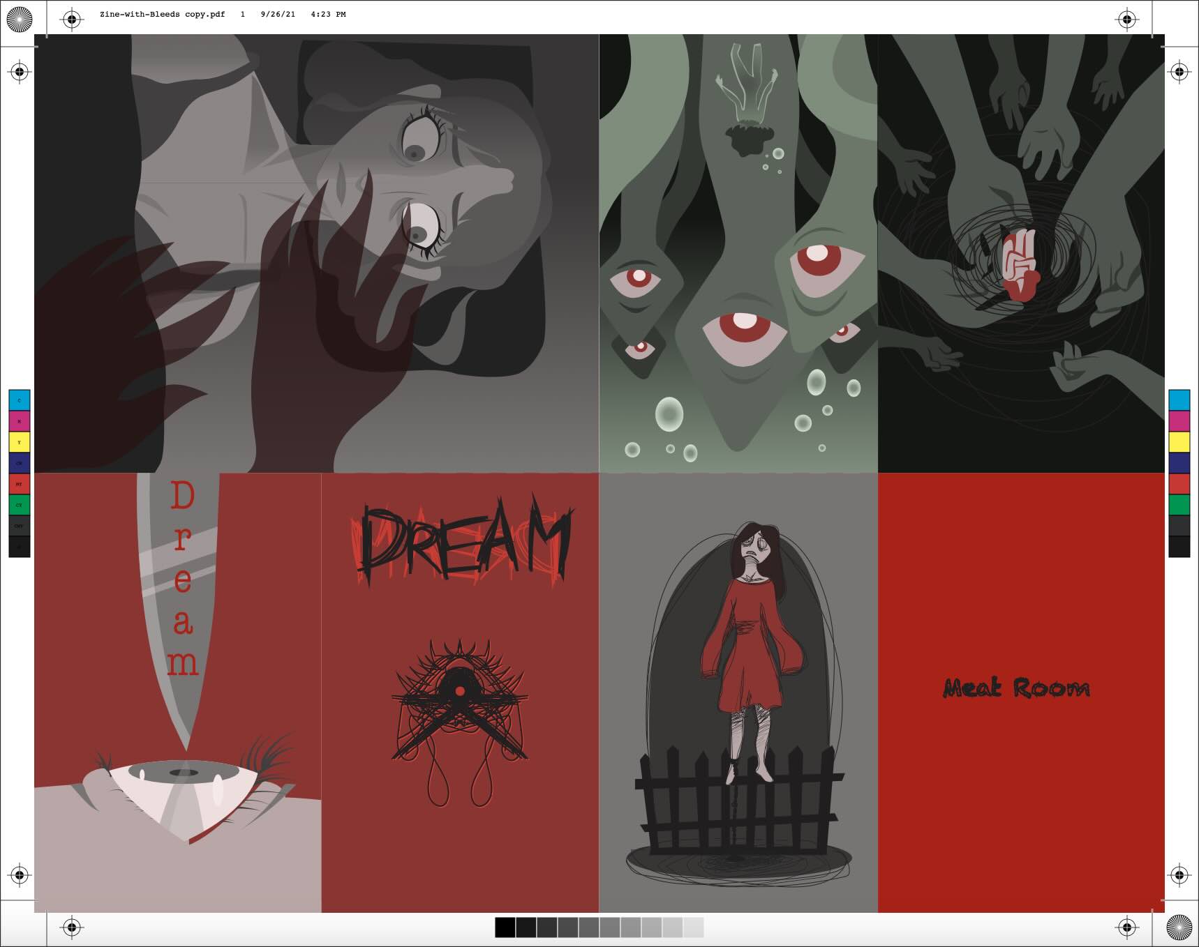
Zine Design with Bleeds
This is the design for a "zine" that I created for entry into the Sierra College library a year or two ago—which I did get into. I've included the bleed lines as demonstration that I know how to create images for print. The theme is based on the nightmares I often get, and some of the interesting imagery that comes with them.
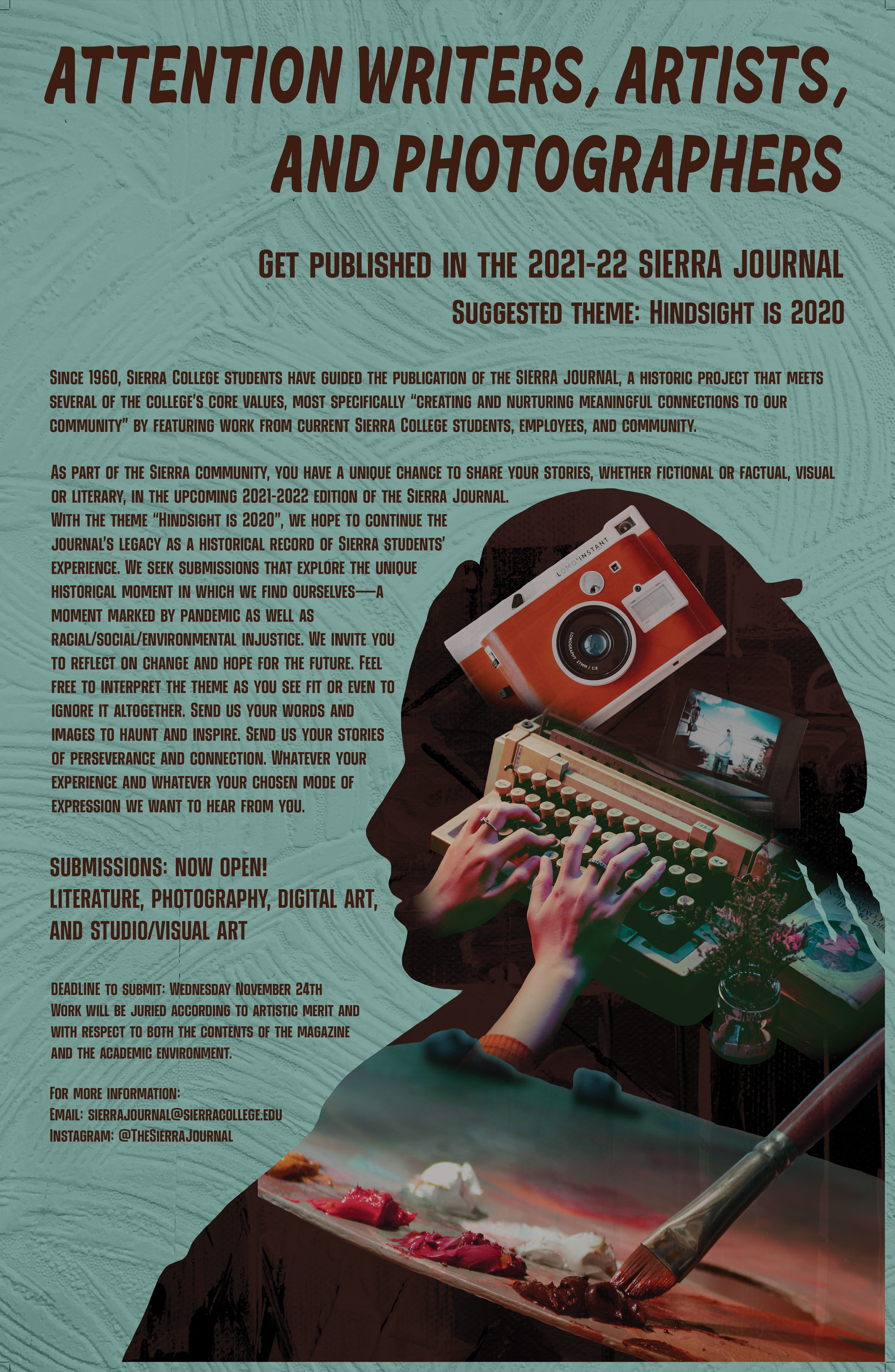
Event Poster
I designed a poster to potentially be used for a design event for Sierra College. It was a class-wide competition, which I unfortunately lost as I got 4th place. While I didn't make it to the podium, this is one of my first attempts at using Adobe Illustrate, so I still have some pride over it. I would love to redo it some day with what I learned from it.
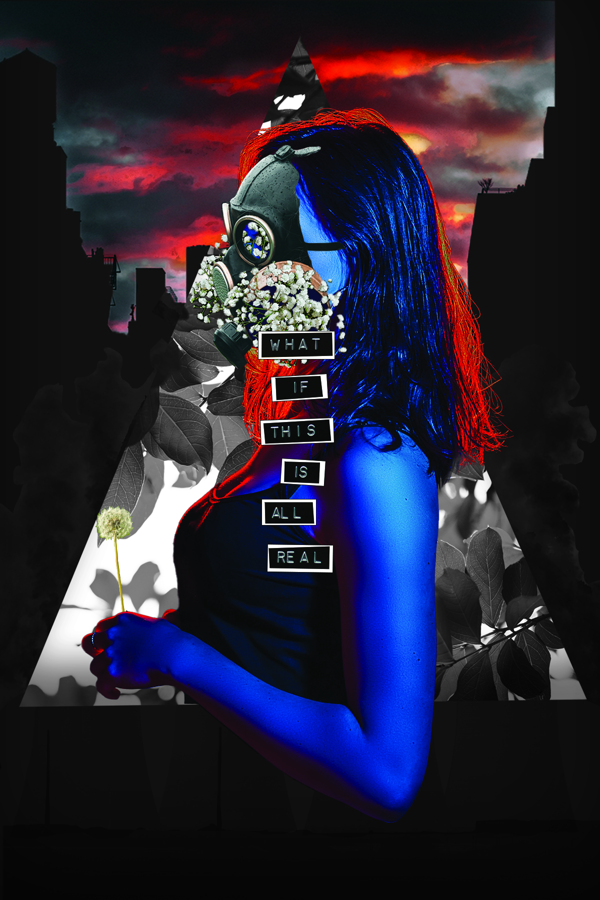
Pandemic Blues
This is a poster I created during the pandemic. While it could technically classify as a digital "illustration", I do no feel that it works as it is a collage. Additionally, it was made for an assignment where we were given quite a bit of creativity. While I am capable of following strict directions to achieve a client's vision, I feel tha it is important to show that I can come up with my own ideas if it is helpful to the overall goals of a project.
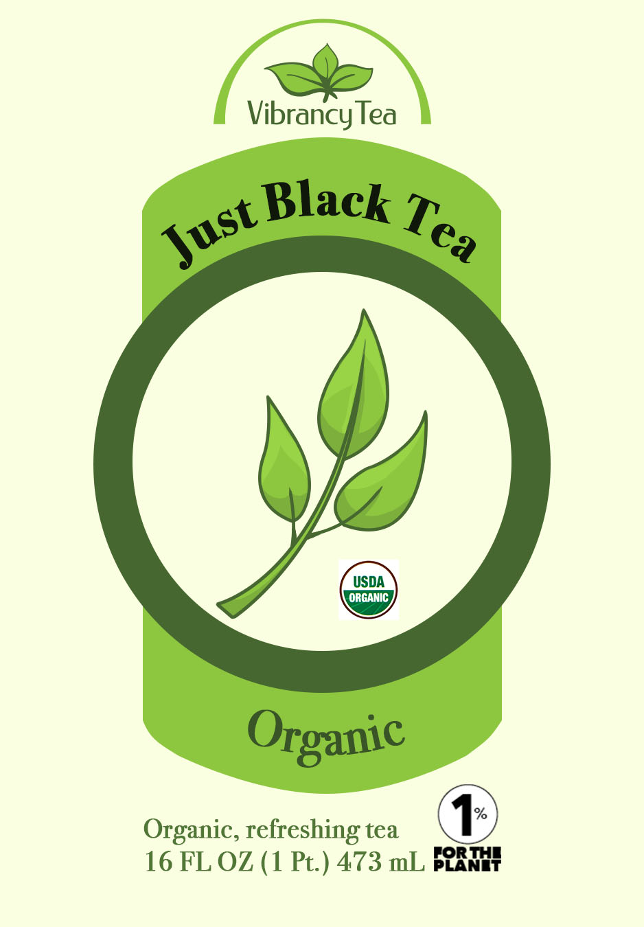
Vibrancy Tea Lab Logo: Standard
This was an assignment to create a bottle/can design for a fictional tea company called "Vibrancy Tea Lab". We were given the logo at the top, some required elements, as well as the product information which I was told to include in our design. This is what I came up with for the original flavor, and I have 4 more designs for alternative flavors.
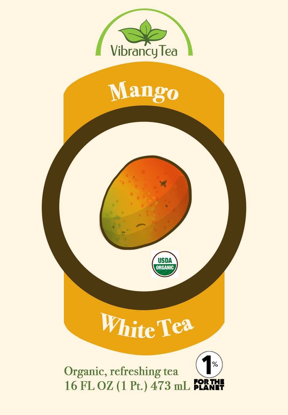
Vibrancy Tea Lab Logo: Mango
This is an example of an alternative flavor for the Vibrancy Tea Lab product label from the design above. Iterations are an important aspect when considering a design, and I hope my examples illustrate my attention to detail.