From Float to Flex, from Flex to Grid, there are tons of layout skills to be learned.
Continue reading “Grid etc”Plugging Away
This week has been crazy with family issues had a death in the family and a some of the family have been fighting…
Continue reading “Plugging Away”Wk 8 – Color Theory & CSS Grid
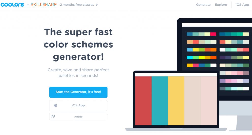
This week we learned a bit about color theory and Coolors.co, a very neat site used to create color palettes. This was especially helpful when deciding on a color scheme for my midterm microsite.
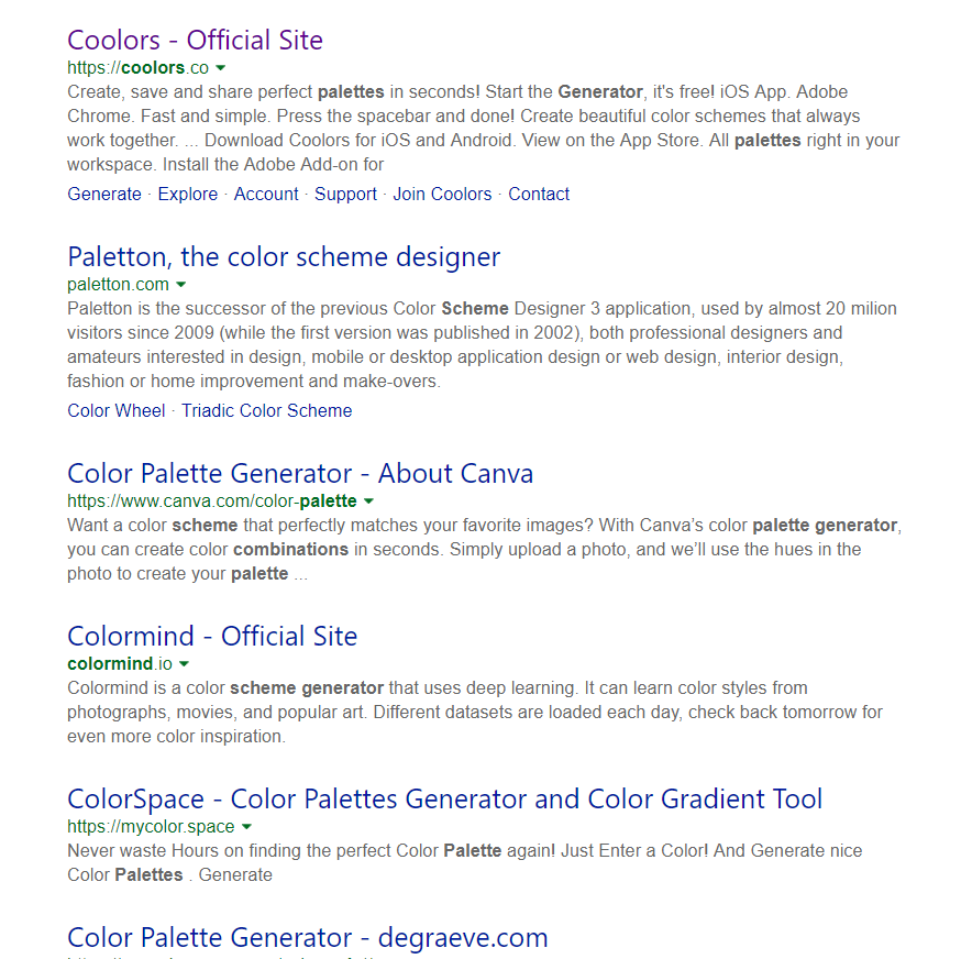
Additionally, anyone who searches ‘palette generator’ will find a myriad of tools at their disposal:
On Thursday we looked at the Grid layout. The Grid layout is used to format content on both a 2D horizontal and vertical axis. The great thing about the grid layout is it can be used in conjunction with the flexbox layout. I personally am enjoying the increased flexibility with CSS 3.
Lastly, my microsite has made some progress. I continued with styling the in-page navigation links and added my first slideshow gallery, which was exciting. Just a few more tweaks and the site should be good to go!
Journey Entry – Week 7
Totally learned something cool this week. I was able to get the carousel image on my microsite to work for my midterm. Of course, I couldn’t haven’t done it without Bill’s help since I didn’t know jquery. I was also able to the background image on my microsite which I haven’t been able to do before either. This was a cool new feature that I got to learn from my fellow class mate.
It’s interesting to read my classmates post, because I see I’m not the only one having confident issues. When I’m in class I understand it and able to get the HTML/CSS to work, but as soon as I’m at home, nothing seems to work. Total buzz kill….and then I’m pulling my hair out for hours trying to figure out what I did wrong. Hopefully, by the end the semester I will start to feel better about my skills.
FTW! (For the Win!)
Last week we not only got presented our midterm microsite assignments, but we also tackled full size images and their responsiveness. Seeing websites out there big sized images and/or video, it seems that that is the direction of design people are looking for. Plus, it’s awesome!
Continue reading “FTW! (For the Win!)”There’s a LOT to learn…
Loving what’s being introduced and excited to learn it, however…
Continue reading “There’s a LOT to learn…”Week 7 – More responsive design and the midterm
This week, I learned more about responsive design, such as techniques for dealing with full screen images.
Continue reading “Week 7 – More responsive design and the midterm”I am a drooling idiot
Ok. I totally get the way we are going through material. The spoon feeding is fine with me, I have no problem being coddled. its nice.
Unfortunately, when I go home and look at my notes and computer I feel completely overwhelmed. I stare at the screen and go DUUUUUUUHHHH.
I did go out to the site and took a quick tour over the weekend. took some snap shots on my phone and sat down and tried to make it work on my computer and simply got it into a tangle.
I tried recoding the sample project, and copying code from the photo example, and made it look like stupid.
Then I cried.
Its like I am being gently encouraged to run towards my goals, and my argument is that I just learned how to crawl. I know when I get some stuff done I will feel awesome, but right now I feel like an idiot.
I am NOT looking forward to the deadline screening towards me. I have no idea if I can finish this in time.
Week 7 Midterm
We’ve gone over an outline of what tech is kinda expecting and I’m excited.
Continue reading “Week 7 Midterm”Perspective
I did a quick design layout for the midterm with the headline text shooting out in perspective. I originally thought it would just be a graphic or image but I just read a bit more about using CSS to create perspective. Here is a simple intro: https://3dtransforms.desandro.com/perspective
Continue reading “Perspective”