PINK FLOYD MAG.
Magazine
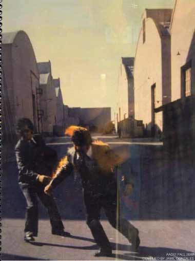
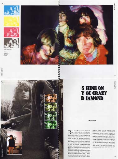
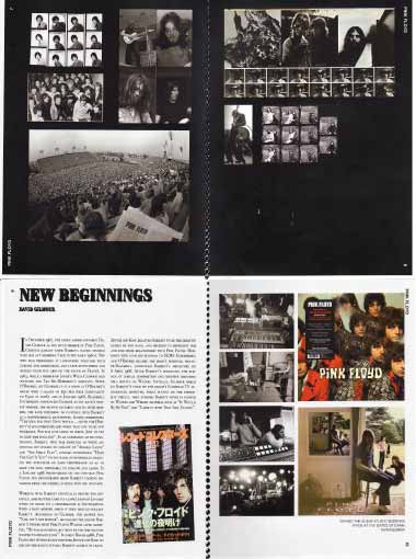
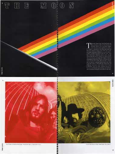
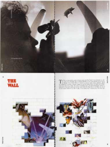
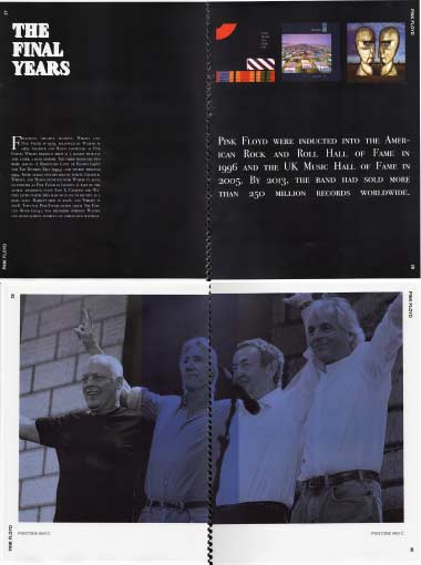
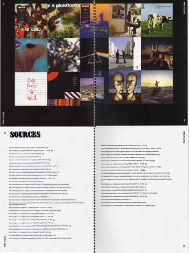
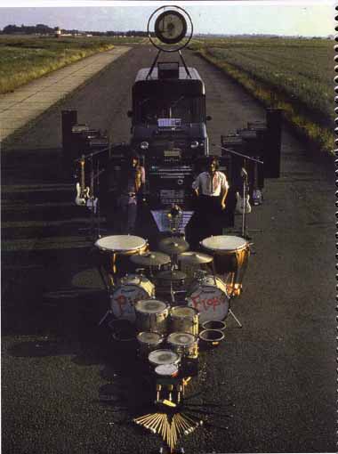
This is a small magazine that combine's the history of Pink Floyd and aspects of color design as the content of the magazine. There are many photographs and album art covers that are simply just part of the content of the magazine and not part of the color design aspect of the magazine. The magazine goes in chronological order from the beginning of the band to modern day. The first color design aspect that is displayed in the magazine is the use of CMYK (Cyan, Magenta, Yellow, and Black) that is presented in a photograph of the band playing one of their early shows in London.The second color design aspect is displayed in the use of different hues of green in a photograph of Syd Barrett an ex band member. The third color design aspect is displayed in a duotone color photograph of the band when they were in their prime. The fourth color design aspect is displayed as different effects (gaussian blur, halftone, and distortion) on a photograph from the Animals photoshoot. The fourth color design aspect is the use of tri-tone colors on a photograph of Pink Floyd's reunion concert.


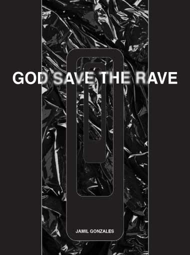
GOD SAVE THE RAVE
Magazine
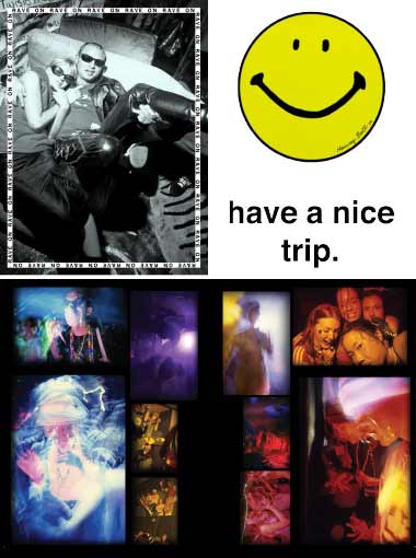
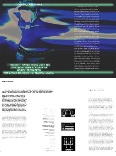
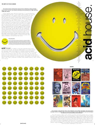
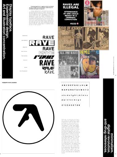
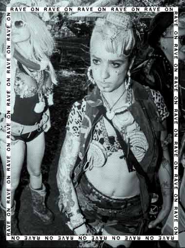
This is a small magazine on the rave era of design. The magazine follows the history and evolution of design that was influenced by the emergence of rave culture during the early 80's to now. The magazine has many photgraphs of the rave scene from the early 80's. The magazine provides the correlation of the drug culture that was highly influenced the overall scene of rave culture in the early 80's. Rave design in the 80's was full of colorful/surreal illustrations and a lot of smiley faces that were hidden from local authorities.

WORDS + PICTURES
Newsletter
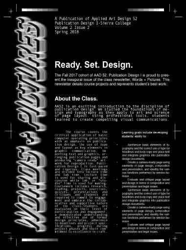
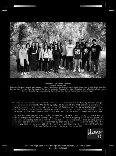
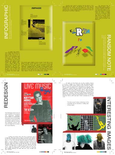
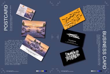
This newsletter displays a variety of small project/assignments for a publication design class that focuses on visual communication through design. Each page contains a seperate project, the first page contains an introduction of what he class is about. The second page is an Infographic that studies the design aspects of a skateboard advertisement. The third page is a Ransom Note, the ransom note is a fun design project that plays with different typographic fonts to construct a saying or sentence. The fourth page is a redesign of a concert venue for a artist names Chris Costa, the purpose of this project was to make a more effective flyer design for his audience. The fifth page is a small project called Interesting Images, the purpose of this project was to experiment with different editing techniques to make the images of our choosing to appear interesting. The sixth page is redesigns of postcards for an event in Lake Tahoe, the purpose of this was make a better typographical design than the original. The seventh page are business card designs. The last page is a rememberance of the publication design class along with a picture of everyone that attended the class.
DRAGON ENERGY
Collage
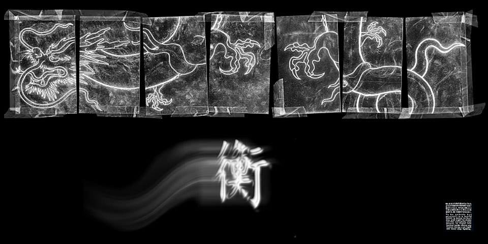
This composition is a series of drawings assembled together, digitally edited and enhanced. This composition was originally designed for a school project. It was later re-developed to this finished piece. Dragon Energy is a combination of various positive characteristics: leadership, courage, and strong spirit.
ENTER
Composition
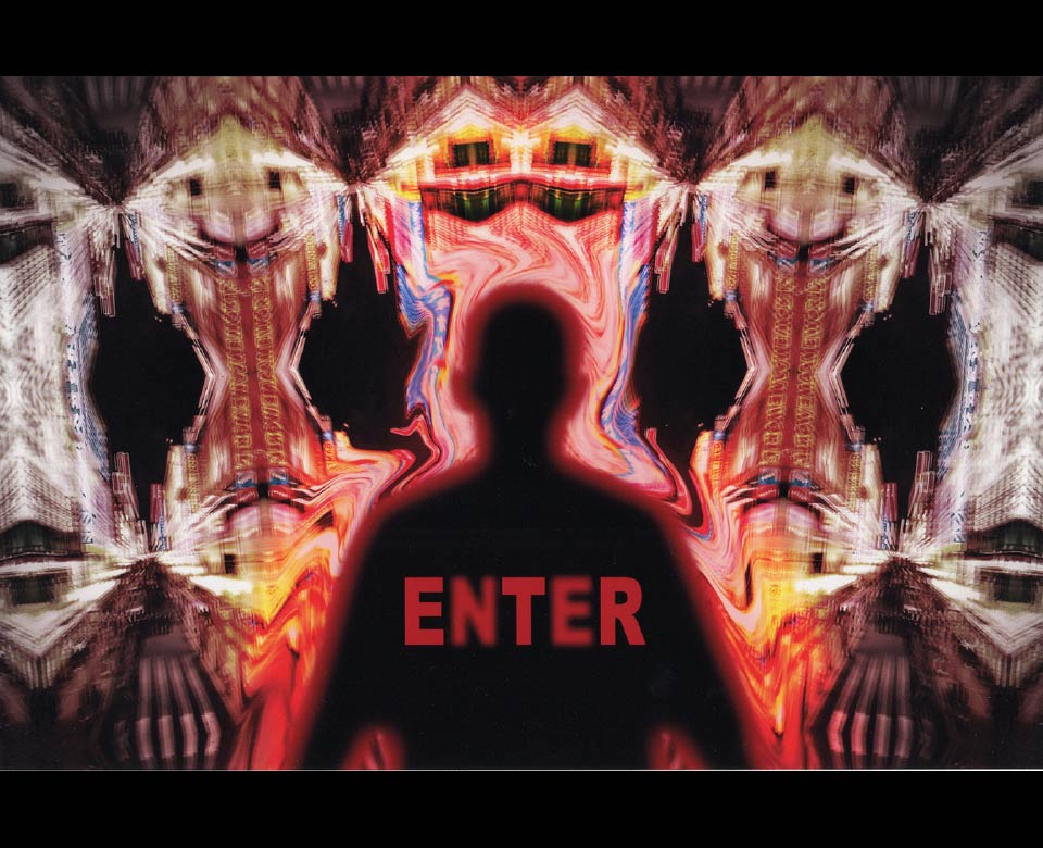
This is a digital composition that experiments with color Hue/saturation, vibrancy and symmetrical structure. This compositon was inspired by Gaspar Noe's "Enter the Void".
MMM
Stippling
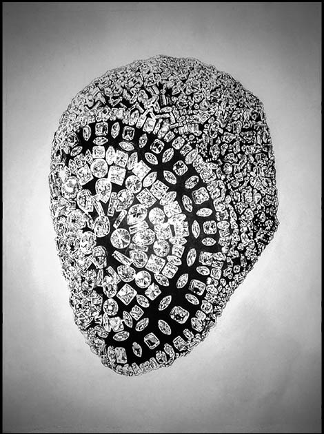
I made this for a stippling art project in my fall/2016 art class. I was inspired to do my project on Maison Martin Margiela's famous F/W 12-13 mask. This stippling piece was all done in ink and took a total of four days to finish.