UX/UI Case Study: Unify

Francisco Bou

francisco@gmail.com

Project Overview

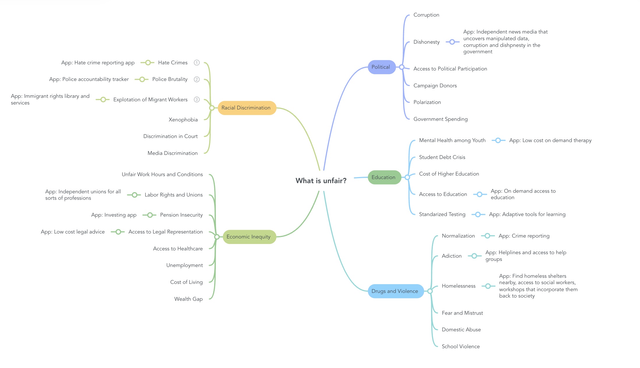
The economy and job market have faced challenges, affecting millions who rely on their jobs for financial stability. Unify functions as a trade union and benefits provider, particularly for those without access through their employers. With the rise of entrepreneurship and remote work, individuals and small businesses can greatly benefit from this app, especially those unable to afford traditional union membership and benefits.

Unify targets professionals and tech-savvy individuals aged 18 to 50 from middle to low-income brackets, focusing on underrepresented groups like minorities and low-income workers. The goal is to support gig workers, freelancers, and those who struggle to access benefits typically available to full-time employees. A user-friendly app with strong UX/UI will appeal to these audiences.

Unify offers:
- Health insurance
- Retirement plans
- Legal services
- Paid time off
- Tax services
- Blogs and informational resources
- Career networking and inclusive communities
Project Research

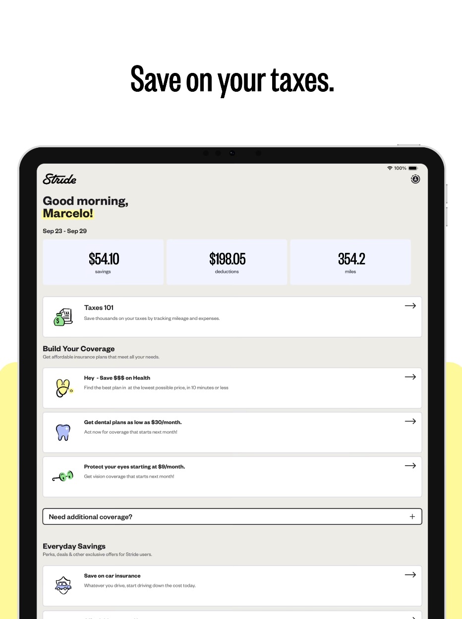
For my union app that provides work benefits and unions, I started by taking a look at work benefit platforms that offer tools for tax deduction and health benefits like Stride. This app helps gig workers like Doordashers and Uber drivers count the miles their car has traveled to help their users get tax deductions on their salaries, and lately, they started offering benefits. Another major inspiration for Unify was Ease, a platform I used to sign up for my benefits at work. It was very user-friendly and made the whole process enjoyable since it gave me so much inspiration for my app user experience.

Unify was set up to target millennials, gig workers, and freelancers. Its goal was to create a user-friendly platform that would provide a better user experience than your usual work-benefit and union platforms. These platforms are a bit outdated and more complex for the user to figure out how to manage work benefits, retirement accounts, and union fees. In Unify, it can be all in one place and still be user-friendly and intuitive.

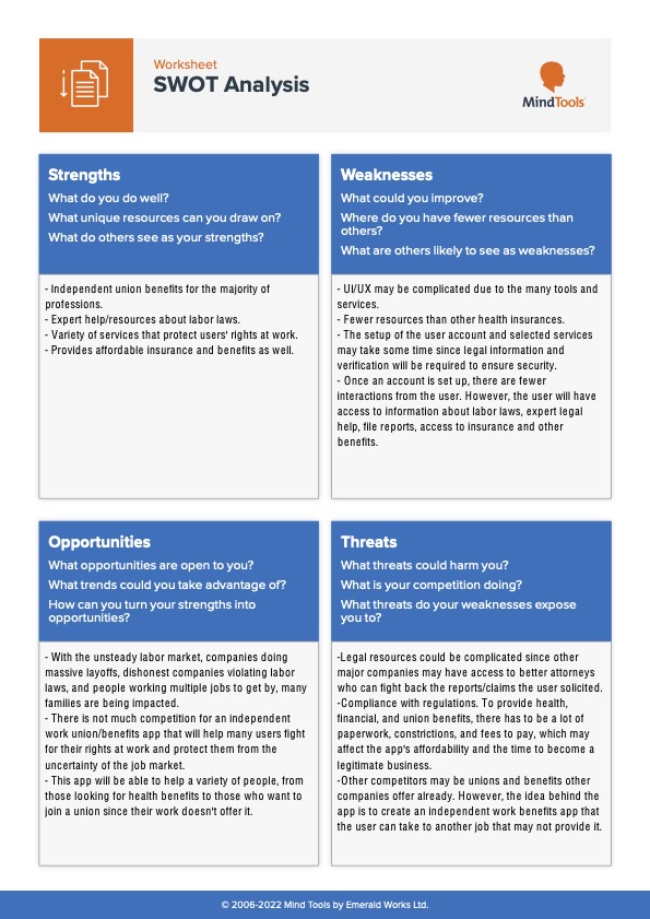
In my SWOT analysis, I break down the app's components and overall concept. It includes various ways for users to interact with the app, such as setting up accounts, managing their plans, and accessing legal resources and information. I also highlight the opportunity presented by an app like this, particularly its low competition. It can cater to many freelancers seeking a stable platform for benefits and contracts.

The 4Cs framework was helpful because it visually represents how the app is structured and explores the services and tools it will offer. It illustrates the main challenge the app may face, which is requiring users to fill out numerous forms to set up their accounts. Additionally, it addresses legal complexities, credibility issues, and other potential challenges that may arise.

App Design

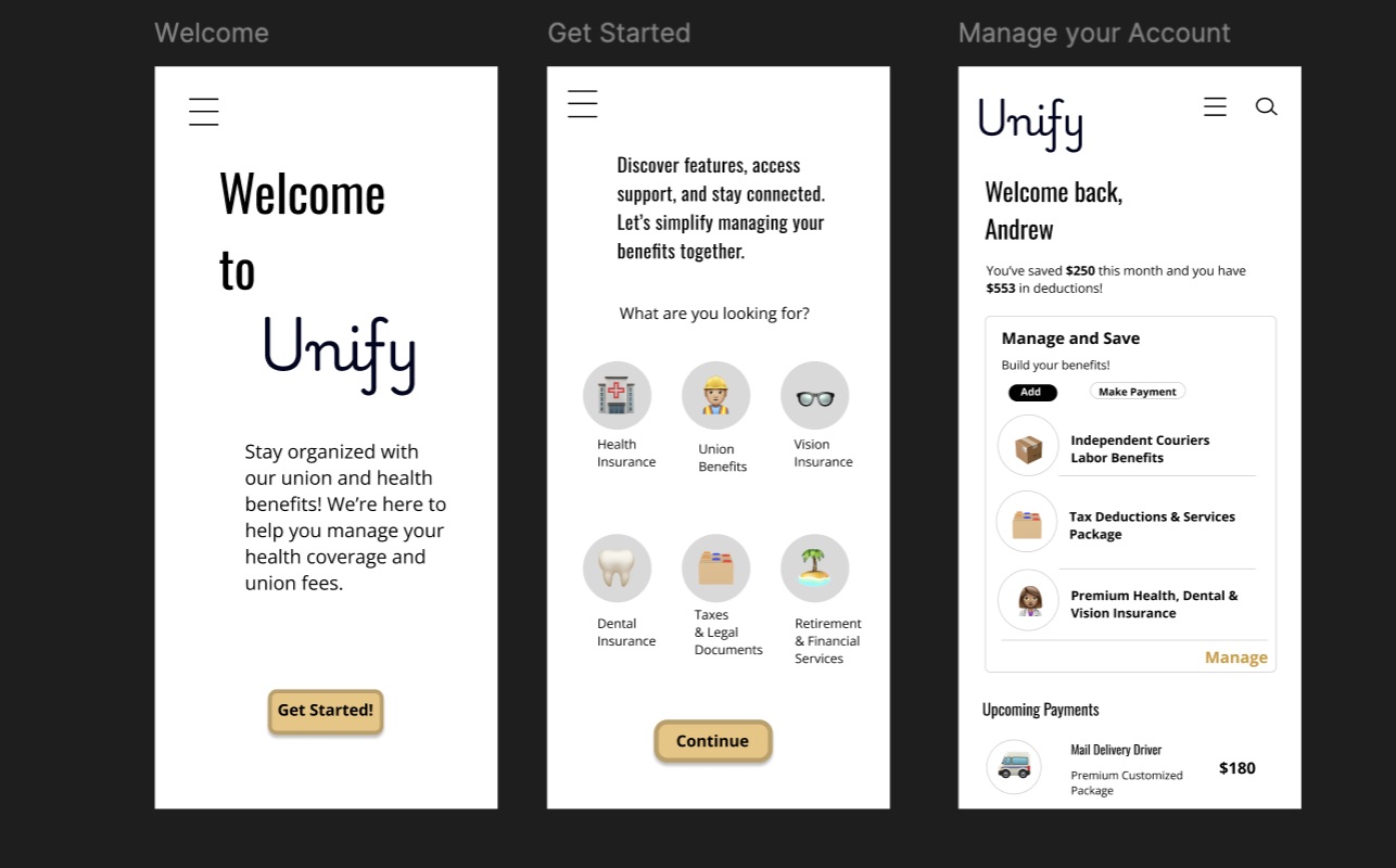
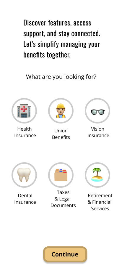
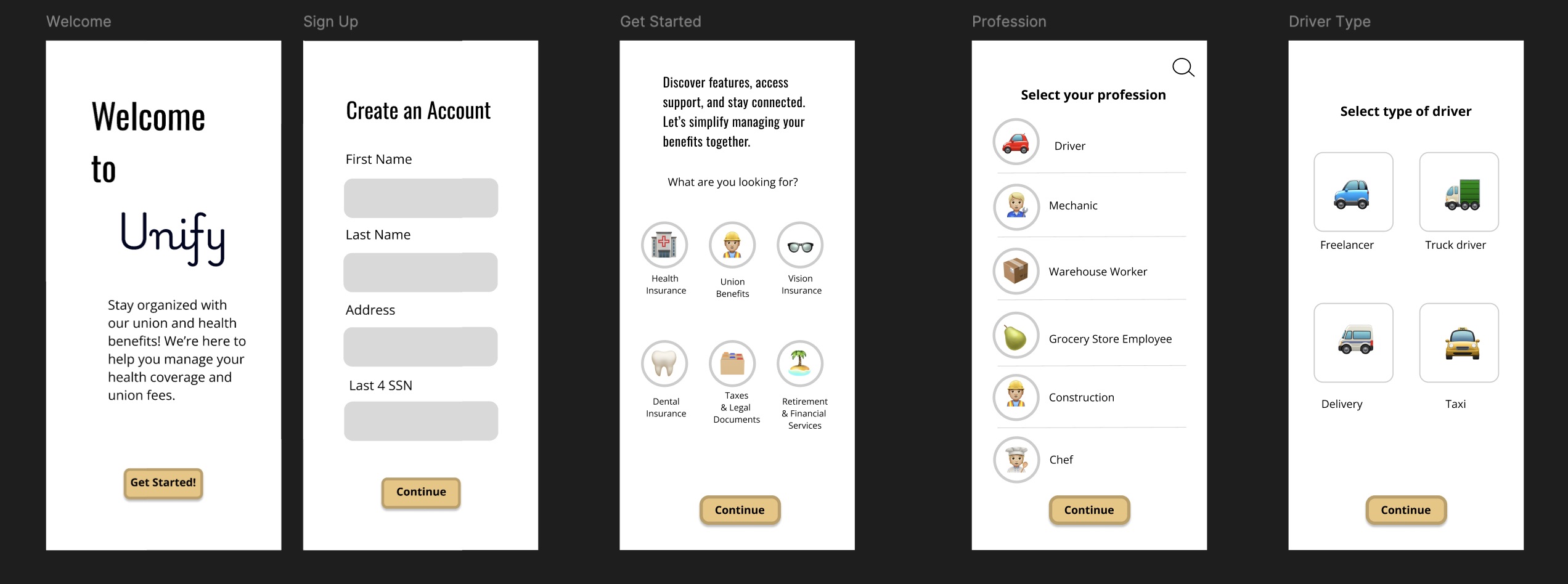
I first started with a simple prototype allowing the user to get started, select a preference, and access their profile. This simple prototype set the foundation for the rest of the app's appearance. Then, my app's first and second versions started becoming more interactive, allowing users to use the continue button, fill out forms, and select preferences to give a smooth onboarding experience. In this app version, I also worked on another page within the app, such as managing the profile, editing contact info, and having the user select a plan.

In version three of the app, I finished developing the dashboard by adding the claim service, where users can file a report and get in touch with the team. I also created a learn more section in the dashboard. I finished cleaning up my design and creating a prototype for my final version.

Tasks For Users

  1. First, the user creates an account.
  2. Next, the user is guided through the steps to build their profile.
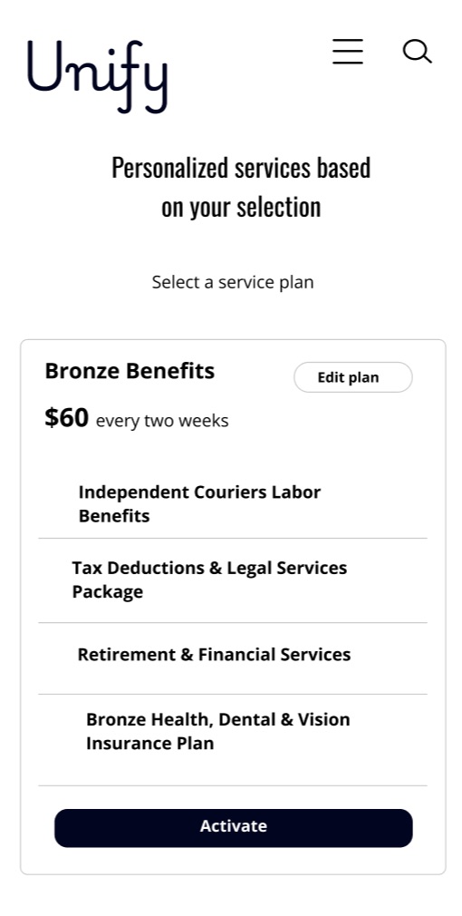
  3. After that, the user sets up their benefits plan tailored to their interests and profession.
  4. The user is asked about their profession to customize their plan accordingly.
  5. Having a traditional profession will determine eligibility for union services.
  6. Users have the option to decide whether they wish to join a union.
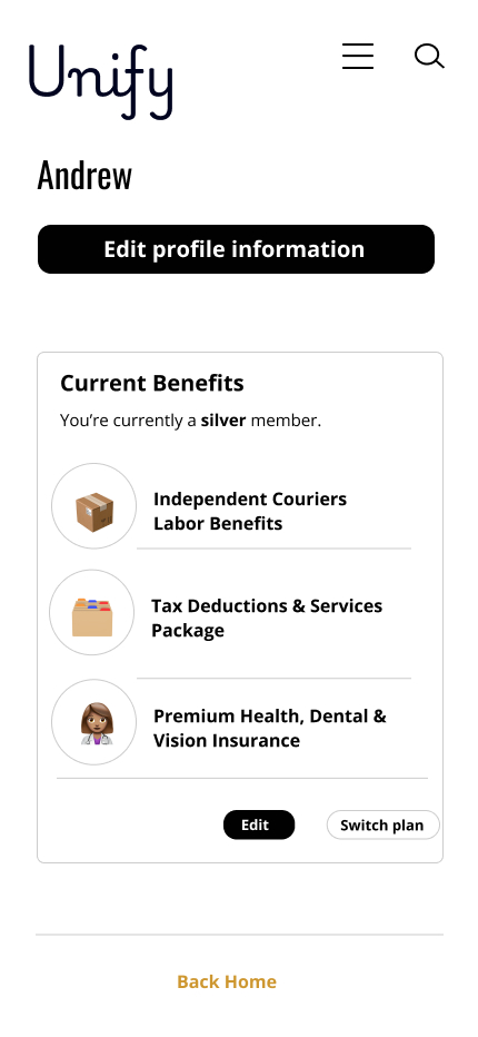
  7. The user can easily access their profile and make any necessary edits to their information.

Access and Management of Profile:

  • The user can edit their profile at any time.
  • They have the ability to change the benefits linked to their plan.

Learn More Section:

  • Users can request services and submit claims by filling out a simple form for the team’s review.
  • They also have access to helpful articles and guides.

    Task Flows

  1. On Boarding.
  2. User sets-up their plan.
  3. Managing account.
  4. Learn more section.

Usability Testing & Further Development

Unify's app offers intuitive navigation to address the challenges of traditional insurance platforms, which often have complicated designs. Its simple and accessible color palette creates an inviting environment while prioritizing content clarity to prevent users from feeling overwhelmed. The app focuses on efficient task facilitation, enabling users to manage their insurance needs confidently.

Targeting millennials who appreciate engaging digital experiences, I designed a clean and user-friendly prototype based on competitive research. The interface emphasizes straightforward tasks and includes a feature that returns users to the home screen upon task completion, encouraging a sense of accomplishment and continuous engagement.

    Qualitative & Quantitative Data
  1. The registration and onboarding are intuitive, providing familiarity.
  2. Managing reports needs more precision; wrong button presses lead to navigation issues.
  3. I found it challenging to offer additional tasks on the dashboard without complicating the prototype.
    Improvements
  1. Introduce fully customizable dashboards with various plans.
  2. Enhance the claims service page with features for insurance claims and legal assistance.
  3. Add functionality to the payment and plan activation buttons.

Summary

Working on this app has taught me many valuable lessons about user experience and emphasized the incredible importance of platform interactions. It inspired me to design the buttons, boxes, grids, cards, and onboarding forms. It also taught me how an interactive design can turn a tedious task, such as benefits and financial tools, into a pleasing experience.

I am proud of the overall user experience. While I know the app may not be the most visually appealing, the most important aspects focus on accessibility and familiarity for users, providing professionals with essential tools, and effectively communicating a message. How content is delivered significantly impacts whether users adopt the app or opt for another. The user experience is designed to be familiar and easy to navigate, allowing users to set up, manage, and access helpful resources with minimal effort. The user interface was the most significant challenge, as it demanded more effort to incorporate simple elements, such as columns with emojis, and to arrange and align the platform and prototype according to the initial concept.