UX/UI Case Study: Music Streaming App

Regine A Iremonger

Project Overview

My goal was to design a music streaming app for children. I wanted to make it look like any other music streaming apps where you can customize playlists.

In this app, I was hoping to solve some issues about app accessibility. I have used other music streaming app for children and I was a little disappointed about how little effort the designers they put into designing it, just because the app was only for children. Children loves well design apps just as much as adults do. And they are just as a valid user as we are.

Even though this app is made for children's use, my main target for making this app are parents. Moms, Dads, even Grandparents. Some children prefers to listen to music during a car ride instead of watching videos and playing games on phones and tablets, coloring books or reading. This app is designed to make things easy for the parents, whom are the real operator of the device. Easy access to the songs their child wants to hear without spending so much time searching for songs.
Project Research

In all the research that I did before starting with this app, I was more focused more on the specific app that I'm using myself. And it was surprising that there was not a lot of attention was given to the inconvinience in the app. It seemed that even though there were plenty of users, they don't care so much because, well, their reason was, it is only an app for children. I thought about asking around, and I did. I ask maybe a couple of mom friends of mine, and it so happened that one of them uses the same music streaming app as me. So I told them my ideas, about how great would it be if this app can also be customized.

If we can create a playlist and add all of our kid's favorite songs so it'll be quick and easy to play. As the other one simply agreed that it was a smart idea, the other one had only question. Why would my design be better than the one that's already existing and popular? - It will be better because it will save us time and less distracted while driving. That way, having all the favorite songs in one playlist, we don't have to keep searching for the song and we can set it to play on repeat if you also have a child who loves to listen to a song repeatedly.

App Design

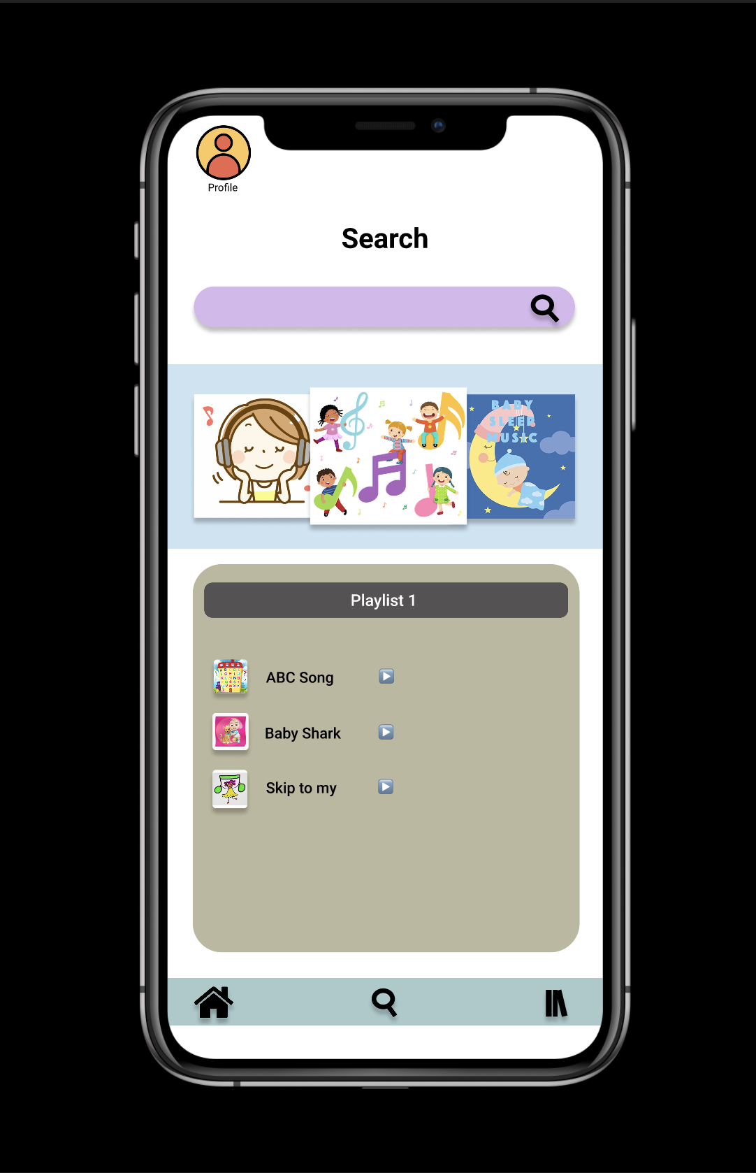
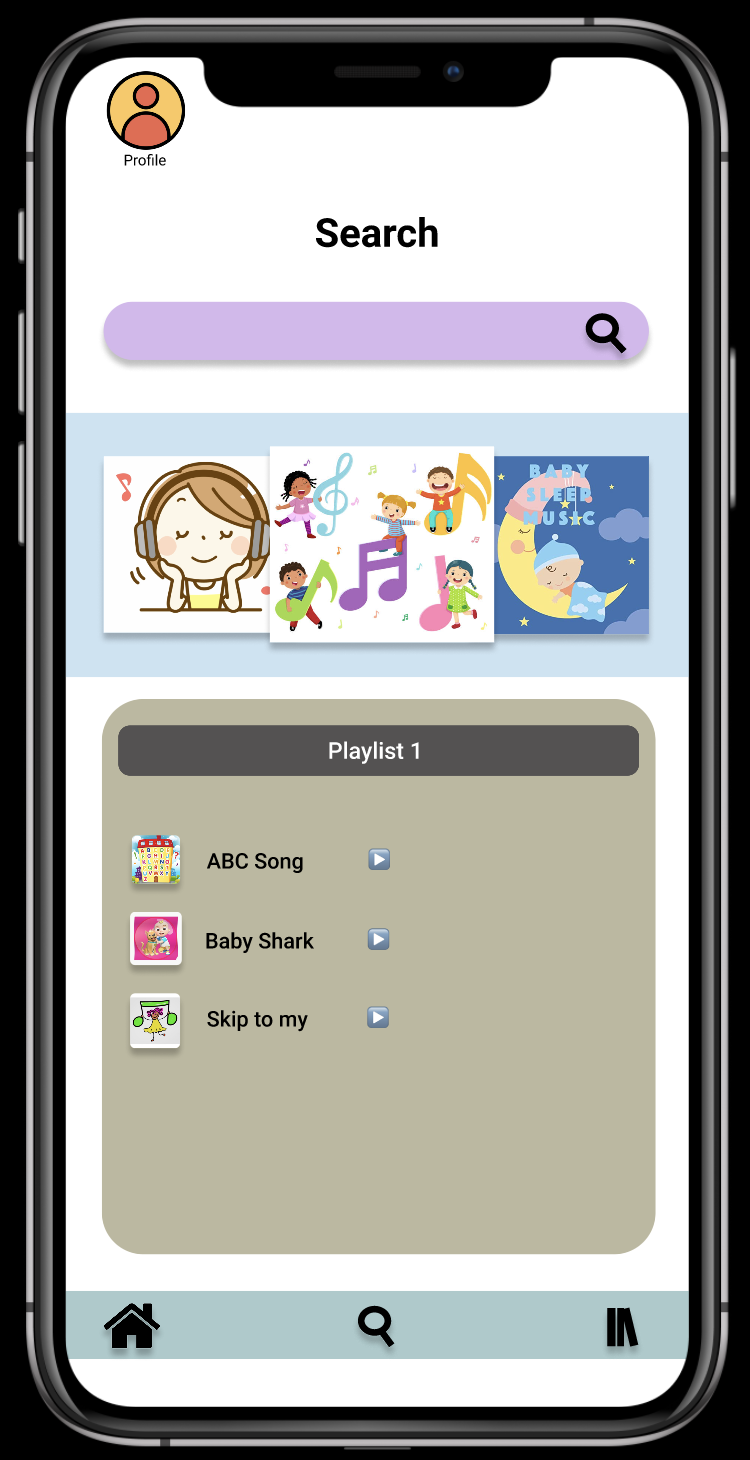
I used an app called Figma to design my app. I am still very new to this app so I had my challenges with it. When I first started, I didn't have a lot of content ideas in my head, so my first design was very minimal. As I progressed, I was able to find the right images that I can use, and the ideas of search bars, user profile, etc,.

I started with the user profile in the design, and then worked on the search bar where I had to create the magnifying glass from scratch. I didn't know what font I wanted to use so I stick with whatever it was when I started. And then I played around with what colors would go together. After comparing bright and bold colors and pastel, I opted out with pastel colors. I think that went perfectly with whom the app is intended for.

Tasks For Users

There are total of four tasks in this app. I made sure that they are brief and easy, that even a young child can do as long as they can read and know how to follow simple and direct instructions.

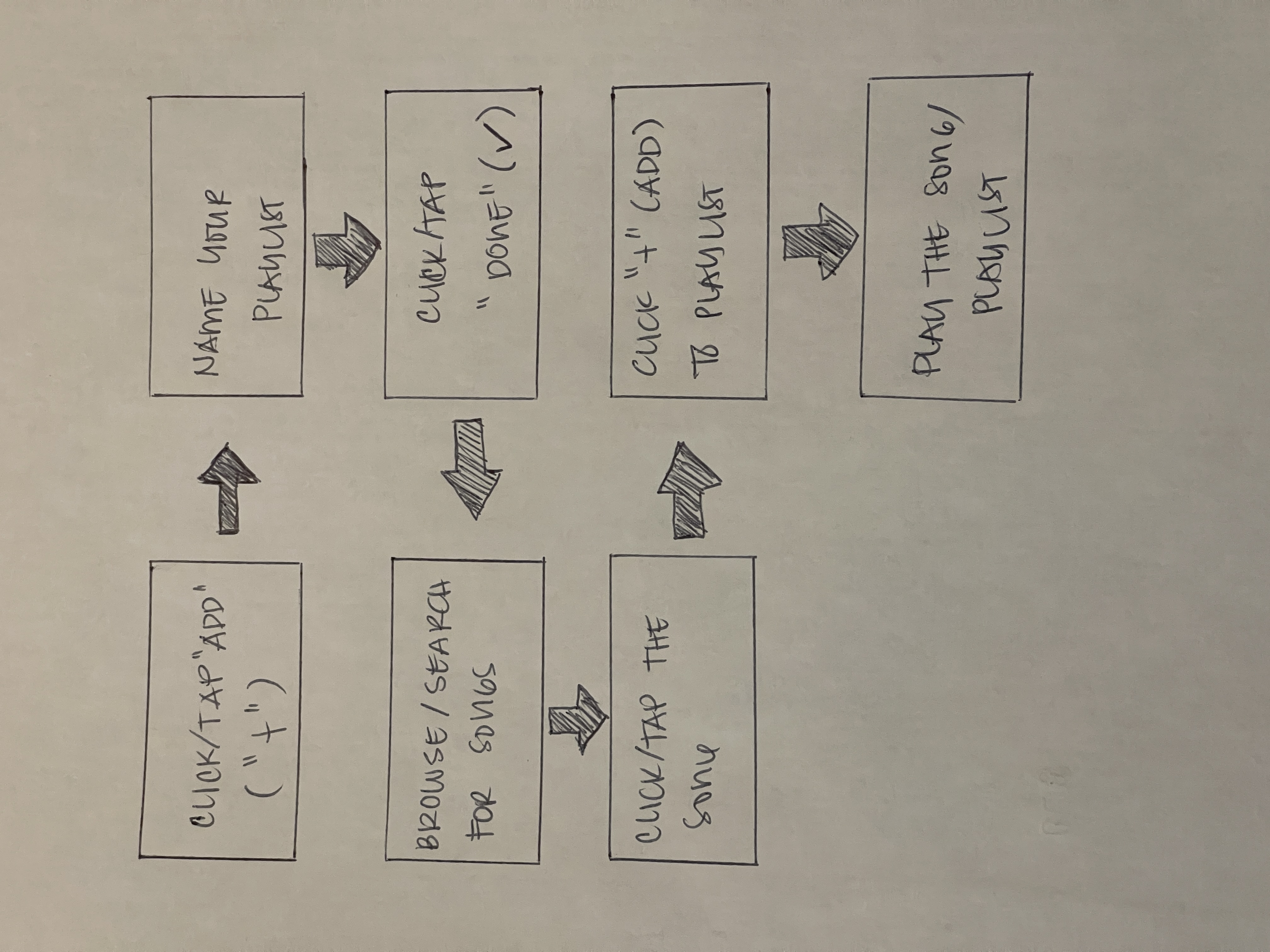
The first task is to create a playlist. Its a simple task, you just tap on "create playlist +", type the name you want and done. The second task is to add a song to the playlist. You just click the playlist of your chooising and add song, type the song in the search bar, tap on the song and its added. Third task is deleting a song from your playlist, which could be done by clicking on the playlist, then the song and delete. The last task is deleting an entire playlist, if your wish to do so. Simply tap on the playlist and hit yes if asked to delete playlist.

The four tasks:

  1. Create a Playlist
  2. Add a Song
  3. Delete Song
  4. Delete Playlist

Usability Testing & Further Development

My user testing was alright. Since I didn't do the submission on time, I had to find users that could give me comments and suggestions. Unfortunately, they were not ver helpful. Aside from the comments about how it needs more contents (which I already know), I didn't get any suggestions so I can make it look better.

After I thought I was finished with the design, I saw something that I thought was missing and so I went and check out other apps. And before finishing it (for real) and submitting the final look, I quickly added the very bottom part of the design. In it were "home", "magnifying glass" and "library" icons.

Summary

Working on this project, I learned a lot. I learned how to view things in user's perspective and it helped me come up with ideas.

Even thought the aesthetic of this app could be improved furthermore, I still feel prpoud that I was able to push myself to do something I have never done before.

The most challenging part doing this project was finding images to use without any copyright issues and doing the layout.