Love Health Case Study

Rachel Gutierrez

madeup@gmail.com

Project Overview

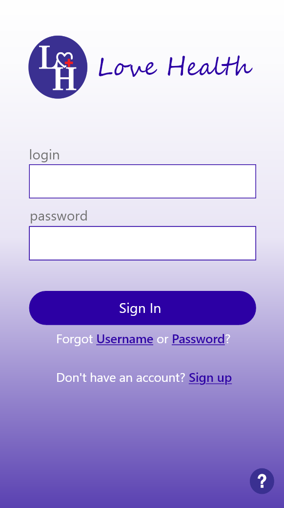
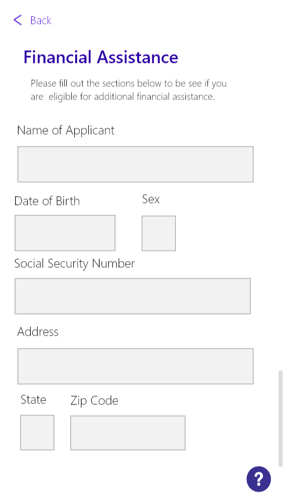
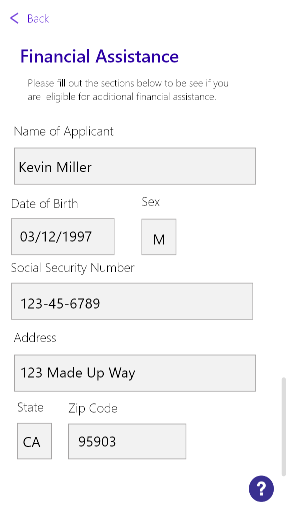
The Love Health app is a mobile tool for those who are struggling financially to afford health care. It is meant to make it easier to apply for financial assistance, provide a way to keep current medical information and insurance within the app, and to find medical centers near the user.

Ideally, the user can search for plans near them which automatically take their insurance as well. I wanted to create an experience that made it as simple as possible. More often than not, users are taken to a different page or site to sign up or to apply for what they need. I wanted the user to be able to do all of the necessary steps right within the mobile app.

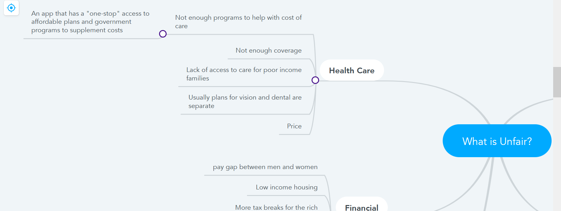
The initial target audience is for those with lower income and who cannot afford basic health care either for themselve or their loved ones. I wanted to provide an opportunity to apply for the proper assistance with the app as well. A representative will contact the user for further options after they apply.

Project Research

The first part of the research comes from the peer reviews. They helped me fine tune design flaws I had within the app when they went through it. One of the main comments was having to click through certain aspects twice in order to get to the next section. For me, I wanted to show even the smallest change that was made. Through the peer review, I was able to cut out some excess steps to make the flow easier to follow.

Second part of the research entailed coworkers in their 60's to use the app and see what they could accomplish. I wanted to test to see if they could navigate it easily since I wanted those of all ages to be able to use it. They were able to for the most part. One of them did have an issue navigating through the Create a Profile task since there wasn't a proper save or back button readily available once the task was completed. I was able to remedy that situation after this test.

App Design

The overall design of the app was to be minimalistic with a higher readability since I was targeting older audiences as well. I wanted to make sure the layout wasn't too overwhelming. I chose a color scheme of different shades of purple for accents, buttons, and links while using an off white as the main background.

I didn't receive too much feedback about the actual design aspect of the app. Most stated they liked the simplicity of it and to change spacing issues in certain areas. I made sure to keep that in mind while creating the rest of the design. It helped keep more focused on what I was actually putting on the app itself.

Another common theme was to take out excess steps for the user. For example, when creating an account after clicking on Sign Up, I had initally had the user click the submit twice once it was done. But I had took the second click away. The same with the login. For the rest of the app, I tried to have the user click on one path and the information for each section would be filled rather than having them click on each individual one.

Tasks For Users

Users can complete four tasks from signing up and logging into the app to finding care. The purpose of the app is to find care, apply for financial assistance, and more. I showed how to do both, creating a medical profile, and signing up and logging in.

1. Sign Up and Logging In

  • Go to the sign up link
  • Each section is required and needs to be filled.
  • Submit the information
  • Enter login and password
  • Sign in
  • Done!

2. Creating a Profile

  • Press on Account Info
  • Enter a nickname for the profile
  • Enter bloodtype, sex, medical condition, and emergency contact
  • Press save
  • Done!

3. Find Care

  • From the Home page, press Find Care
  • Enter zip code
  • Browse results
  • Done!

4. Financial Assistance

  • Press on Financial Assistance
  • Fill out all of the boxes
  • All of them are required
  • Press Apply
  • Done!

Usability Testing & Further Development

I conducted a usability test with two of my coworkers who are in their 60's. It was extremely informative as I had actually forgotten to add a way for a user to return to the previous or main page. They found the app to be easier to navigate once that was accomplished. They also though the design was nice and the size of the type was easy to read.

For further development, I'd want to fine tune more of the apps features that I didn't have a chance to get to such as Benefits. I want to further look at narrowing down the audience as well since it doesn't seem to target lower income persons as much as I had wanted it to. I also think it'd be fun to actually implement this into an app one day.

Summary

I learned the importance of research and making adjustments as you go. I was able to gain a lot of feedback through my peers and those around me in order to develop this app. It caused me to step outside of my own preferences and think about that the user needs.

I am most proud of the fact that my design seems to have gone over well with users. I'm still not completely satisfied with it, but I think tweaking it here and there will by continuing to ask for feedback is beneficial.

The most challenging aspect was to make sure each path lined up properly and each link was working as they needed to. The user testing definitely helped me with that fortunately. The easiest part was the design itself. I had a set vision in mind and was able to nearly execute it into reality. There's still some changes that need to be made, but I'm overall happy with the way it turned out.