Caremunity Mobile App

UX/UI Case Study

Hadassah Ronneberg

The Concept

This project began with the challenge of creating a mobile app that would address an inequity in the world. I began by mindmapping ideas and chose homelessness as the cause to move forward with.

My initial hope was that the app would let homeless people know that they mattered. Users would be people who are homeless and individuals, groups , and businesses who want to help in some way. The help could be a job, a room for rent, a place to shower before work, a ride to an interview, a haircut, a jacket, etc. People can send messages or hope and support to homeless people individually if they are moved by their story.


The Process

The process really began with thinking about what problems the app could potentially help address by brainstorming using mindmapping. Mindmapping really started the journey into what help the app could offer and helped to narrow my focus on the elements I felt I should focus on.

You can view my entire mind map and the other causes I considered at MindMeister.


Creating a userflow was a critical part of the process. Made so even more because was this was first attempt at designing an app or as a contributing member or part of any app design process. I learned a lot from this part of the process.


The Research

Competitive Analysis

My goal for this analysis was to find out what similar apps offer to users and what they don’t. I also wanted to know if these types of apps have design systems that users might be expecting to encounter, if there are any trends, and to read user reviews on what is or is not working.

Competition

There are several apps that provide lists of resources and/or connect homeless people to resources in their area but only a couple with features that go beyond that and these two provide very different ways for people to help.

Samaritan
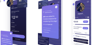
samaritan app

The app supports users in Seattle, WA by When users sign up they choose whether they are someone in need(Member) or a person who wants to help(Volunteer). The app works by sending a notification to alert Volunteers when they are near the location of a member who wears a Bluetooth enabled beacon. The Volunteer can then click on the profile of the Member and read their story and then allows them to donate money through the app to that Member specifically or to a general fund. Volunteers can also send messages. Members can use the funds at partner locations. To receive donations members must meet with a counselor each month and be working towards goals.

OurCalling
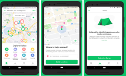
ourcalling app

OurCalling is a faith-based non-profit organization that serves Dallas County, Texas. The app gives the homeless population of Dallas a database of service providers, such as shelter, clinics, food, clothing, etc. It allows users to search by location or by category. Another feature is the map view for searching for resources. Users enable their location and can see available resources on the map with It also has a free meal calendar with times, locations, and other details. Users that are wanting to help can donate money, find volunteer opportunities on an event calendar, or submit a resource. The app has another feature, a REPORT button that allows users to submit pictures and GPS locations of homeless encampments so the organization can “schedule a Search & Rescue”.

SWOT Analysis
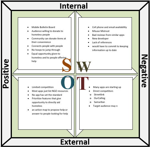
To evaluate the competition further I generated a SWOT analysis to find where these apps are succeeding and where they are falling short. User reviews of the apps were fundamental in this part of the research.

Strengths

  • No hoops to jump through
  • Equal opportunity given to homeless and to people offering help
  • Mobile Bulletin Board
  • Audience willing to donate to homeless people
  • Community can donate items at their convenience


The Design

People who are homeless would create profiles that tell about who they are, what their circumstances are and what kind of help they need. Individuals who want to help or have something to give can post to the community or read through profiles and can direct message the user. People who want to help but don’t know how can look through profiles and needs and decide what they are able to contribute or how they can help. The homeless would also have a place to post comments and to connect with each other in a supportive environment. The app would also provide a list a services and resources in the area and provide direct links to those resources by phone, email, or live chat.

The Results

The usability testing was conducted to evaluate two processes of the Caremunity mobile app prototype. The app would allow homeless users to post their stories and their needs to a user profile and the Caremunity bulletin board and for people who want to help to learn more about the homeless people in their community and to discover ways to help them directly. This report outlines the major issues affecting usability and user engagement as well as ways to improve the user experience and functionality of the Caremunity app.

Task 1. You passed a homeless person while driving. You have seen them many times and wish you could help but are hesitant to approach them. You heard about an app that helps people give directly to homeless in their area and want to find out more by downloading and trying the app.

Task 2. You are homeless and have had the app for a week and want to create a profile so that you can post a help request to the app bulletin board.

    The Recommendations

  1. Make a smooth transition from sign up process to user dashboard by adding an interface walkthrough/tour for new users.
  2. Make searching easier by allowing users to search by GPS location.
  3. To encourage giving and use of the app, add a reward/recognition element for users who give or help in some way.