Equity App Case Study

Hannah Perron

hperron@sierracollege.edu

Project Overview

The Idea

Understanding medical insurance is something that many people struggle with. The confusing nature of the paperwork and how hard it is to get in contact with someone who understands your exact coverage are a few of the big issues that users face. Our goal is to create an app that not only addresses both of these issues but is also available to all people regardless of their financial situation.

App Specifications

The app will rely on user input that will be collected from both professionals in the field and those who are already knowledgeable about their medical insurance. Users will be able to submit information and if there is a conflict between two pieces of information, it will be reviewed by a knowledgeable party before being published.

There will be multiple tabs along the bottom of the app that users can use to access either "search" "explore" and "compare" which will each allow them to access different features within the app. The "search" and "compare" feature will likely be the most utilized features as they will allow the user to look-up their current plan where they can find information and explanations about that specific plan. "Compare" will allow them to pull up two plans side by side so that they can see exactly what each plan offers. This could either be to compare their current plan to other options or to compare two plans so that they can decide which one they want to purchase.

Research

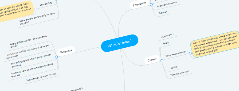
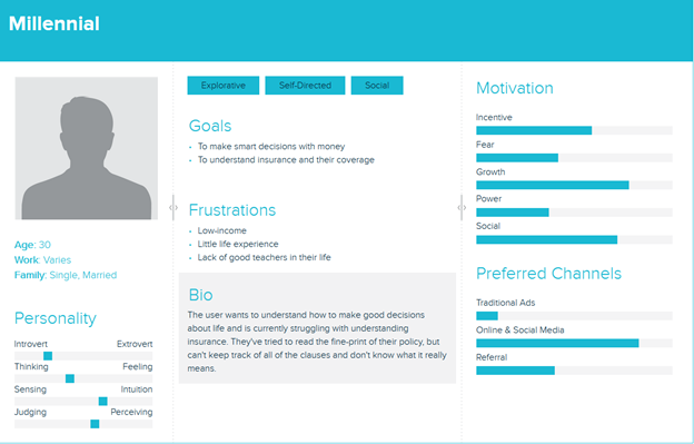
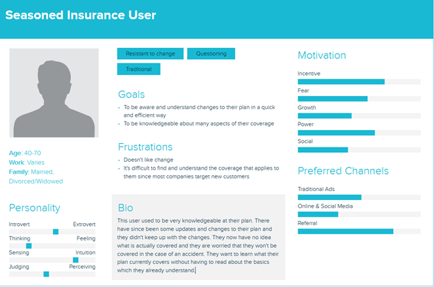
I conducted interviews with my target audience as well as creating and exploring multiple personas. In doing so, I found that there are a lot of different individuals who would benefit from my app. The interviews showed that there was a universal need for all kinds of individuals, but there was even more of a struggle for those who are financially unstable. These individuals found it harder to find access to information and were too busy to research their plan and find affordable options. This app would support these people and help to address this equity issue.
Project Research

When I interviewed people in my demographic, I found that there were commonalities between all of the interviewees. When asked about health insurance and if they understood it, their response was "I tried, but it was too complicated." None of them were confident enough to say that they understood it, even after saying that they had spent many hours trying to. This response, although sad, shows good promise for my app as this is the main issue that I hope to be solving. There was also a lot of frustration expressed about how hard it was to find information about their insurance and how many hoops they had to jump through to finally talk to someone that could help them.

Something new that I learned from my interviews is that there are some people that don't care about knowing about their plan. Some people want to have other people choose for them and are comfortable having someone else tell them that it will cover what they need. Because of this I decided to add a rating system where users can quickly and easily see what other users think of each plan.

App Design

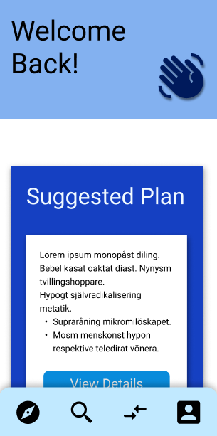
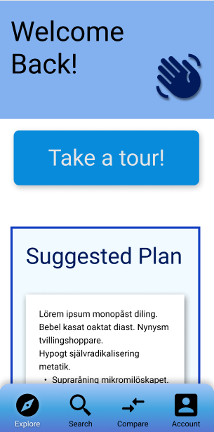
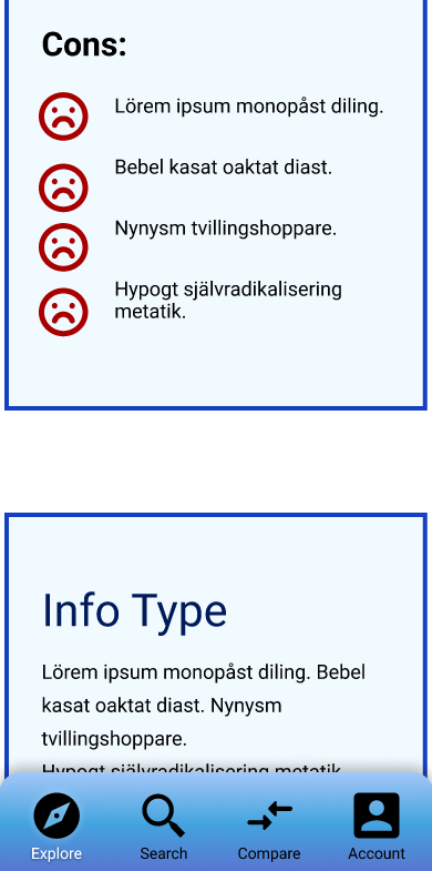
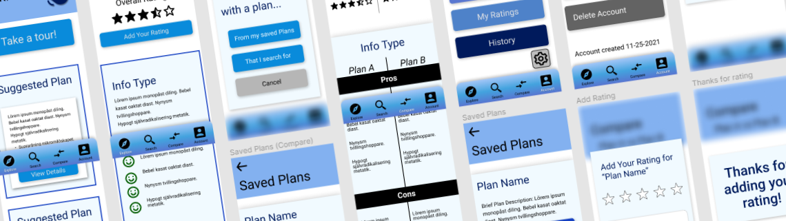
The original design (on the left) for the explore page had a different design for the "suggested plan" cards. The design had more contrast and shadows which resulted in a cluttered look. I removed some of the shadows and made the contrast between the front and back not as noticeable. The original design also had a different navigation bar which was simpler. I added a gradient and labelled the icons after my research showed that some of my users were confused by what each icon meant.

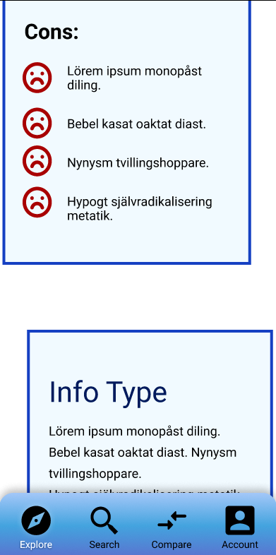
I changed my design for the "Plan Details" page from the original design (left) to the new design (right) when I got feedback telling me that the staggering of the information boxes was distracting. Changing to a simple non-staggered layout helps the flow of the document and doesn't distract from the content that's being displayed. It also allowed for more information to be displayed at one time without looking cramped.

Tasks For Users

Search for a plan

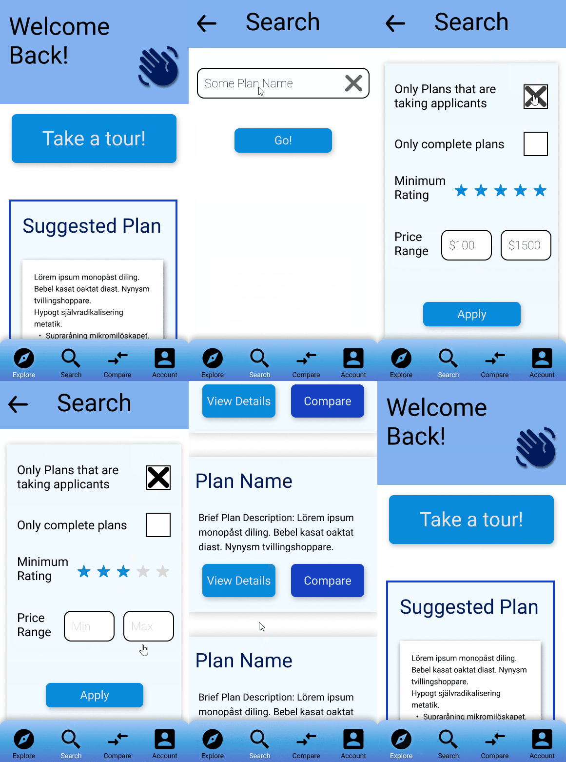
The search function is one of the most important features because it will allow users to easily find plans. Also, because users are familiar with the search feature, it will be a place where they instinctively go in order to find answers.

  1. Use the bottom navigation to go to the search page
  2. Click to fill the search bar
  3. Click “Go!”
  4. Click “Filters” and apply your desired filters.
  5. Click “Apply”
  6. Click “View Details” or “Compare” to go to the corresponding page for that Plan

Add rating to a plan

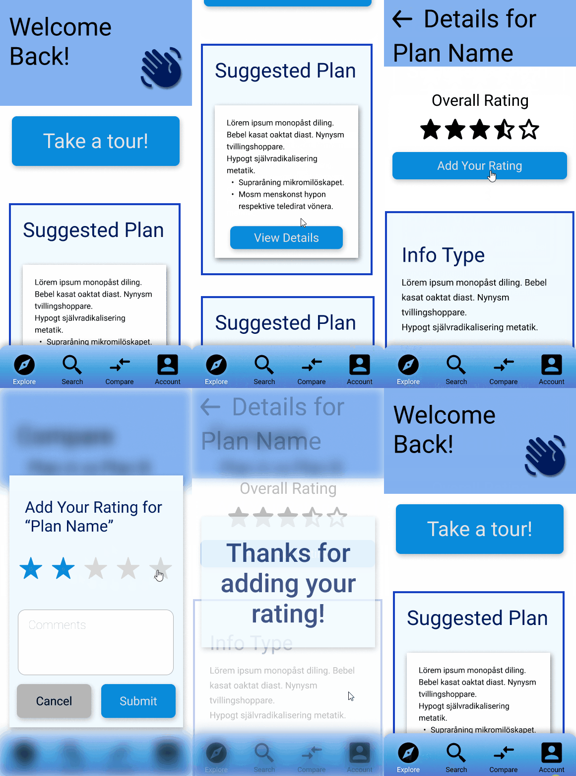
Adding a rating is very important as it will allow users to quickly assess the quality of the plan that they’re viewing. Being able to submit a rating should be an easy and painless task so users have a pleasant experience and aren’t discouraged from adding their input. User input will be essential to this app, so finding small ways to improve user experience is especially critical.

  1. From the explore page, click view details to go to the plan details page
  2. Click "add your rating"
  3. Click on a star to select the correct rating (credits to a free star template I found online)
  4. Click submit
  5. After 10 seconds you'll be returned to the plan details page

Compare 2 plans

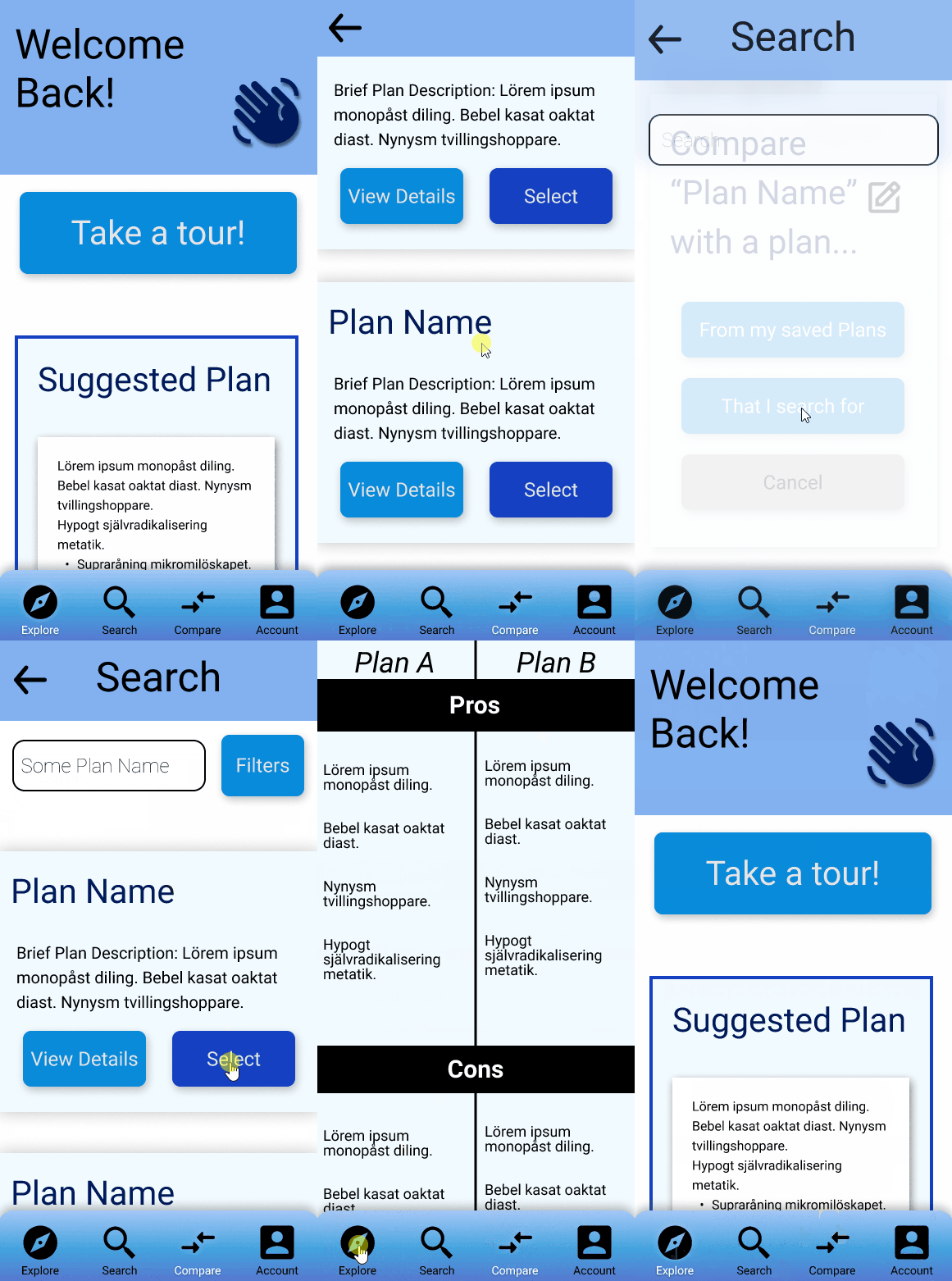
Comparing 2 plans is something that a lot of users will likely want to do. The simple side-by-side display makes it easy for users to compare plans quickly. The ability to change which plan you’re comparing with or against is also an incredibly important feature that I expect to be utilized quite often.

  1. Use the bottom navigation to go to compare tab OR click compare at the bottom of the plan details page
  2. Click one of the options to change the 2nd plan to compare against or use the edit icon to change the starting plan
  3. Click "Select" from one of the plan cards to select it
  4. You can click the edit icon next to "Plan A" or "Plan B" to choose a new plan after the initial compare

View account details/change password/delete account

Although adjusting account details is a basic feature, it’s still important none-the-less. Allowing users to painlessly change their password, delete their account, or view their account details helps their overall experience as well as showing your users that you trust them to manage their own information.

  1. Use the bottom navigation to go to the account page
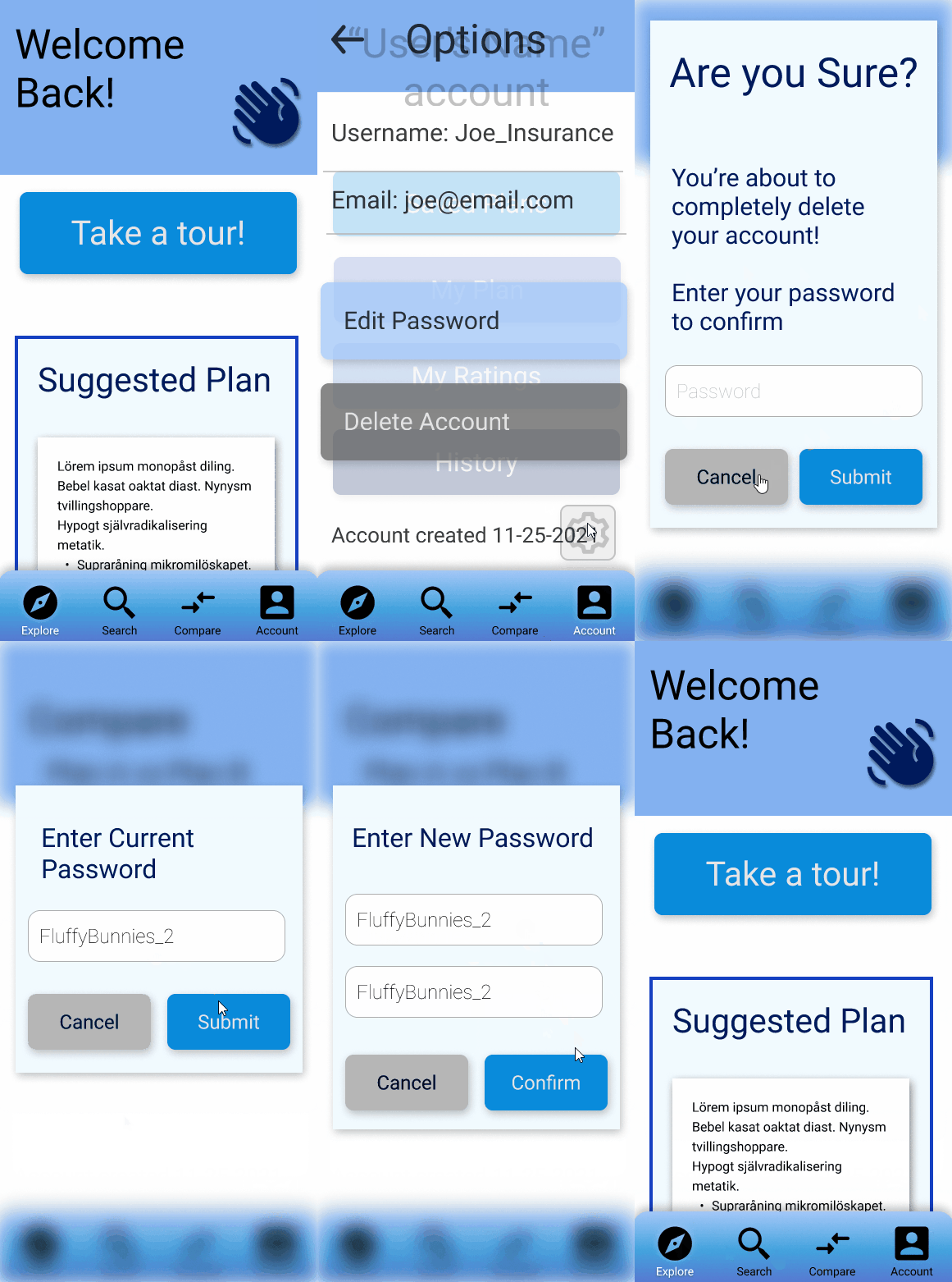
  2. Click on the gear icon
  3. Click "edit password"
  4. Click on the password field to fill it
  5. Click submit
  6. Click to fill both fields
  7. Click submit
  8. After 10 seconds you'll be returned to the account details page

Usability Testing

In order to get a better understanding of how users would use my app, I conducted some user testing. The tests revealed that users were confused when they first opened the app because it lacked a clear direction for them to go

Fixing this issue by implementing some clear call-to-actions on the main page will help to guide users to the correct place and increase the usability of the app.

This usability test showed that there are some flow issues with the main portion of the app. This difficulty made it difficult for users to know where to go when using the app and resulted in disinterest.

Future Development

The prototype does almost everything that I want it to do. If I had more time, however, I would add the following features

  • A history feature where you could see all the plans that you’ve previously viewed
  • “My plan” feature where users could input the details to their current plan
  • "My ratings” feature where users could see all the plans that they’ve added ratings for

Summary

After working through all of the different design stages there is now a functioning prototype that could be used to design an amazing app. Careful planning has gone into the layout and design choices and the need for such an app is clear based off of the research.

I am really proud of how smooth and intuitive the navigation is within my prototype. Moving between pages makes sense and I was able to utilize many of Figma’s features in order to create page indicators and animations.

I learned so much by creating this project. The most valuable experience that I had was learning how to work with Figma and adjust things as I developed my design. Using components was essential so that revisions didn’t slow down my workflow by very much and also helped me to start thinking of elements in terms of what needed to be coded later in the process.