Natalie Rishe
AAD 85
6 Feb 2023
Web Critique
Site 1:
Lemonadela.com
Overview:
Lemonade is a Southern California-based chain with an emphasis on health and sustainability. The site is meant for users to learn the company values, view the menu, find locations, and place orders.
Term 1: Labeling
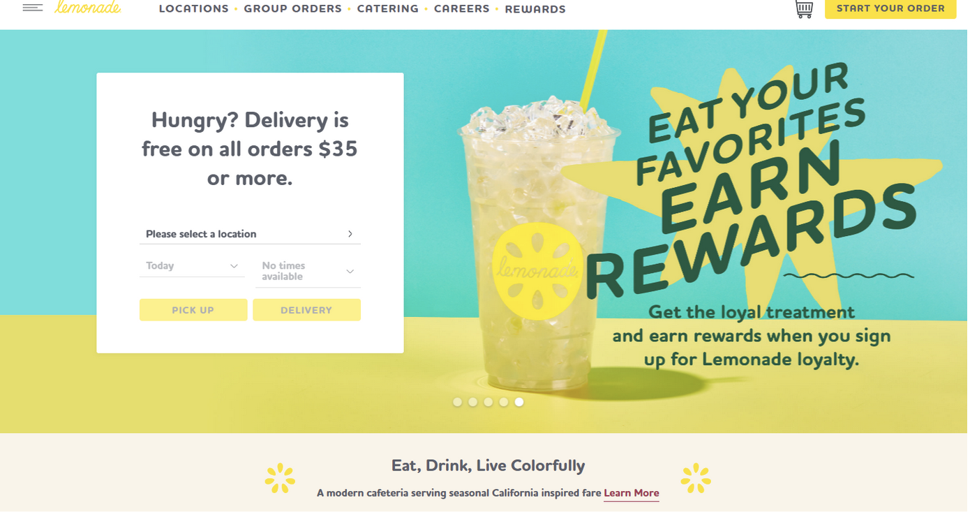
The site does a great job employing labeling. The labels are clear, concise, and bold, helping draw the viewer’s eye around the page and easily take in essential information. The labels contrast with their backgrounds and are very user friendly.
Term 2: Visual Hierarchy
This site also nailed visual hierarchy. As mentioned above, titles are clearly labeled which allows the user to understand what they are looking at in a second. Large fonts and colorful graphics pair with main menu items and less essential information is in smaller text, located further down the page, or have lower contrast.
Term 3: Color Scheme
The site features some pastels with bright pops of teal and yellow. Living up to its name, the color scheme makes me think of getting an ice cold lemonade drink on a beautiful summer day. It works well with their menu of fresh food, making me think “fresh, juicy, healthy” while also being visually appealing. The bright colors pair well with the muted colors, making the site interesting to look at yet not too overstimulating.
Site 2:
The1975.com
Overview:
The1975.com is a website for the band of the same name. The website advertises the band's latest album, social media platform, and tour.
Term 1: Navigation
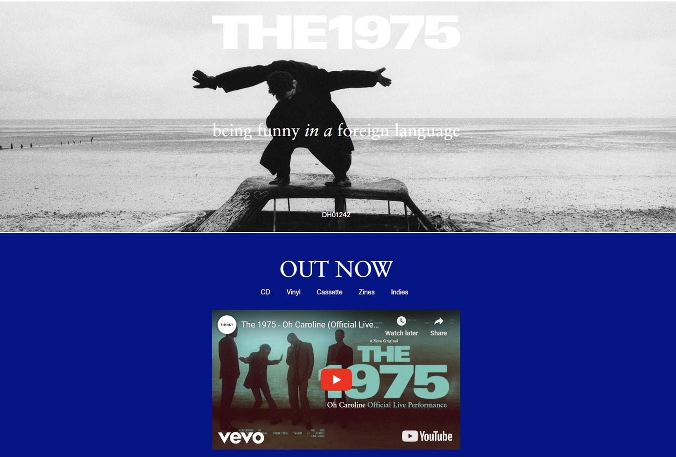
This site is very displeasing to navigate. When a user first loads in, they are stuck as the first image takes up the whole screen for a few seconds before allowing the user to scroll. The navigation bar is near the very bottom and is in a tiny font with no contrast to the rest of the page. The buttons and labels are hard to differentiate from each other, making the site feel like a mess.
Term 2: Visual Hierarchy
This website is a great example of terrible visual hierarchy. They get points for having their new album cover as the first thing you see on the website, but the rest is uncomfortable to understand. Fans visit music websites to buy merch or tour tickets, and the tour dates are in a small font at the very bottom of the page. Sources to find their music are in the smallest text on the page.
Term 3: Alignment
The whole site has center-alignment. There’s minimal text which allows there to be minimal ragging but it still looks like an immature site. I cannot tell if I am just not smart enough to understand the graphic design choices or if the site is actually that bad.
Site 3:
everlane.com
Overview:
Everlane is a website that sells sustainable, ethical clothing. Their website is used as an online store and also puts emphasis on educating buyers about the importance of sustainability and the pitfalls of fast fashion.
Term 1: Text over Image
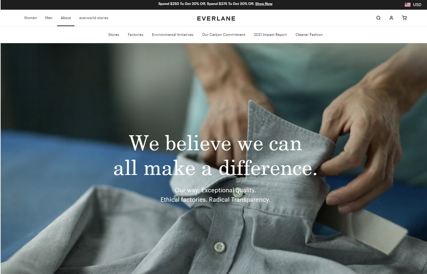
Everlane does a great job with text over image. They either put a darkening filter over the entire image to make the text stand out crisply or use rounded white boxes to provide the contrast. This concept is used very effectively and helps promote a clean, cohesive look.
Term 2: Typographic variation
The typographic variation is not wide but works well. The site uses mainly a sans-serif font for labels, sublabels and body text with the occasional use of times new roman. The sans-serif font varies in size, boldness, and caps/no-caps, still giving the feel of different categories of text while looking uniform and sleek.
Term 3: Color Scheme
It is hard to tell what the exact color scheme of the site is, but there are many muted, soft earth and jewel tones. Images and backgrounds of images contrast softly with each other without clashing. The colors give a feel of being modern and elegant without being cheap or artificial, conveying the message of sustainability.