The
Principles
Series

Goals and Expectations
The goal for this project was to choose three principles of design and represent them in three different pieces using any preferred format. Each piece should be one part of a unified three-part series.
I practiced developing a concept to illustrate the three principles I chose in a poster series; by choosing stencils and acrylic paint as the medium for each principles’ graphics and working on Photoshop to develop my template and text elements.
Tools and Processes
I was interested in doing handwork for this project, so I chose to work with stencils and acrylic paint when developing my sketches. I then decided to scan all of them and work on Photoshop to create my template and text elements.
Principles Definitions and Representations
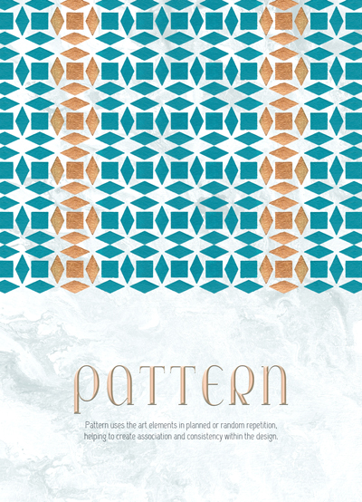
Pattern
Pattern uses the art elements in planned or random repetition, helping to create association and consistency within the design.
Graphic: Pattern formed by the repetition of a small shape created by four rhombuses around a square. The pattern is mostly teal colored with two vertical golden “lines” across.
Emphasis
Emphasis is defined as giving an area or object within the artwork properties that draw attention and become a focal point.
Graphic: Teal colored pattern formed by the repetition of a “flower” circle, a salmon-colored circle draws attention to the center top of the composition.
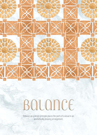
Balance
Balance as a design principle places the parts of a visual in an aesthetically pleasing arrangement.
Graphic: Golden squares with patterned borders and “flower” circle in the middle. One square is centered, and five others are repeatedly placed around it, making an open composition.
The Series
To unify the posters, I started by making sure to use only three paint colors when I was producing my sketches, and only add white paint to the mixture of those if I wanted to have some variety.
When working on Photoshop, I made sure to keep the layout consistent throughout the pieces. The graphics take the same amount of space on all three, the text elements are placed in the bottom half, and the typefaces for both the principles’ titles and descriptions are also the same. The gray background texture is also consistent.
Other Principles of Graphic Design
I chose to illustrate the principles of Balance, Emphasis, and Pattern, however, I think symmetrical balance is present in all three pieces since the graphic elements placed on the right and left sides are equal. Pattern, as a design principle, uses repetition of art elements to create association and consistency, and I would also consider that repetition, if not pattern, is also present in all three posters.
For the poster illustrating the principle of Pattern, I chose to repeat the horizontal line created by the small shapes to create an organized and predictable pattern.
For the piece illustrating the principle of Emphasis, I decided to draw attention and emphasize the center circle by using the salmon color, creating contrast with the teal colored pattern surrounding it.
And for the piece illustrating Balance, I decided to use symmetrical balance and place even elements on both right and left sides and also, to not emphasize any one shape, I chose not to use any distinct colors.
Strengths
I believe that the most successful aspects of my project are the graphic elements that I created using stencils and paint. The stencils’ shapes allowed for a pleasing arrangement, and the acrylic paint created texture in the graphics, which added interest to my final composition. I also think that I was successful in creating unity and harmony between the three pieces by using the template consistently.
Areas for Growth
I would want to develop a more compelling template, mainly focusing on playing with the text elements placement, arrangement, and proportion.